

Your Cart
0 products
News
The same shade can feel warm in the morning, cooler during the day, and entirely different at night under artificial lighting. On the French Riviera, this is particularly noticeable: intense sunlight, large windows, pale stone, terraces, and reflections from exterior surfaces constantly influence the way color is perceived.
The right paint choice therefore begins not with “Which color do I like?” but with a more useful question: How will this color actually behave in my space?
Benjamin Moore emphasizes that room orientation has a direct effect on how color is perceived. Time of day, season, window size, the surrounding environment, and artificial lighting also play important roles.
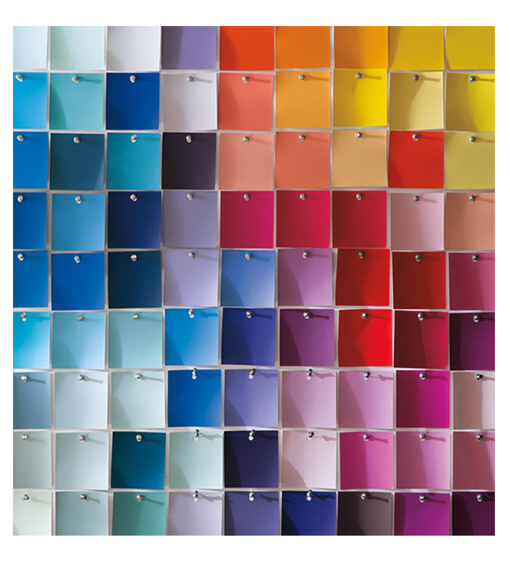
A shade seen on a small sample in a showroom can look very different once it covers an entire wall. Professional color selection therefore considers not only the paint itself, but also the architecture, the light, and the materials within the project.
South-facing rooms generally receive the most consistent natural light throughout the day. That light often has a warm, golden character.
In this environment, warm beiges, creams, and yellow-based shades can become even warmer. If that is not the desired effect, cooler green, blue, or violet undertones can help balance the golden light.
Deep and saturated colors can also work beautifully in south-facing rooms. Abundant daylight allows them to retain their richness without making the space feel excessively heavy.
For interiors on the French Riviera, this creates possibilities far beyond the traditional “white walls with blue accents” formula.
North-facing rooms receive more consistent but usually less intense daylight. The light often has a cooler quality and can make colors appear cooler as well.
A cool white may look gray or slightly blue, while cool neutrals can feel more restrained than expected.
Warm undertones – cream, sand, soft yellow, or warmer greige – can help counterbalance the cooler northern exposure.
That does not mean cool colors should be avoided. If the aim is a more graphic, calm, or atmospheric interior, northern light can actually enhance their character.
East-facing rooms are at their brightest in the morning. Direct morning light can make colors appear cleaner and brighter, while in the afternoon they often become softer and cooler.
West-facing rooms behave in the opposite way. Morning light is generally indirect and muted, while late-afternoon sunlight becomes stronger, warmer, and sometimes almost amber.
For east- and west-facing rooms, it is especially important to observe color samples at different times of day.
A shade that feels perfect at ten in the morning may have an entirely different character at six in the evening.
At first glance, white may seem like the safest choice for a bright Mediterranean interior. In reality, white is often where mistakes happen most easily.
A very pure white can feel harsh under intense southern sunlight. A warm off-white beside cool marble may suddenly appear yellow. A white with a subtle gray or blue undertone can become too cold in a north-facing room.
White therefore deserves the same attention as green, blue, or terracotta.
Benjamin Moore offers hundreds of whites and off-whites precisely because there is no single universal “perfect white.”
Mediterranean interiors are often reduced to white walls with blue details. The real palette of the region is far richer.
In its Mediterranean-inspired palettes, Benjamin Moore draws on sunbaked hues, earthy neutrals, crisp seaside blues, natural greens, and stone-inspired colors.
A contemporary French Riviera interior can therefore work with chalky whites, sand and linen tones, olive and gray-greens, terracottas, deep blues, and complex browns.
The result often feels more authentic when the colors extend the materials already present in the space rather than literally reproducing the colors of the sea and sky.
Paint never exists in isolation.
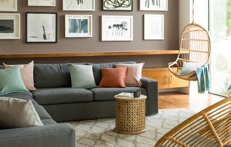
It sits beside flooring, wood, stone, tile, kitchen cabinetry, metal, textiles, and furniture. Each of these materials has its own undertones and affects the way the walls are perceived.
Warm travertine may make a neutral wall color appear cooler. Pale oak can emphasize warm undertones. Gray marble can reveal yellow in an off-white that seemed almost invisible on a standalone sample.
For this reason, paint should ideally be selected as part of the project’s overall material palette.
If stone, tile, wood, countertops, cabinetry, or textiles have already been chosen, their samples should be part of the color selection process.
Color changes with scale.
A dark shade may seem restrained on a small chip and become significantly deeper across an entire wall. A pale neutral may appear even lighter on a large surface because it reflects more natural light.
Benjamin Moore recommends testing color in the actual room and observing it at different times of day.
Look at the sample in the morning, afternoon, and evening, under both natural and artificial light.
This is especially important on the French Riviera, where the intensity of sunlight can change dramatically throughout the day.
After sunset, an interior effectively enters a new lighting scenario.
Warm artificial light strengthens cream, beige, red, and yellow notes. Cooler lamps make blue and gray undertones more noticeable.
Benjamin Moore also points to the importance of color temperature: bulbs above roughly 3,500 K generally appear cooler, while lower color temperatures create a warmer, more intimate atmosphere.
If a room is primarily used in the evening, choosing its paint color only in daylight is not enough.
The most compelling contemporary interiors use paint not as a decorative layer added at the end, but as part of the architectural concept.
Color can connect walls, doors, and moldings. It can emphasize a niche or volume, visually alter the proportions of a room, or create a more intimate atmosphere.
In a space with expressive natural light, this becomes particularly important: paint and light work together, changing the perception of volume throughout the day.
The right color is therefore not simply the one that looks best on a sample card.
It is the one that works with the specific architecture, light, and materials of the interior.
At the Noblesse & Élégance showroom in Nice, you can explore and compare Benjamin Moore colors in person and receive professional guidance tailored to your project.
We recommend bringing more than photographs of your interior. If you already have samples of stone, tile, wood, countertops, cabinetry, textiles, or other materials selected for the project, bring them with you.
Seeing these elements together makes it possible to evaluate color in its real context.
Our team can help you create a cohesive palette, identify the Benjamin Moore shades best suited to the natural and artificial light in your interior, and select the colors to test directly in your space before making a final decision.