Your Cart
0 products
News
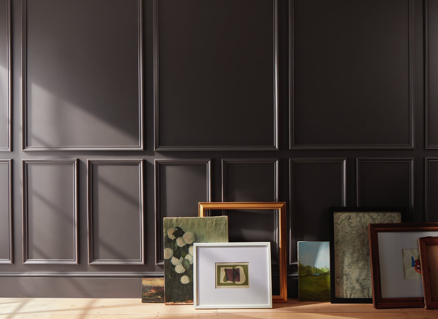
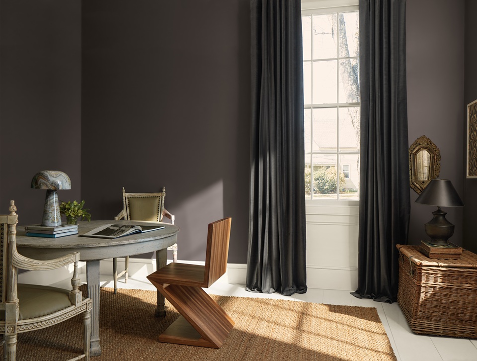
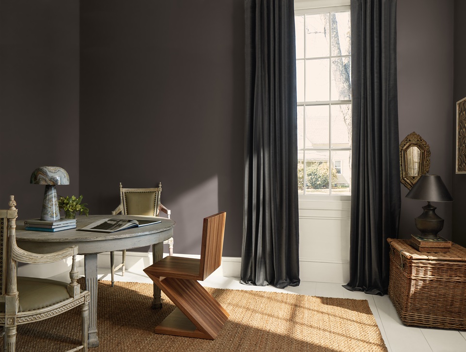
In 2026, Silhouette AF-655 takes center stage – a deep, sophisticated brown in which Benjamin Moore combines rich espresso tones with subtle charcoal notes.
Around it, the brand has created a palette of eight colors, ranging from warm white and muted neutrals to powdery pink, gray-green, deep blue-green, and terracotta.
Rather than a fleeting trend, the palette signals a return to complex, natural, and timeless color.
And that is precisely what makes it so relevant to contemporary interiors.
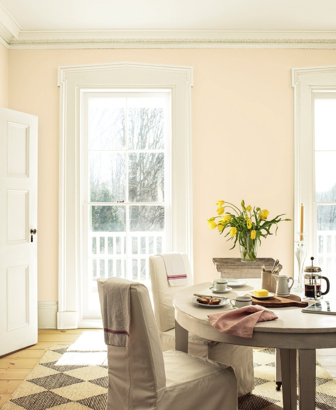
The Color of the Year is not selected according to the number of saves on Pinterest or simply based on paint sales forecasts.
Throughout the year, Benjamin Moore’s color and design experts observe developments across fashion, architecture, art, product design, culture, and the way people live.
These influences are then considered specifically through the lens of interior design and paint. The aim is to identify colors that capture the current moment while retaining their aesthetic relevance long after the calendar year has ended.
This is an important distinction between a trend and a passing fashion.
A fashionable color can appear quickly and disappear just as fast. A color used in architecture needs greater longevity.
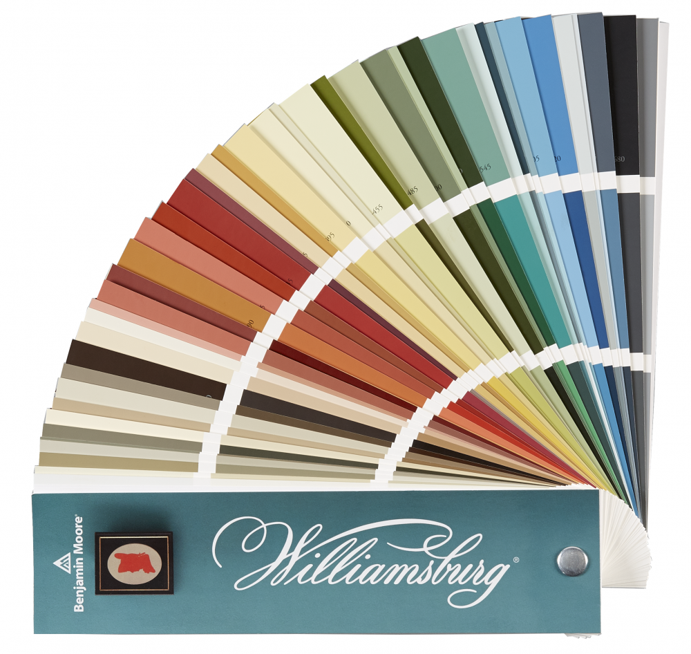
Benjamin Moore develops its Color Trends palette from a library of more than 3,500 colors, considering both global influences in art and design and changes in consumer behavior.
For 2026, this process has resulted in a palette shaped by ideas of craftsmanship, attention to detail, understated elegance, and a renewed appreciation for the classics.
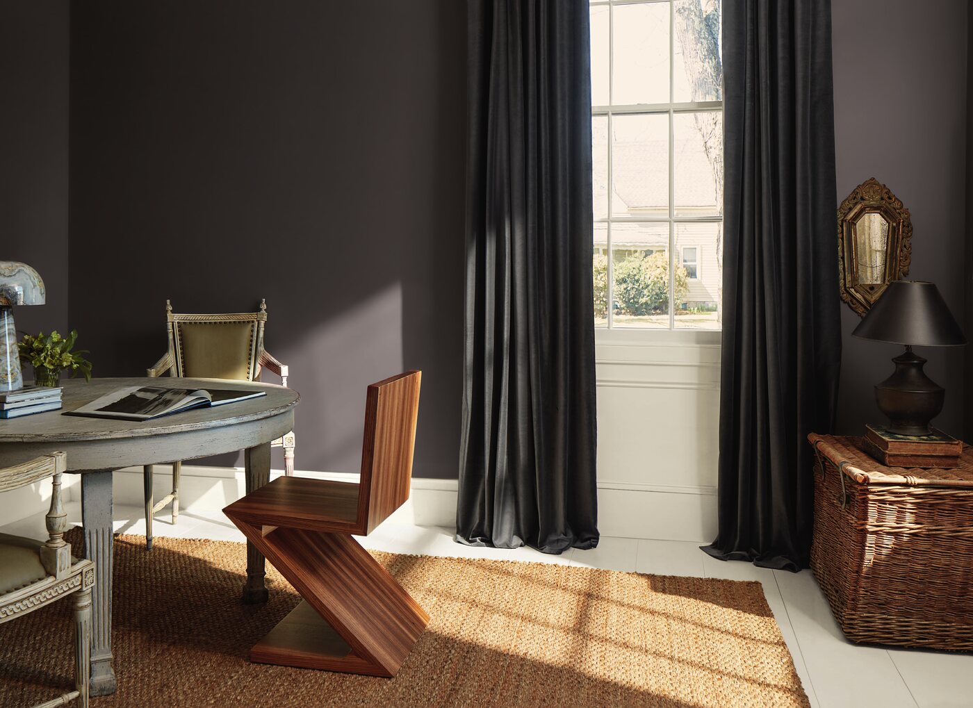
At the heart of the palette is Silhouette AF-655.
Benjamin Moore describes it through the idea of a beautifully tailored suit: elegant, structured, and timeless.
Silhouette is built around a deep espresso brown with charcoal undertones. It is neither a conventional chocolate brown nor an almost-black. It is precisely this combination of brown and charcoal that gives the color its complexity, allowing different aspects of it to emerge depending on the light and surrounding materials.
With an LRV of 10.18, Silhouette is a genuinely deep color with relatively low light reflectance.
But deep does not necessarily mean heavy.
Silhouette can create very different effects depending on how it is used.
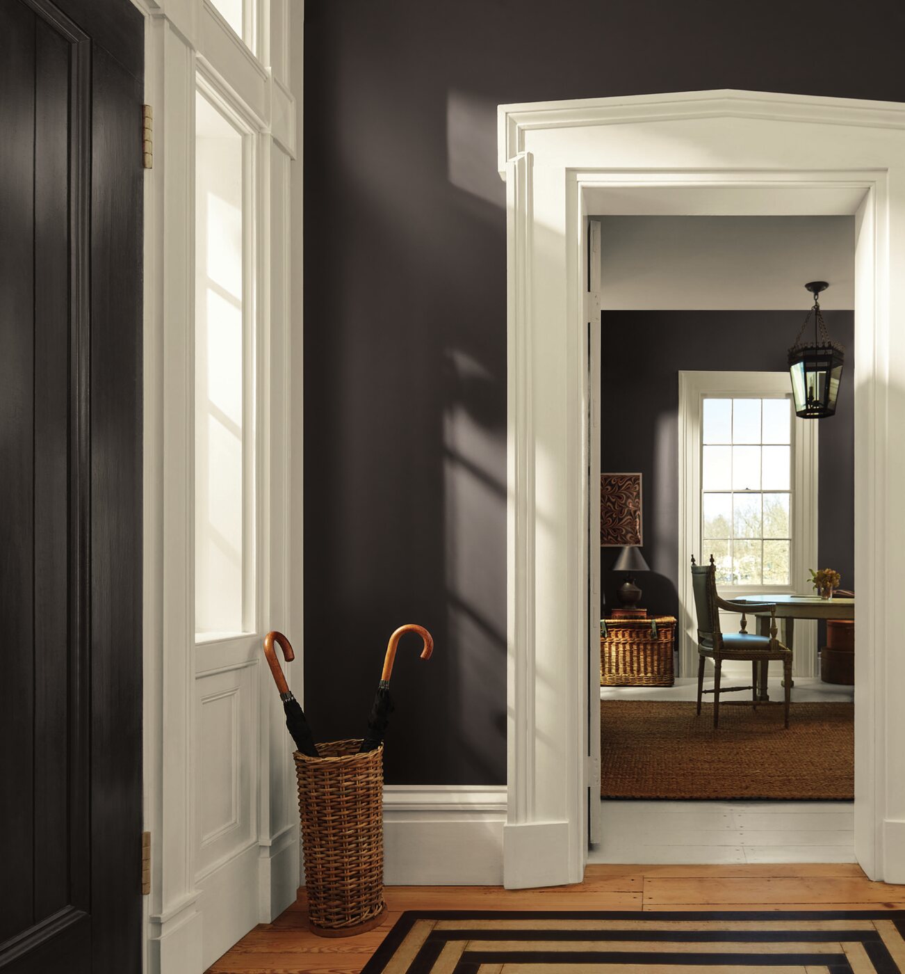
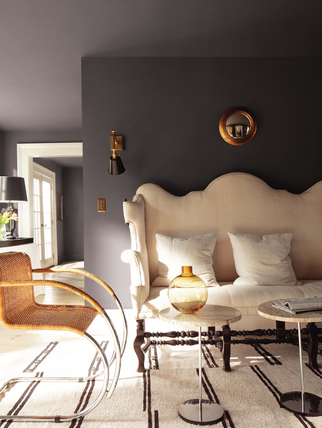
Applied across walls and ceiling, it creates an intimate, enveloping atmosphere. Used on doors, built-in bookcases, kitchen cabinetry, or wood paneling, it becomes an architectural feature. Paired with lighter walls, it can also serve as a softer, more nuanced alternative to black.
Silhouette works particularly well alongside natural wood, travertine, pale stone, linen, leather, brass, and other richly textured materials.
For interiors on the French Riviera, it may seem like an unexpected choice, but it can be particularly effective. In spaces with abundant natural light, deep colors can reveal remarkable richness while creating a sophisticated contrast with the brightness of the Mediterranean environment.
The presence of brown at the center of Color Trends 2026 is no coincidence.
Benjamin Moore has noted a growing interest in brown alongside a broader return to classic silhouettes in fashion, beautifully crafted textiles, high-quality natural materials, and objects designed to last beyond a single season.
A similar shift is taking place in interior design.
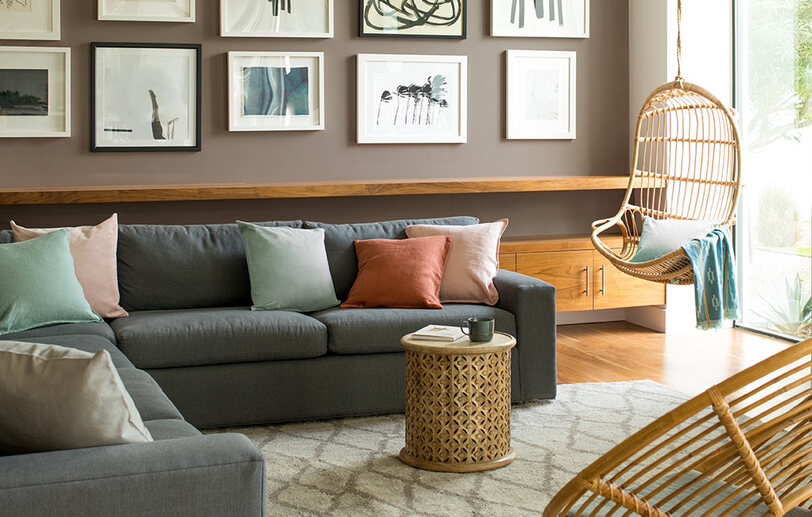
After years dominated by cool grays and very pale neutrals, interiors are becoming warmer. Wood is returning to the foreground, accompanied by deep browns, caramel, clay, burgundy, and earthy shades.
But contemporary brown is not a return to the interiors of previous decades.
Today, it appears within cleaner architectural forms, alongside natural stone, contemporary furniture, art, and generous amounts of light.
Silhouette embodies this evolution particularly well: classic in character, yet distinctly contemporary in application.
The strength of Color Trends 2026 lies not only in the individual shades.
Benjamin Moore has created the palette so that its colors can work independently or be layered and combined to create richer compositions.
The palette brings together Silhouette AF-655, a deep espresso brown with charcoal notes; Raindance 1572, a soft muted gray-green; Swiss Coffee OC-45, a warm off-white; First Crush CSP-310, a delicate powdery shade; Batik AF-610, a complex muted mauve-brown; Narragansett Green HC-157, a rich blue-green; Southwest Pottery 048, a warm terracotta; and Sherwood Tan 1054, a classic earthy tan.
Together, these eight shades create a palette that balances light and depth, warmth and cooler accents.
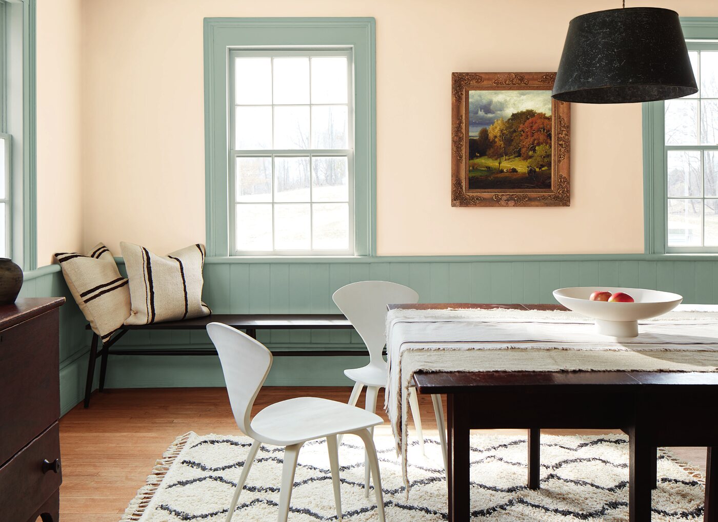
The inclusion of Swiss Coffee OC-45 in Color Trends 2026 is particularly telling.
White is not disappearing from interiors. Its character is simply changing.
Instead of stark, cool whites, softer off-whites are becoming increasingly relevant – shades that interact more naturally with wood, stone, textiles, and earthy colors.
Swiss Coffee fits perfectly within this shift.
It can be used as the primary color for walls, ceilings, or woodwork, or as a backdrop for the palette’s more expressive shades.
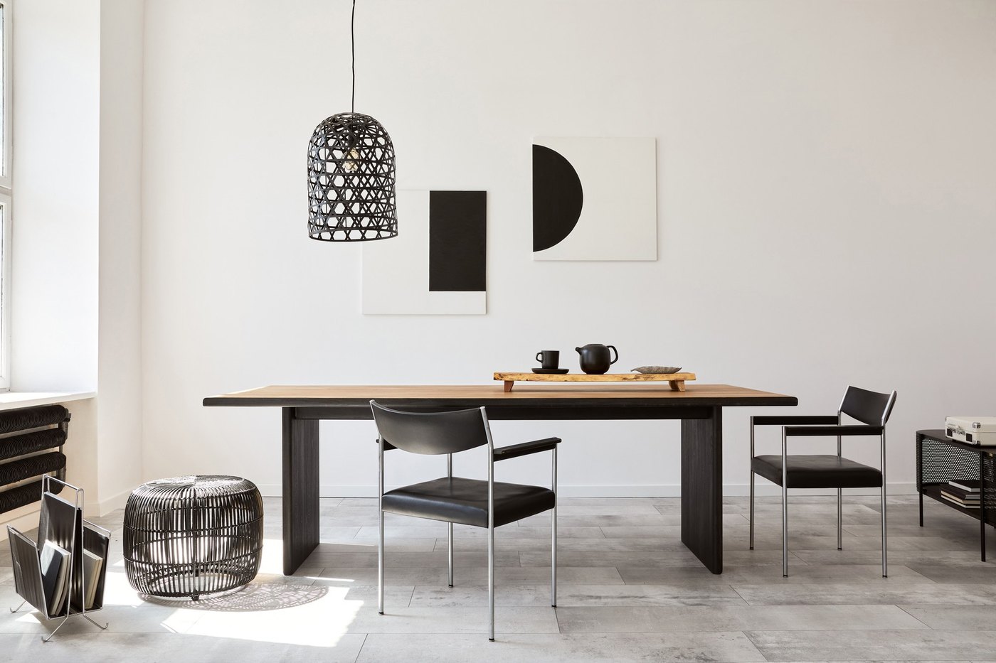
Its combination with Silhouette is particularly effective: a warm, light background paired with deep brown creates a contrast that feels softer and more sophisticated than the classic black-and-white combination.
For Mediterranean interiors, this pairing feels especially natural alongside pale stone, wood, and tactile textiles.
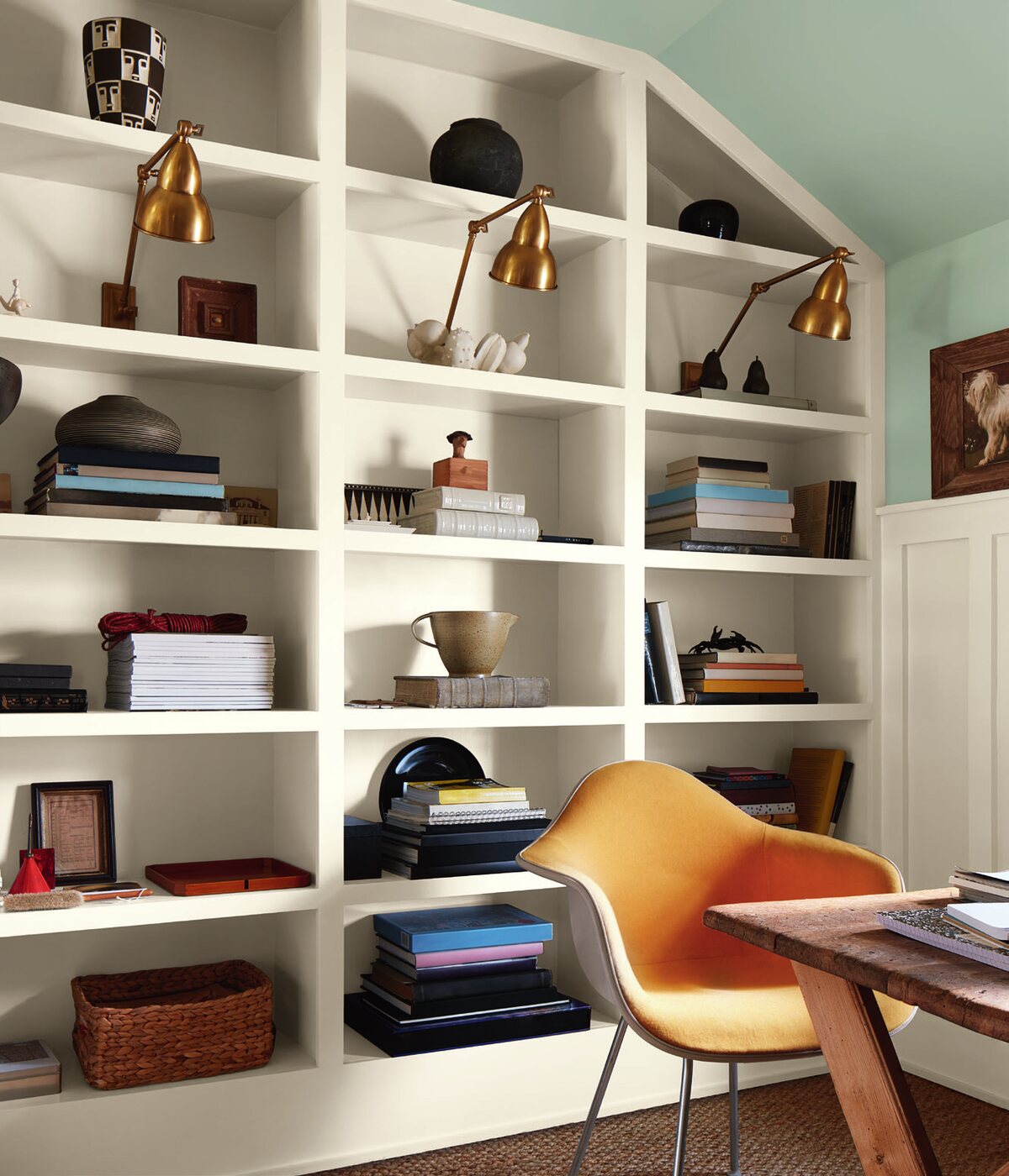
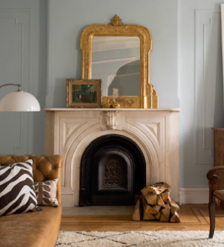
Raindance 1572 is an excellent example of how green can function almost as a neutral.
Far from a bright or decorative green, it is a muted gray-green that works easily alongside wood, stone, whites, browns, and natural fibers.
In a contemporary interior, it can therefore be used far beyond a small accent.
Living room walls, kitchen cabinetry, a built-in bookcase, a bedroom, or architectural woodwork — it is often across larger surfaces that the complexity of this kind of color becomes most interesting.
On the French Riviera, gray-greens have an additional advantage: they naturally extend the palette of the surrounding landscape — olive trees, Mediterranean vegetation, stone, and sun-softened greens.
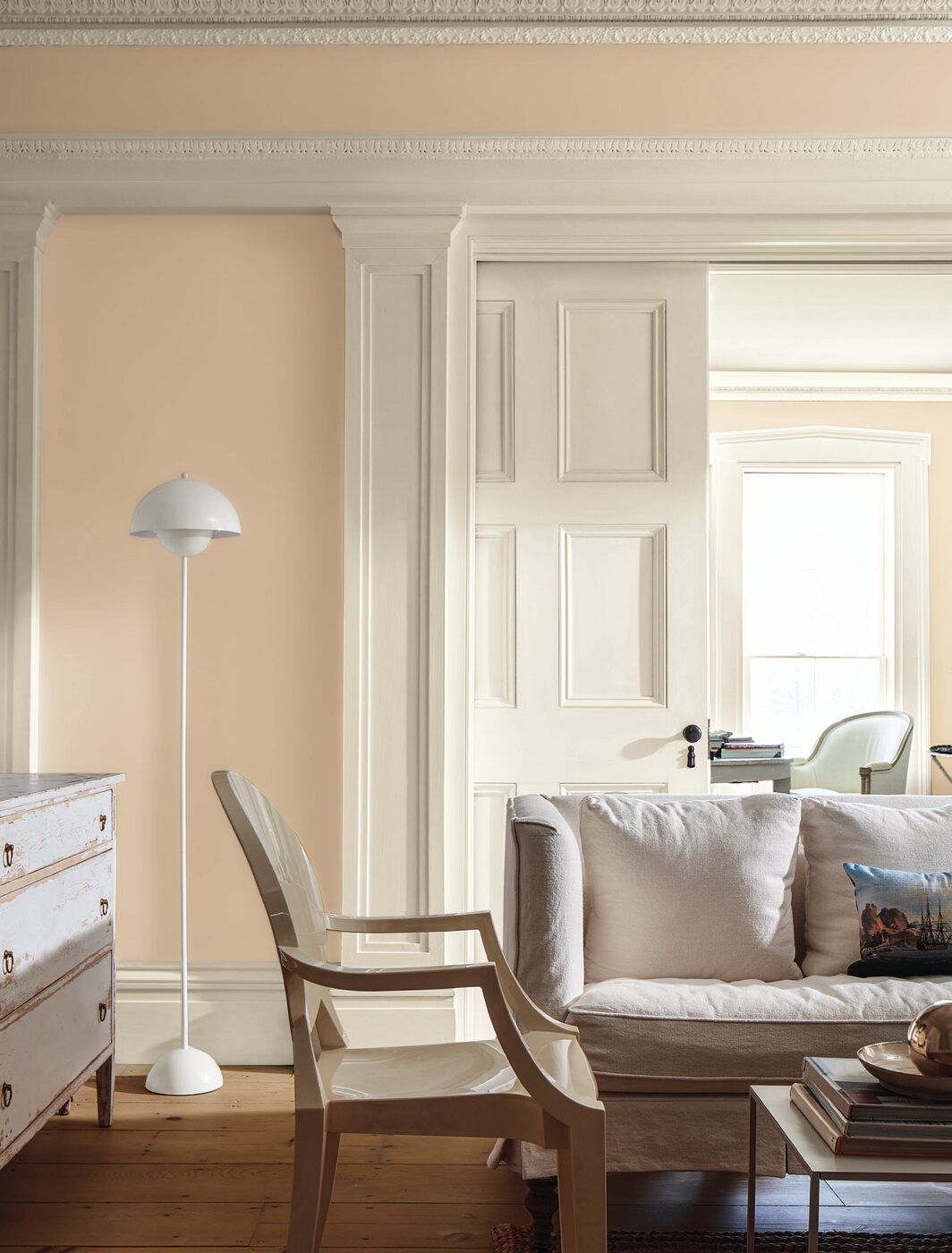
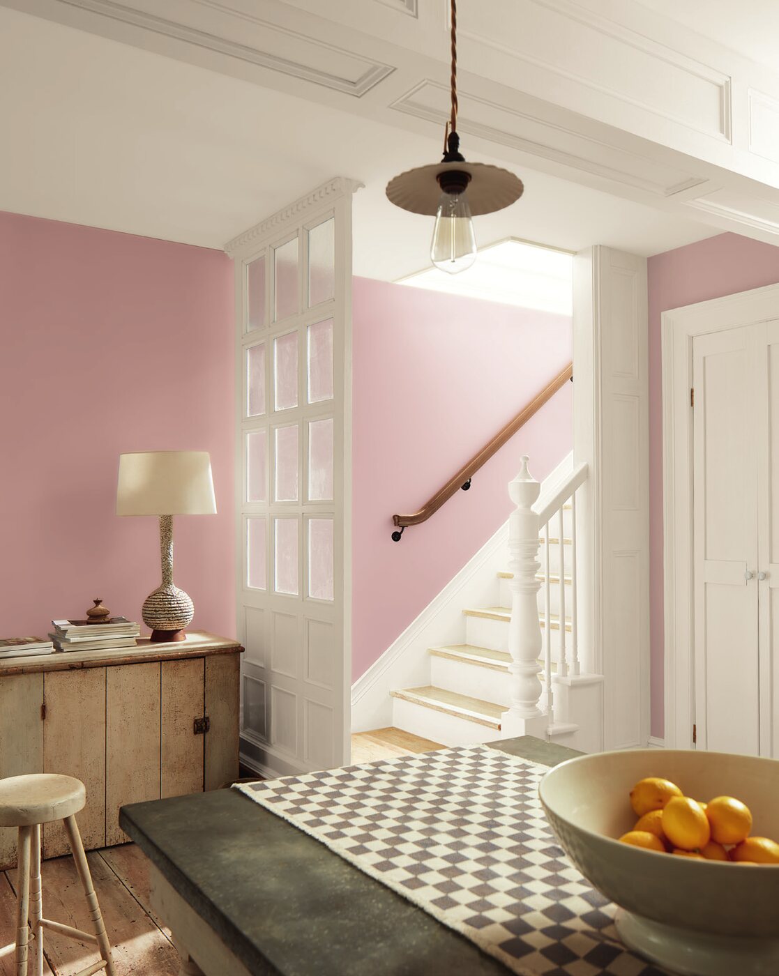
Pink in interior design still tends to carry very specific associations. First Crush CSP-310 demonstrates how much more nuanced this color family can be.
It is a delicate, muted, powdery shade that can read almost as a warm neutral when used across a larger surface.
It works particularly well with warm whites, natural wood, browns, and clay tones.
This type of pink does not need to be treated as an accent, nor does it belong to any particular kind of room. It can work in a living room, bedroom, bathroom, or even within minimalist architecture where a subtle sense of warmth is desired without resorting to traditional beige.
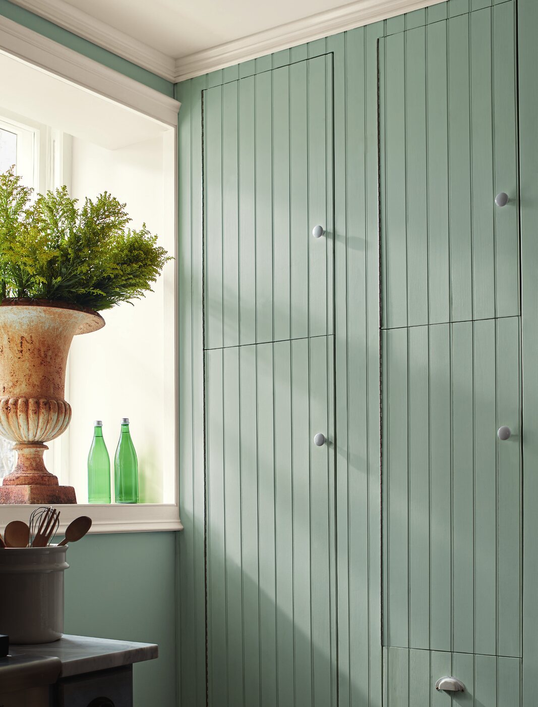
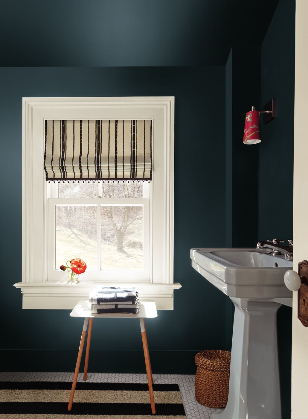
Narragansett Green HC-157 is one of the deepest and most expressive colors in the palette.
This rich blue-green changes subtly depending on the light. Under certain conditions, its green character becomes more apparent; under others, the deep blue comes forward.
It can create an enveloping atmosphere in a library, study, bedroom, or bathroom.
But it is equally compelling on architectural elements such as doors, wall paneling, kitchen cabinetry, or built-in furniture.
In its Color Trends 2026 imagery, Benjamin Moore even uses Narragansett Green across both the walls and ceiling of a room – a strong example of how dark color no longer needs to be confined to a single traditional “accent wall.”
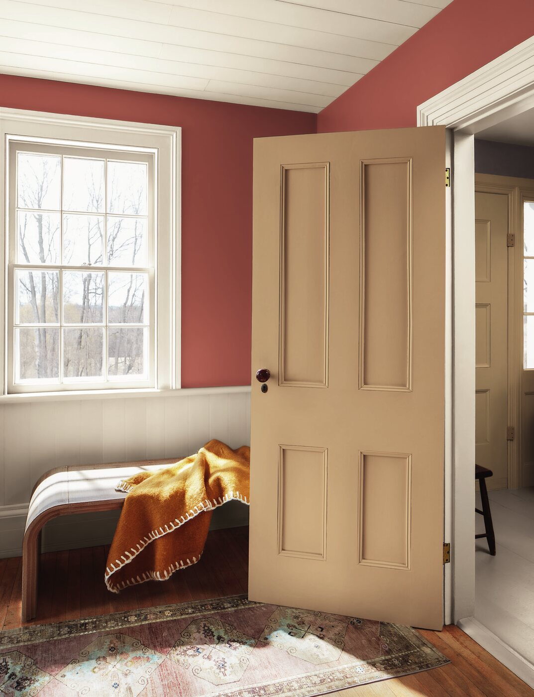
Southwest Pottery 048 introduces the tones of ceramics and fired clay into the 2026 palette.
Benjamin Moore describes it through its combination of brown and red tones reminiscent of kiln-fired clay.
The shade has particular resonance in the South of France, where terracotta has a long-standing connection with local architecture and landscape.
Yet it can be used in an entirely contemporary way.
Paired with minimalist furniture, pale natural stone, warm white, or dark wood, terracotta moves away from a rustic aesthetic and becomes a sophisticated architectural color.
It can envelop a bedroom, bring character to a dining room, or appear as a smaller accent within an otherwise neutral space.
After years of cool greiges and grays, warm neutrals are returning to interiors.
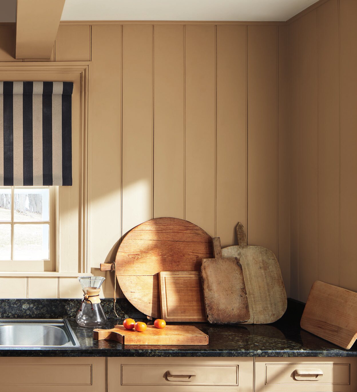
Sherwood Tan 1054 is a good example of this new approach to beige.
It is not simply a pale, safe background designed to disappear. Its earthy brown character gives it enough presence to actively shape the atmosphere of a room.
It works particularly well with dark wood, black details, cream textiles, stone, and other shades from the 2026 palette.
In interiors with abundant sunlight, these medium-depth warm tones can offer a compelling alternative to very pale walls. Natural light allows them to retain their depth without making the space feel heavy.
Batik AF-610 is one of those colors that is difficult to define with a single word.
It contains muted mauve, taupe, and earthy nuances. This ambiguity is precisely what makes it interesting in an interior.
Colors like Batik evolve with the light and the materials around them. Alongside warm wood, it may reveal more warmth; next to cooler surfaces, it can appear more restrained and complex.
It is an interesting choice for anyone looking to move beyond traditional beige and gray without introducing an obviously bright or saturated color.
A Color of the Year palette is not an invitation to paint your entire home in all eight shades.
It is far more useful to think of it as a system.
Swiss Coffee + Silhouette create a light architectural base structured by deep brown accents. Swiss Coffee + Raindance + natural oak form a calm, organic palette particularly suited to a contemporary Mediterranean interior. First Crush + Silhouette pair a soft powdery background with dark structural elements. Southwest Pottery + Swiss Coffee + travertine offer a contemporary interpretation of a warm Mediterranean palette. Sherwood Tan + Narragansett Green create a deeper, more dramatic combination for spaces where color is intended to play an architectural role.
It is equally possible to select just one shade from the palette and introduce it into an existing interior.
The objective is not to “use the trend,” but to identify the part of it that makes sense for a particular space.
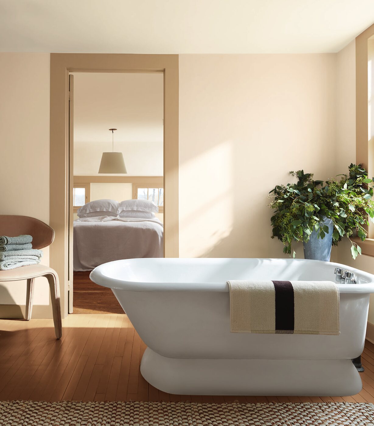
One of the most interesting developments in contemporary approaches to color is its movement beyond the traditional accent wall.
Color is increasingly appearing on doors, moldings, ceilings, built-in furniture, kitchen cabinetry, and other architectural surfaces.
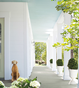
Benjamin Moore presents Color Trends 2026 in precisely this way: Silhouette appears not only on walls but on doors; Raindance is used on built-in cabinetry; Sherwood Tan extends across walls, lower kitchen cabinets, moldings, and a ceiling beam; Narragansett Green envelops both walls and ceiling.
Color therefore stops being a decorative layer added at the end of a project and becomes an integral part of the architecture itself.
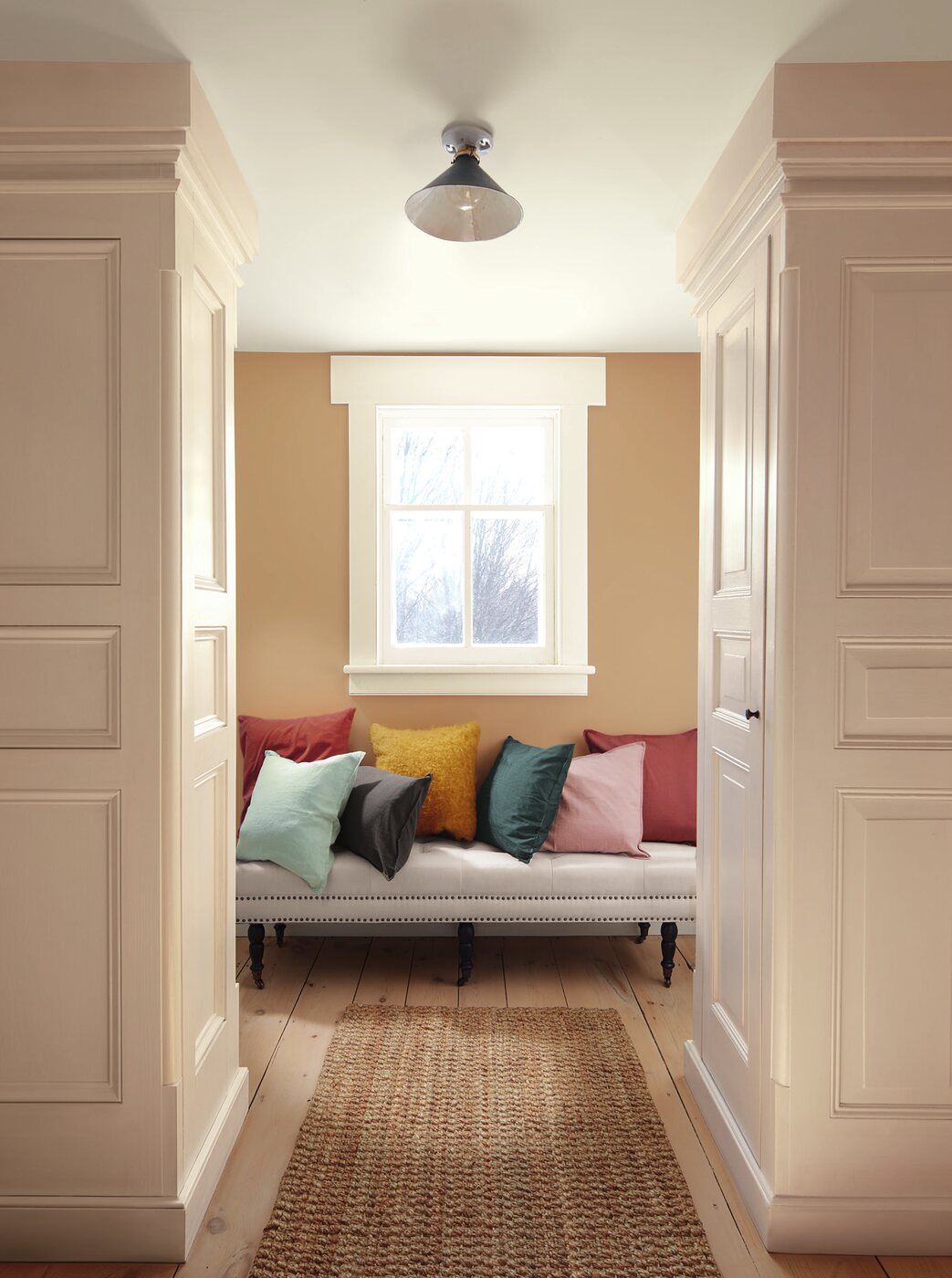
At first glance, a deep chocolate brown such as Silhouette may seem unexpected in a region traditionally associated with white, blue, and sunlit neutrals.
That is precisely what makes this palette interesting.
A contemporary interior on the French Riviera does not need to literally reproduce the colors of the sea and sky to express a Mediterranean identity.
A sense of place can instead emerge through light, natural stone, wood, linen, ceramics, and the relationship between the interior and the surrounding landscape. Against this backdrop, complex browns, greens, clay tones, and powdery shades offer a far more contemporary interpretation of Mediterranean aesthetics.
The region’s intense natural light also makes it possible to work more confidently with deeper colors.
Silhouette with travertine. Raindance with natural oak. Southwest Pottery with pale stone. Narragansett Green with a warm white.
It is not a literal “seaside palette” – and that is precisely why it can feel so convincing here.
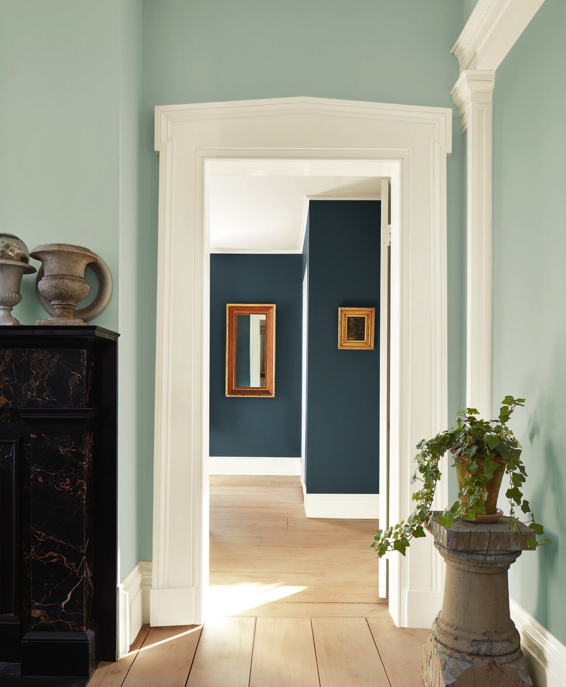
Perhaps the most compelling aspect of Color Trends 2026 is its restraint.
None of these colors requires an entire interior to be redesigned around it. Most have a natural, complex character that allows them to work easily with materials that have long been fundamental to architecture: wood, stone, metal, ceramics, and natural textiles.
That is what separates a meaningful color trend from a short-lived fashion.
The Color of the Year does not necessarily need to become the color of your walls.
Its role is to indicate a direction.
And in 2026, that direction is clear: more depth, more warmth, greater attention to materials, and less sterile neutrality.
Perhaps most importantly, it marks a return to color as a genuine architectural tool.
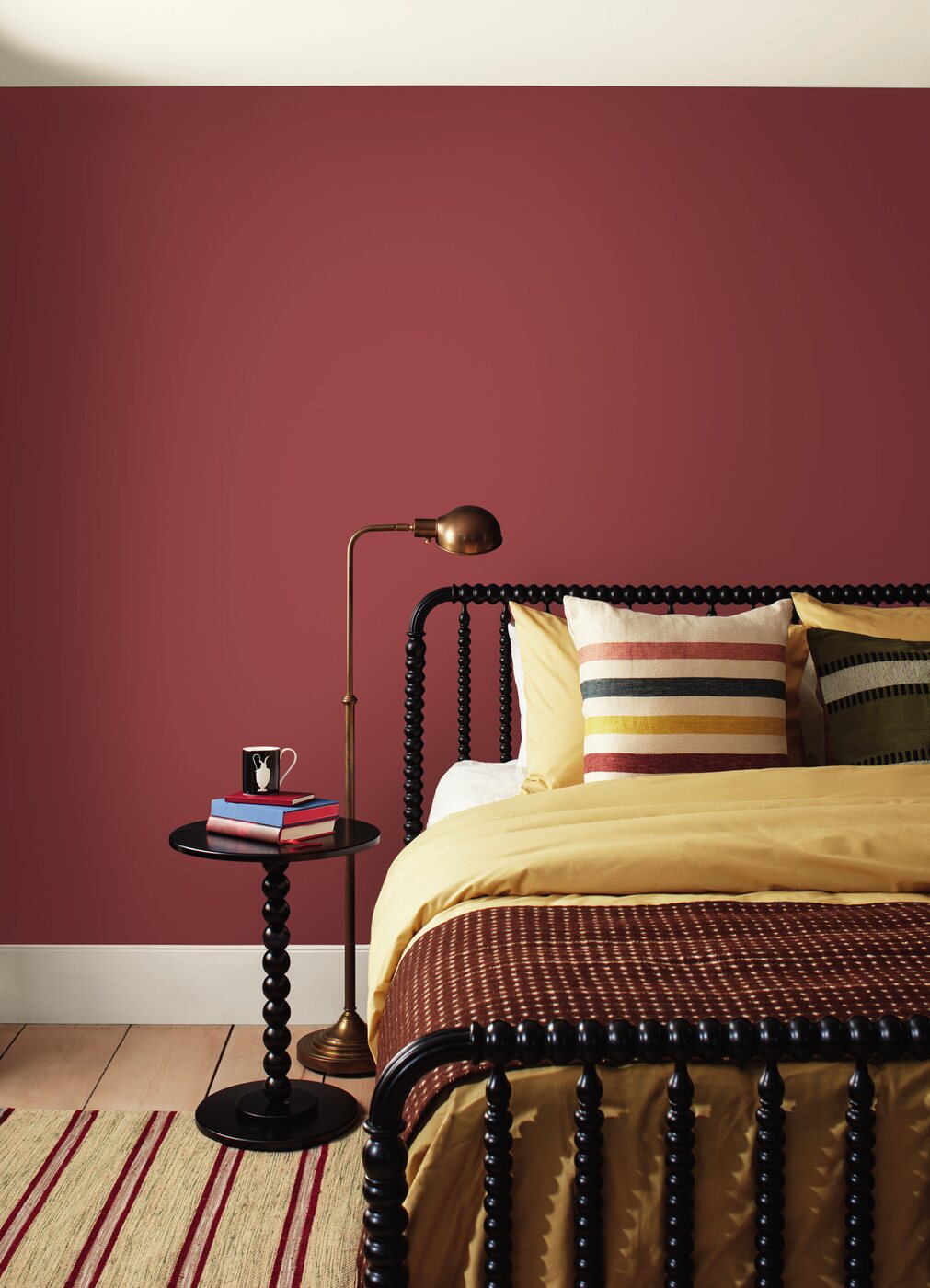
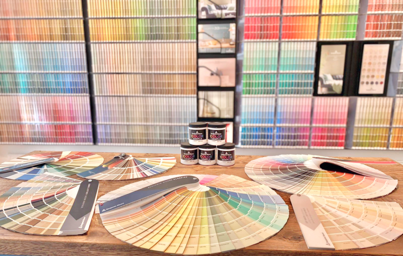
At the Noblesse & Élégance showroom in Nice, you can discover Benjamin Moore’s Color Trends 2026 shades in person, compare them with the materials selected for your project, and receive professional guidance in developing your color palette.
Our team can help you determine which colors will work in your space, how to combine them with stone, wood, tile, textiles, and other materials, and where each shade can be used most effectively – on walls, ceilings, doors, moldings, cabinetry, or built-in furniture.
Because a trend becomes truly valuable when it is not simply copied, but adapted to the architecture, light, and individual character of an interior.