


Your Cart
0 products
News
Warm white or cool white? Pure white or off-white? One shade throughout the room, or different whites for the walls, ceiling, doors, and trim?
In a real interior, white is almost never perceived as simply white. Natural and artificial light, room orientation, wood, stone, tile, textiles, flooring, and even neighboring colors all influence the way it appears.
The right white should therefore not be chosen in isolation from a fan deck. It needs to be developed within the context of the specific interior.
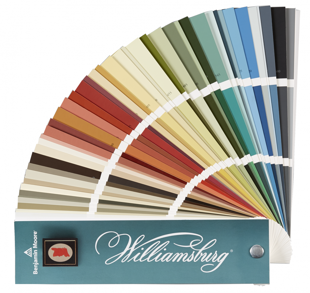
Benjamin Moore offers hundreds of whites and off-whites, and the differences between them are far from decorative details.
Some contain warm red, orange, or yellow undertones. Others lean toward cooler green, blue, or violet. Some appear almost neutral until they are placed beside another white.
Comparison is often the easiest way to reveal these undertones: one white suddenly looks creamy, another slightly gray, and a third almost blue.
Choosing white without context is therefore one of the most common mistakes.
Warm whites contain yellow, red, or creamy nuances. They work particularly well with natural wood, travertine, warm stone, brass, linen, and earthy palettes.
Cool whites can contain blue, green, or violet undertones. They often pair more naturally with cool marble, gray surfaces, black detailing, and sharper contemporary architecture.
There is no rule, however, that a warm interior must always have a warm white. Sometimes a subtle contrast creates a more interesting result.
What matters is that the entire palette works together.
Chantilly Lace OC-65 is among Benjamin Moore’s cleanest, brightest whites. It has very little visible undertone, making it a strong choice when a crisp, fresh white is required.
White Dove OC-17 is one of the brand’s most popular whites. Softer and slightly warmer, it works easily with natural materials and both traditional and contemporary architecture.
Swiss Coffee OC-45 is a warmer off-white with a gentle, enveloping character. It is particularly effective alongside wood, stone, and calm natural palettes.
These three colors alone demonstrate how many different personalities can sit behind the simple word “white.”
LRV stands for Light Reflectance Value and measures the amount of visible light a color reflects.
The higher the value, the more light the surface reflects. Whites generally have high LRV values, but even the difference between two pale shades can significantly influence the feeling of a room.
LRV is a useful technical reference, but it cannot tell you whether a particular white will be right for your interior.
A high LRV does not automatically make a color “better” or subjectively brighter. Undertones and lighting conditions remain just as important.
In south-facing rooms with abundant warm light, creamy and yellow undertones become more noticeable. A warm white may therefore appear significantly creamier than it did on the sample.
North-facing rooms receive cooler light. Benjamin Moore suggests considering clean, fresh whites with a hint of yellow to help counterbalance the cooler northern exposure.
In east-facing rooms, white moves from brighter morning light toward a generally cooler appearance later in the day. In west-facing rooms, it tends to become warmer as the afternoon progresses.
White should therefore be observed at several different times of day.
Even a white that looks perfect in daylight can change once the lights are switched on.
Warm lighting strengthens cream and yellow notes. Cooler lighting makes gray and blue undertones more apparent.
In a room with several lighting sources, the same white can appear different under general ceiling lighting, wall sconces, kitchen task lighting, or decorative lamps.
The final test should therefore always include the evening, under the actual lighting scenario in which the room will be used.
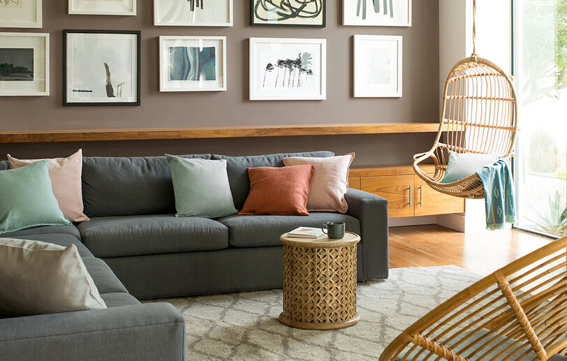
If stone, wood, tile, countertops, or cabinetry have already been selected for a project, it usually makes sense to begin with those elements.
Paint is available in hundreds of shades. The tone of a particular natural stone or tile is already fixed.
Place white samples beside the materials.
Warm travertine can make a cool white feel too stark. Marble with gray-blue veining may emphasize yellow in a warm off-white. Natural oak can beautifully support White Dove or Swiss Coffee while changing the way a more neutral white is perceived.
The right white is the one that connects the materials rather than sitting apart from them.
Not necessarily. Several approaches can work.
Walls, ceiling, doors, baseboards, and moldings can all be painted in the same shade, with only the finish changing.
This creates a cohesive contemporary space without strong visual breaks. Matte walls, for example, can be paired with satin or semi-gloss woodwork.
A warmer or softer off-white on the walls can be paired with a cleaner white on doors and moldings when the aim is to emphasize the architecture.
Benjamin Moore gives combinations such as White Dove OC-17 with Ballet White OC-9, or Fossil AF-65 with Swiss Coffee OC-45.
The important point is to make sure the undertones of the two whites do not conflict.
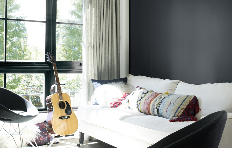
With colored walls, white can act as an architectural frame.
For cooler wall colors, Benjamin Moore suggests whites such as White Heron OC-57 or Decorator’s White OC-149. For warmer wall colors, Cloud White OC-130 or Simply White OC-117 can work particularly well.
Chantilly Lace OC-65 or Super White OC-152 can create a crisper, more graphic contrast.
The same white will not look identical in different finishes.
A matte surface absorbs more glare and appears softer. Eggshell or satin reflects more light and may look cleaner and brighter.
This means a single white can be used throughout a room while walls, doors, and trim are differentiated only through sheen.
In light interiors, this can be an especially subtle and sophisticated design tool.
The first is choosing a white from a Pinterest or Instagram photograph. A screen cannot reproduce paint accurately, and the lighting conditions of another interior can never be replicated exactly.
The second is looking at only one white in isolation. Undertones become far easier to identify when several options are compared side by side.
The third is ignoring flooring, stone, wood, and other fixed materials.
The fourth is evaluating the color only during the day.
The fifth is automatically using the same white in every room, even when orientation and materials differ.
Begin with several close options rather than a single shade.
Compare them with each other – this is often when the undertones become obvious.
Then test the finalists directly in the interior. Observe them on different walls and beside flooring, stone, furniture, and architectural woodwork.
Look at the colors from morning to evening and always check them under artificial light.
For kitchens, Benjamin Moore specifically recommends viewing white samples beside the backsplash, countertops, and wall color.
There is no white that works equally well in every home.
Chantilly Lace may be perfect in a clean contemporary space and too stark beside warm travertine.
Swiss Coffee may beautifully complement natural materials and appear too creamy elsewhere.
White Dove may be the ideal compromise – or reveal a very different personality under a particular light.
The right white is therefore neither the most popular nor the “whitest.”
It is the one that works with the light, architecture, and materials of your interior.
At the Noblesse & Élégance showroom in Nice, you can explore and compare Benjamin Moore whites and off-whites in person and receive professional guidance tailored to your project.
We recommend bringing more than photographs of your interior. If you already have samples of tile, stone, wood, countertops, cabinetry, textiles, or any other materials selected for the project, bring them with you.
It is by viewing these elements together that we can determine which white truly works.
Our team can help you create a cohesive palette, identify the Benjamin Moore shades best suited to your interior, and select the options to test in your space before making a final decision.