

Your Cart
0 products
Aura® Interior
Two walls painted in the same color can produce very different results. The difference is not simply the shade itself. The quality of the paint film, its hiding power, the way it responds to light, its resistance to everyday wear, and its ability to retain color all have a direct impact on the finished surface.
This becomes particularly noticeable with demanding colors: deep blues, dark greens, rich reds, but also nuanced whites and sophisticated neutrals. Across a large surface, even small inconsistencies become visible.
Aura® Interior was developed with precisely these demands in mind: to achieve rich, even color and preserve its visual quality over time.
The deeper or more saturated the color, the less forgiving it tends to be.
With a lower-performing paint, roller marks may remain visible, some areas can appear lighter than others, and touch-ups may stand out from the surrounding surface. Over time, repeated contact and cleaning can also alter the appearance of specific areas.
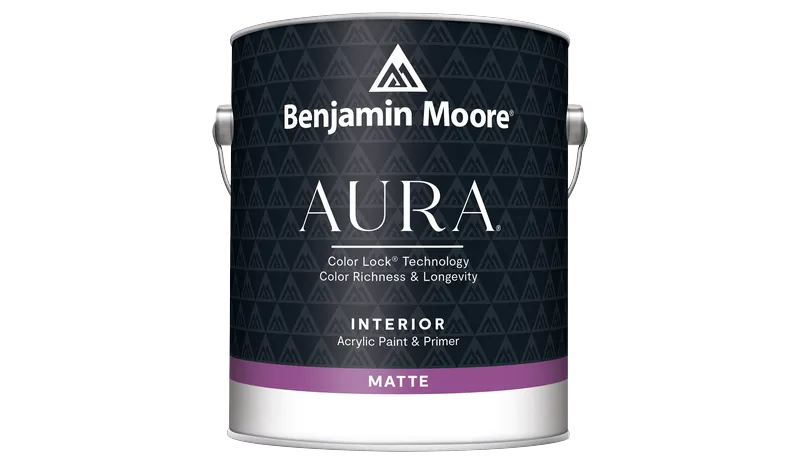
Aura Interior features Color Lock® technology, which locks pigments into the paint film to help preserve the richness and integrity of the color.
The difference becomes especially apparent across large surfaces and with intense shades. A deep green should remain equally deep across an entire wall; a midnight blue should retain its density even in areas exposed to everyday use.
The same principle applies to lighter shades. In an off-white, beige or complex greige, paint quality helps preserve the subtle undertones that give the color its character in the first place.
Hiding power is often reduced to a practical question: how much paint will be needed?
Its impact is also aesthetic.
Good opacity helps neutralize the existing surface and create visual continuity. The eye should not detect the previous color, variations in substrate absorption or successive roller passes.
Aura Interior offers excellent hiding power, with an approximate coverage of 8.6 to 9.8 m² per liter, depending on the substrate and application conditions.
None of this replaces proper surface preparation. Even a premium paint cannot compensate for a poorly prepared wall. Cracks, repairs, differences in porosity and highly absorbent surfaces need to be addressed before painting begins.
The quality of a painted wall always starts with the quality of the surface beneath it.
Choosing a finish is not simply a matter of deciding how much shine a wall should have. Finish determines how light interacts with the surface — and therefore how we experience the color itself.
A matte finish absorbs more light and minimizes reflections. As a result, the surface appears calmer, more continuous and often deeper.
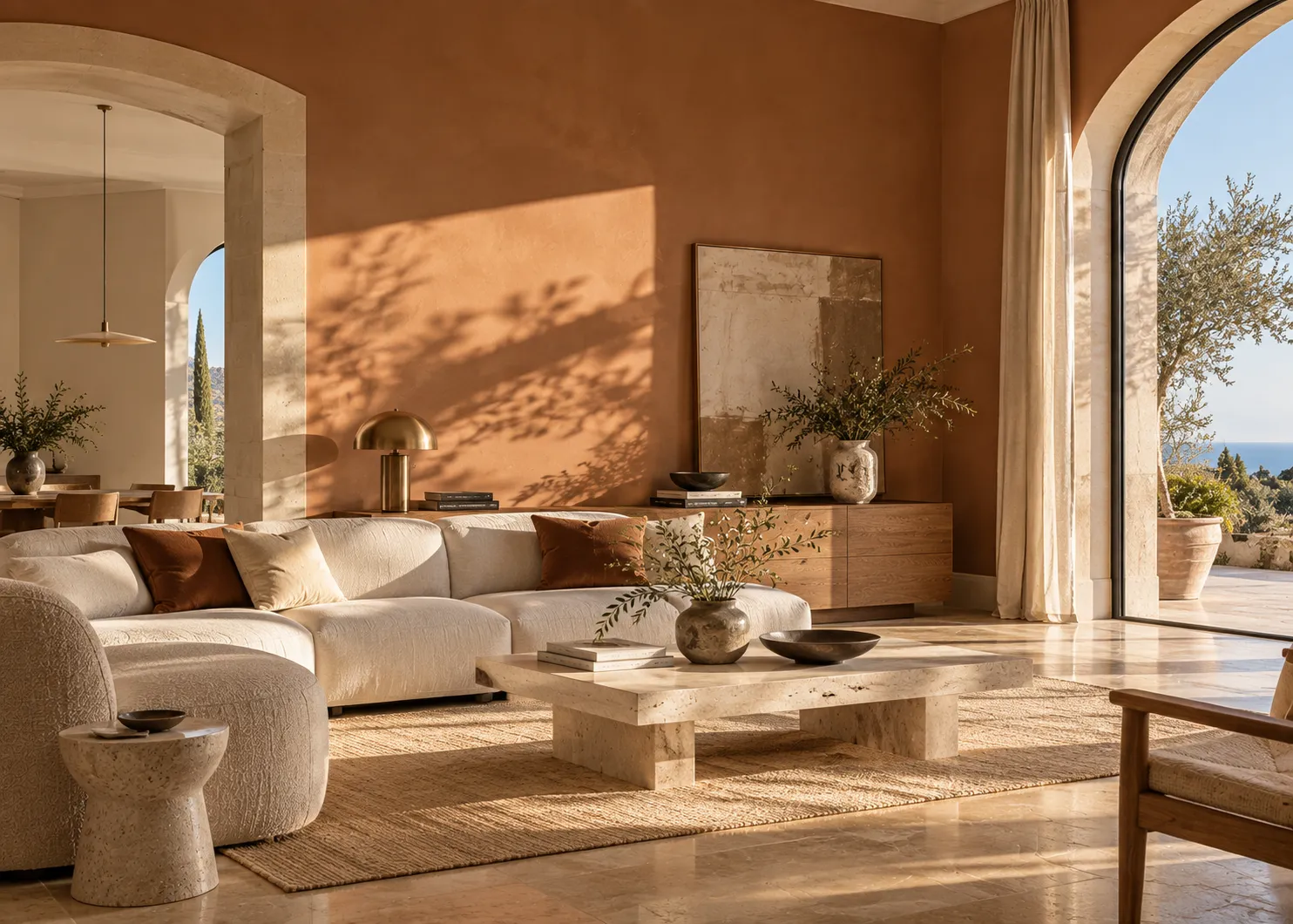
This is particularly effective in interiors where paint plays an architectural role: expansive areas of color, enveloping bedrooms, minimalist living spaces, or rooms where the intention is to emphasize volume rather than reflection.
With darker shades, the lack of shine can create an especially sophisticated effect: the wall begins to feel almost like a material in its own right.
We favor Aura Matte 522 when the goal is visual depth and an understated surface.
Eggshell reflects slightly more light. The difference is subtle, but it allows the surface to respond differently as natural light changes throughout the day.
This finish is particularly well suited to living spaces, hallways, kitchens and other areas where walls experience more frequent everyday use.
We choose Aura Eggshell 524 when a refined appearance needs to be combined with the practical demands of a more active interior.
The choice between the two is therefore less about following a rule and more about the effect you want to create: a matte surface absorbs more light; an eggshell surface interacts with it.
A freshly painted wall tells only part of the story.
Walls are touched, brushed against and cleaned. Areas around light switches see repeated contact. Hallways experience everyday traffic. In kitchens and family spaces, surfaces need regular maintenance.
An interior paint therefore needs to preserve not only its color, but also the consistency of its finish.
Aura Interior is formulated to resist marks, rubbing and repeated cleaning. This matters particularly with low-sheen finishes: a surface can look perfectly matte when new, yet develop localized shiny areas after repeated contact if the paint film is not sufficiently resistant.
It is one of the least dramatic differences when choosing a paint — and one of the most noticeable months or years later.
Color never exists in isolation. It exists in relation to the light around it.
The same shade can appear cooler in the morning, warmer toward the end of the day and noticeably different under artificial lighting. The orientation of the room, the size of its windows, the color of the flooring and even surrounding surfaces can influence how a color is perceived.
That is why we always advise evaluating a color in the room where it will actually be used, at different times of day.
A small color sample offers an indication. A sufficiently large test area reveals much more: the depth of the shade, its undertones, its relationship with furniture and materials, and the way it responds to changing light.
With complex colors, this step can completely change a decision.
Not necessarily in the most dramatic interior.
Aura becomes particularly relevant when the quality of the wall itself is an important part of the design: an expansive monochromatic surface, a deep statement color, a minimalist interior with few elements to distract the eye, a high-end renovation, or simply a room that is not intended to be repainted frequently.
The more restrained the architecture, the more visible the quality of the paint becomes.
On an almost empty wall, there is nowhere for uneven texture, roller marks or a lack of color depth to hide. Paint is no longer simply the final decorative layer.
It becomes an architectural material in its own right.
That is where Aura Interior comes into its own: allowing color to take on that role without unnecessary effects — with depth, consistency and durability.
Because ultimately, a premium interior paint should not draw attention to its performance.
It should simply allow the color to be exactly what it was meant to be.


