

Your Cart
0 products
News
Green has long held an important place in interior design and global trends. It evolves with changing styles while retaining the familiarity that contributes to its lasting appeal.
Selected as Colour of the Year 2027, Webster Green HC-130 connects past and present. This mid-tone green combines classic confidence with a freshness that makes it equally suited to contemporary settings.
For Andrea Magno, Benjamin Moore’s Vice President of Brand, Color, and Integrated Marketing, green’s timelessness lies in its ability to adapt and transform. Webster Green captures that balance: a shade that recalls the past while feeling right for today.
Webster Green balances the stability of blue with the warmth of yellow, introducing expressive colour without overwhelming a space.
Its versatility allows it to serve as a dominant shade, highlight an architectural detail or create a focal point. Depending on where it is used, it can complement the overall scheme or set the direction for the entire project.
On built-in shelving, doors or trim, Webster Green draws attention to architectural features. Paired with neutral walls, it helps define their shapes and bring rhythm to a room.
The collection illustrates its relationship with White Down OC-131. The two colours can be used across walls and woodwork to create a clear contrast. Alternatively, extending the green across several surfaces creates an enveloping atmosphere, with light revealing the architectural relief.
In an entrance, Webster Green makes a memorable first impression. In private or shared spaces, it offers a way to express an individual style with quiet elegance.
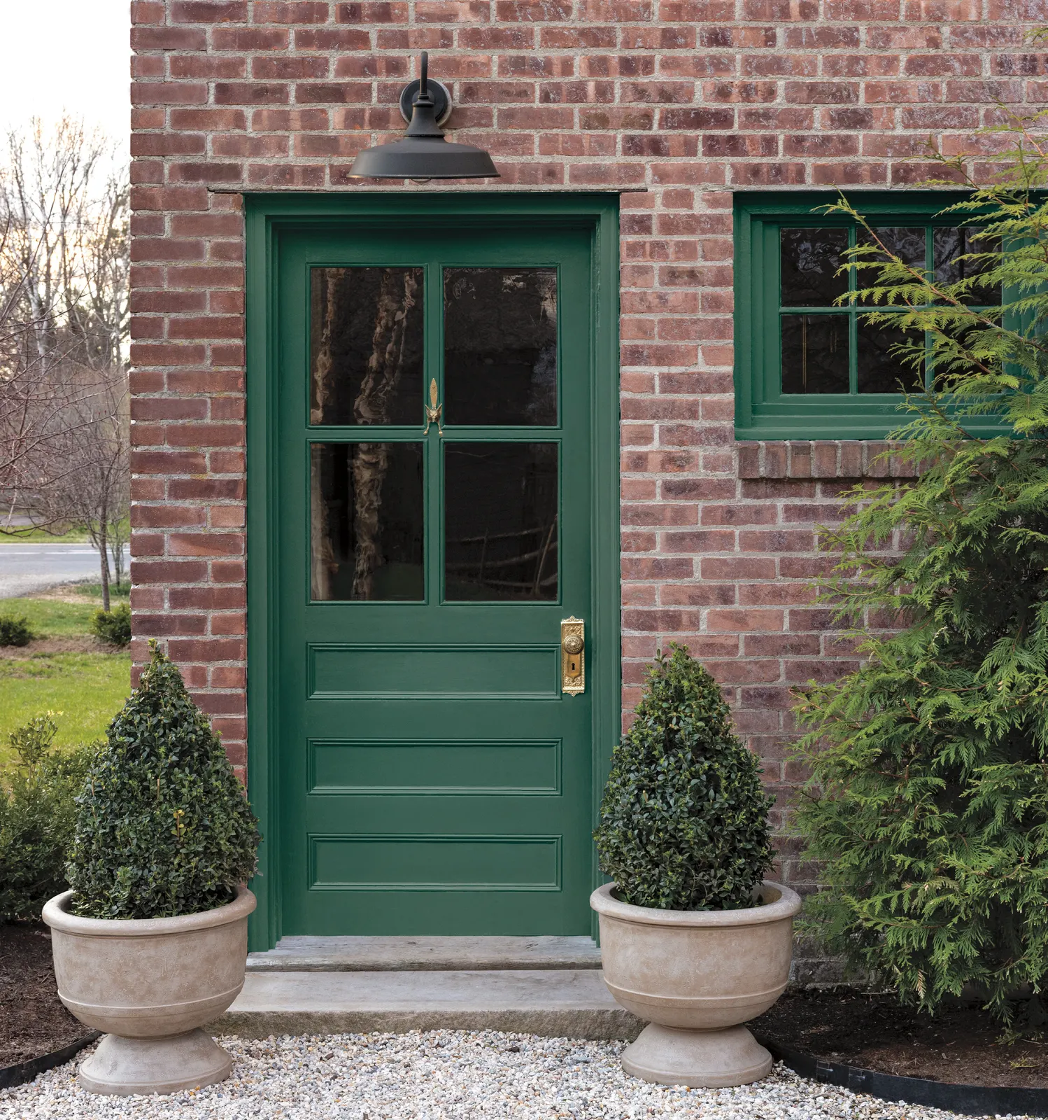
On a front door, Webster Green catches the eye and gives the entrance definition. It works with the façade and surrounding landscape to create an arrival that feels cohesive yet distinctive.
Its role extends beyond a simple colour accent, helping connect the architecture to its setting.
The Colour Trends 2027 palette brings together softened neutrals and confident mid-tones. Each shade can stand on its own or work alongside the others to create a contemporary scheme with classic appeal.
The collection explores several ways to give traditional colours a fresh expression.
Soothing pastels help create restful settings. Used together, they also allow for more unexpected combinations, bringing a playful touch to their softness.
Stronger mid-tones add intensity and definition. They offer an elegant way to make a statement in living areas and smaller spaces alike.
Softened neutrals complete the palette and support its combinations. Together, these shades offer different levels of contrast and a variety of approaches to colour.
Benjamin Moore’s featured interiors show how one collection can create distinctly different moods.
For a light colour scheme, Nelson Blue CW-635 pairs with White Down OC-131: blue defines the kitchen cabinetry, while the off-white brings the surrounding surfaces together. Wild Aster 1240 offers another approach to softness, extending across walls, trim and ceiling, with different finishes used for each surface.
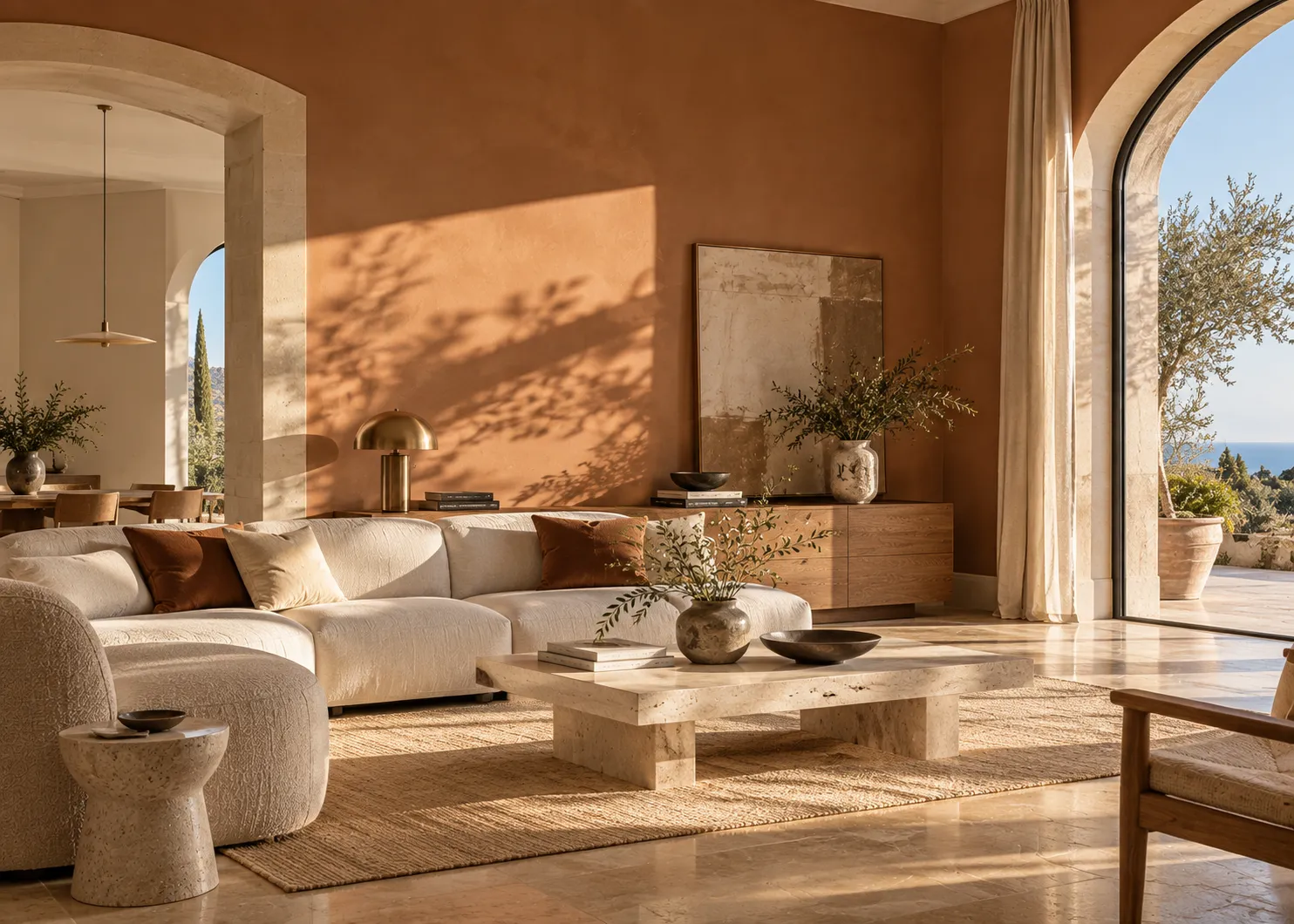
Shakespeare Tan 228 is paired with a White Down OC-131 ceiling. Antique Copper 1169 is also accompanied by White Down, used on both the ceiling and trim. These combinations give the wall colour room to stand out while keeping the ceiling light.
The collection also explores deeper colour statements. Durango 2137-30 provides a backdrop for artwork, while Townsend Harbor Brown HC-64 unites walls, trim and ceiling in a high-gloss finish.
These examples offer starting points for choosing a combination, deciding where each shade will go and exploring the contribution of different finishes.
The Benjamin Moore Color Portfolio® app allows you to visualise different colours in a space and compare the possibilities.
Follow this initial exploration with physical colour samples. On-screen colours may differ from actual paint colours: test your chosen shades before making a final decision.