
Your Cart
0 products
Inspiration
Changing the way a room feels doesn’t always require a new layout, new furniture, or a major renovation. Used thoughtfully, color can become a powerful interior design tool.
It can draw attention to an architectural detail, highlight molding, add depth to an alcove, create a more enveloping atmosphere, or visually alter the proportions of a room.
In other words, choosing paint is no longer simply about asking, “What color should I paint the walls?” A more interesting question is: “What can color do for this space?”
From ceilings to trim and built-ins, here are five ways to use color to transform an interior and bring its architecture to life.
For decades, ceilings have been painted white almost by default. Yet they represent a significant surface—and an opportunity to change how a room is perceived.
Benjamin Moore often refers to the ceiling as the “fifth wall.” Its color can add character, highlight architectural features, and influence how open, intimate, tall, or enveloping a room feels.
A light ceiling remains an excellent choice when the goal is to preserve a sense of height and brightness. But it doesn’t have to be pure white. A lighter variation of the wall color can create a softer, more cohesive transition.
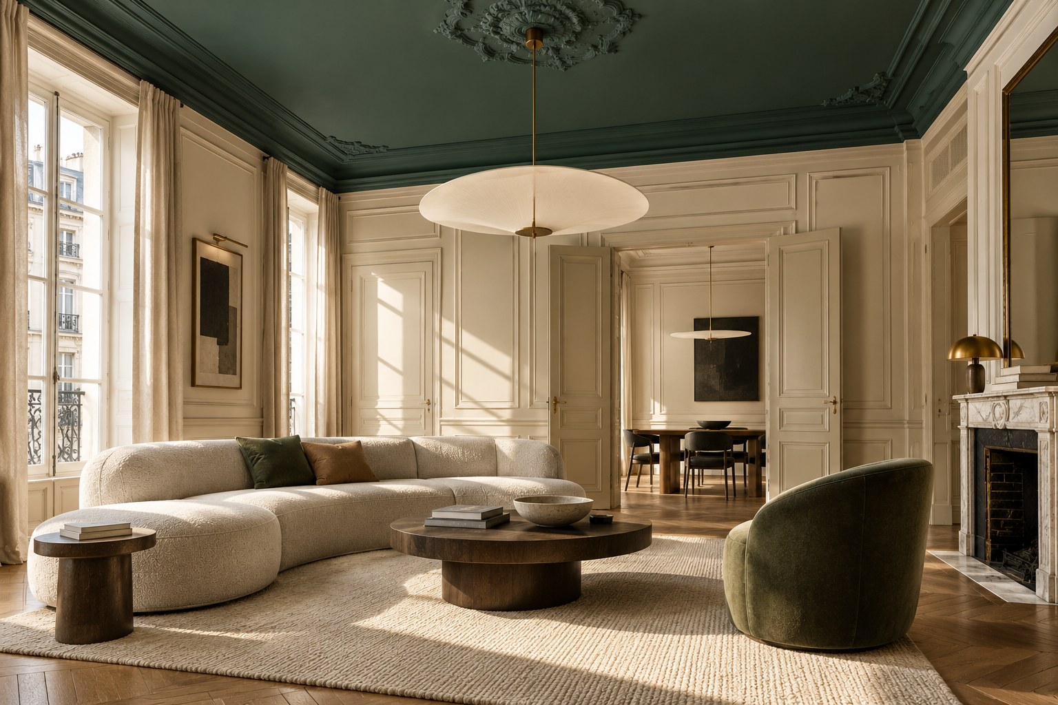
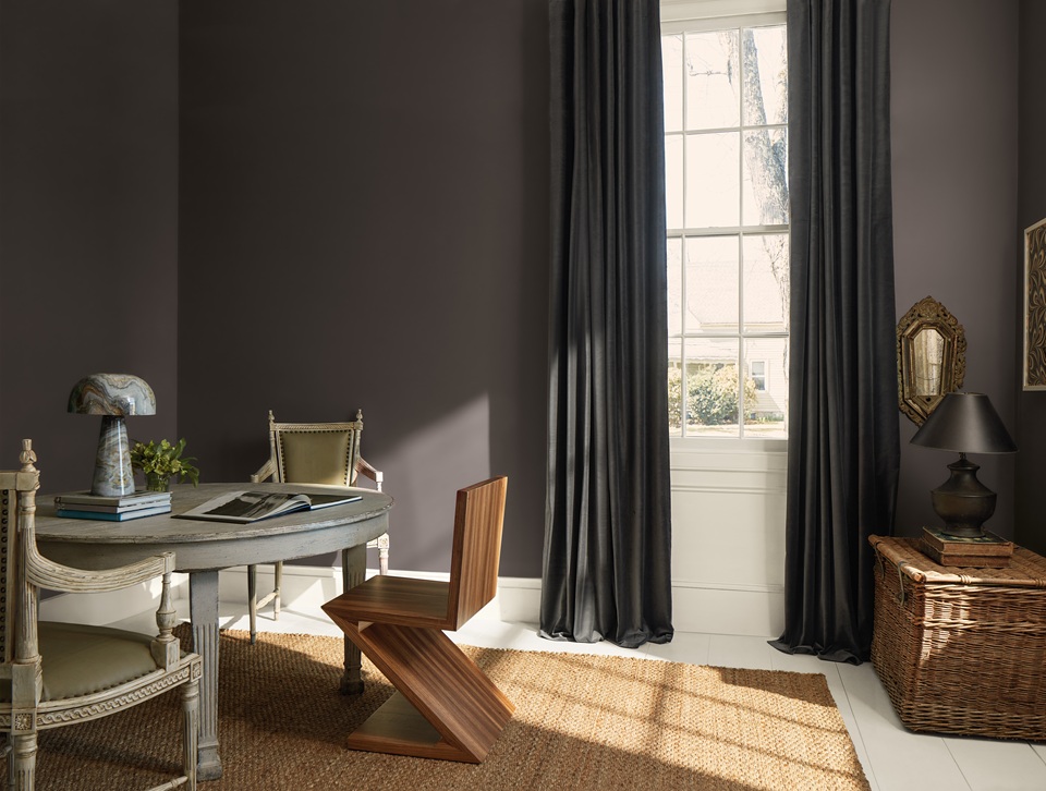
A deeper ceiling color, on the other hand, immediately draws the eye upward and gives the room a new dimension. In a living room with neutral walls, a deep blue, muted green, or earthy shade on the ceiling can completely shift the atmosphere.
In a room with high ceilings, a darker color can also create a greater sense of intimacy. Benjamin Moore, for example, suggests rich shades such as Narragansett Green HC-157 for creating this type of effect.
The goal isn’t necessarily to make the ceiling dramatic. It’s to treat it as part of the overall design rather than as a separate surface that automatically has to be white.
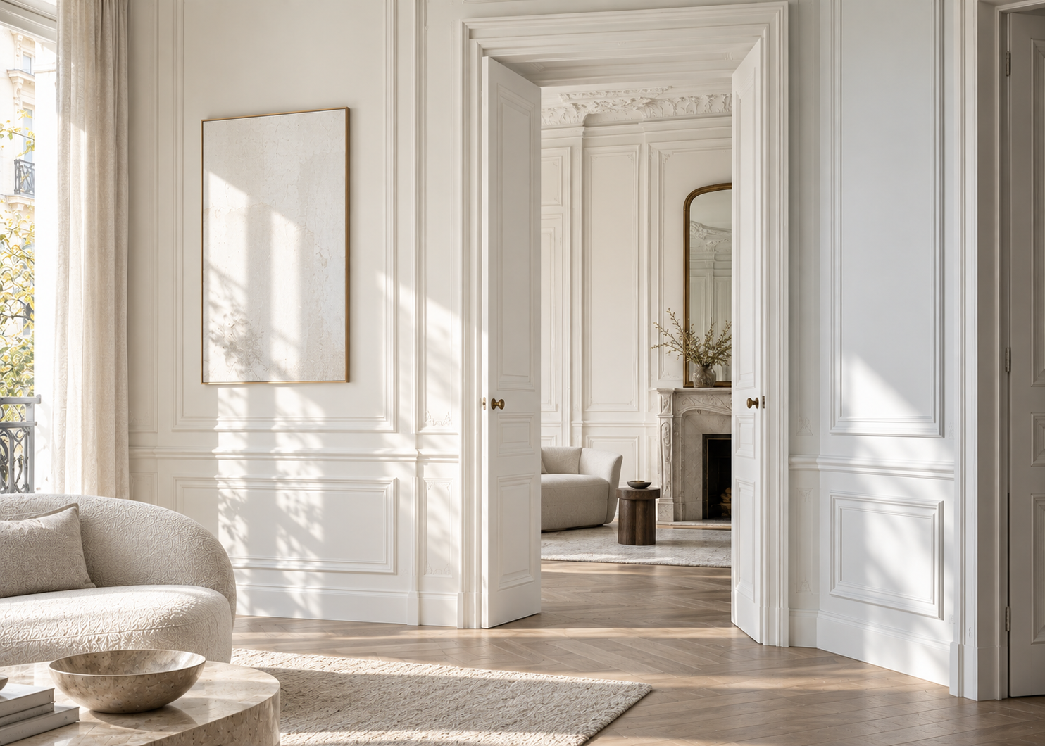
Crown molding, wainscoting, door casings, paneled walls, and original doors often give an interior its character.
And yet these elements are frequently painted white out of habit.
There is another approach: use color to make the architecture more visible.
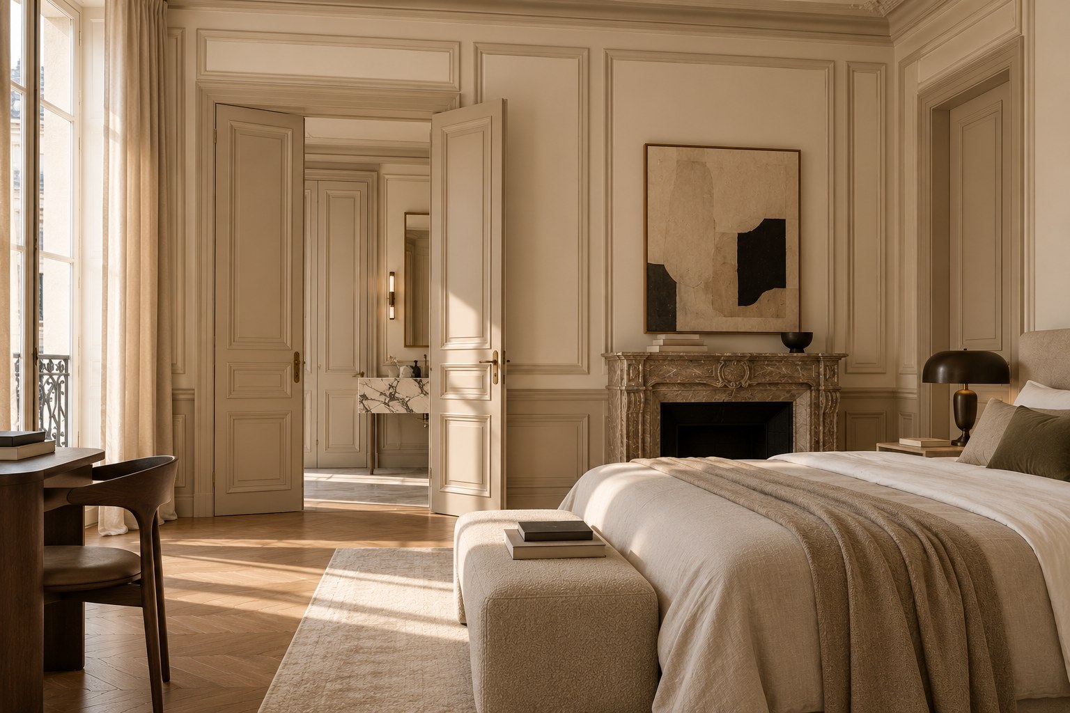
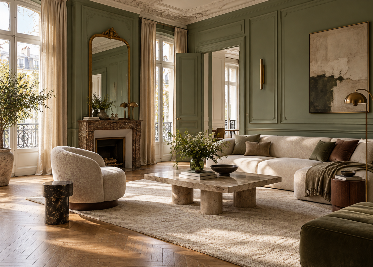
Against light or neutral walls, colored trim can create a crisp, contemporary contrast. Alternatively, painting the walls and trim in shades from the same color family can produce a softer, more sophisticated effect.
Benjamin Moore, for example, pairs White Down OC-131 walls with Grant Beige HC-83 trim as a way to layer warm neutrals. More contrasting combinations can turn millwork into a deliberate design feature rather than a background detail.
In an older home or apartment, this approach can highlight existing architectural elements without overwhelming them.
A beautiful door, fireplace surround, or paneled wall doesn’t always need additional decoration. Sometimes, the right paint color is enough to give it presence.
Recessed areas are particularly interesting places to work with color.
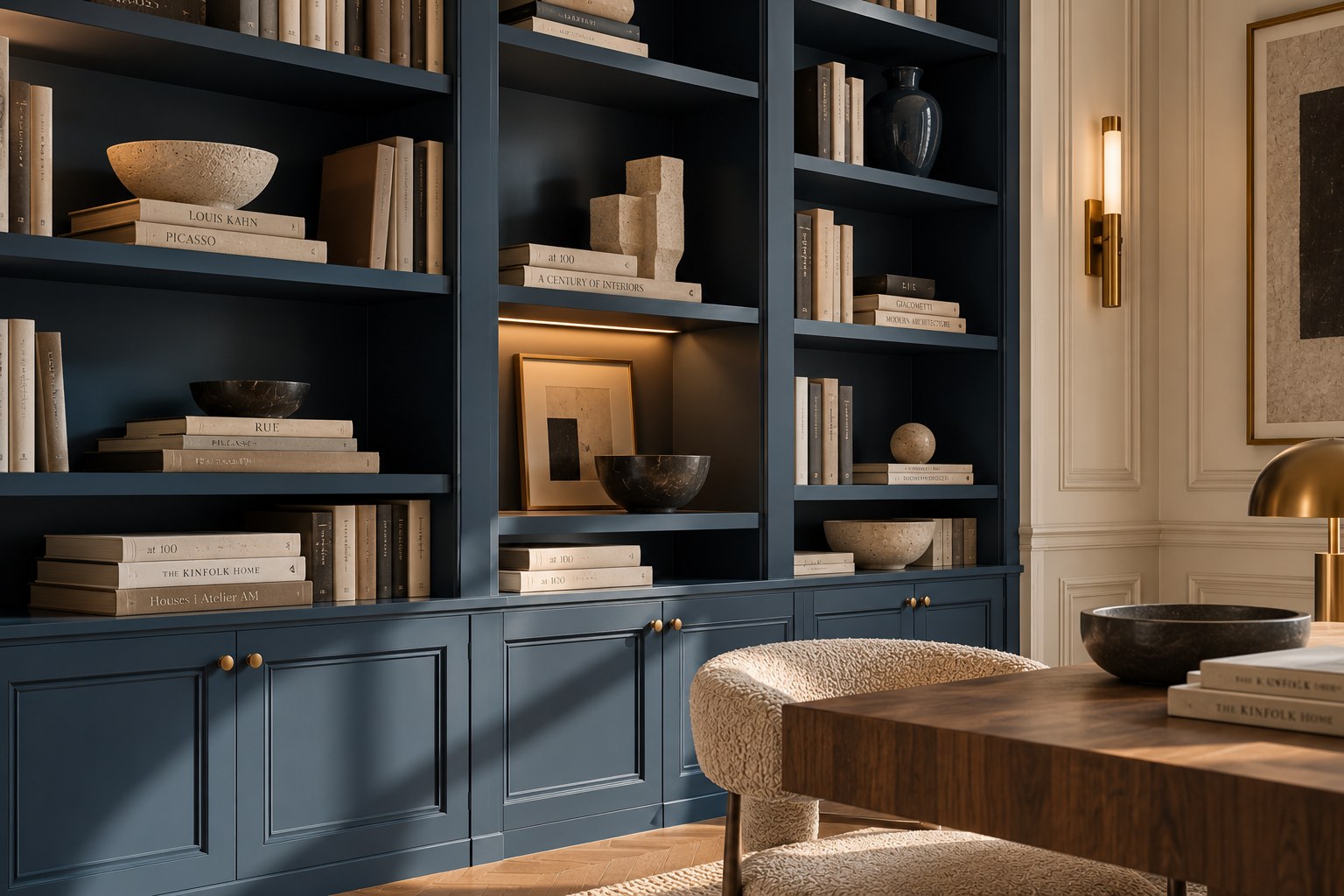
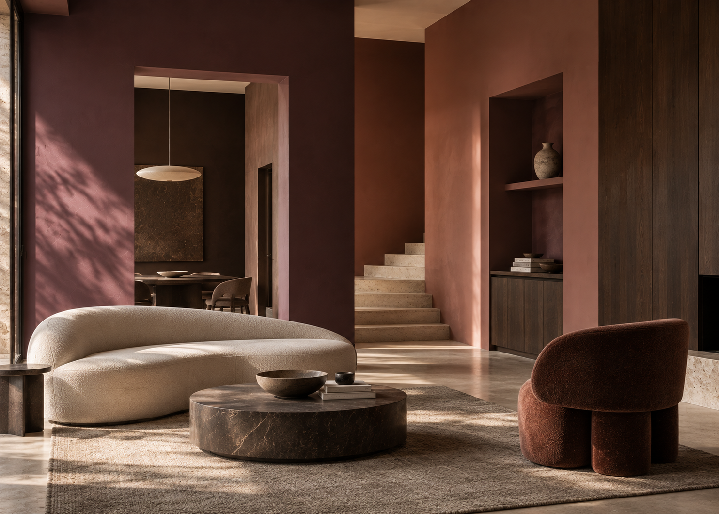
Painting an alcove in a different shade from the surrounding wall immediately creates a greater sense of depth. Built-in bookcases can become a strong architectural feature when the entire structure—the back panels, shelves, and frame—is treated as one color composition.
There are two main approaches.
The first is contrast. In a room with neutral walls, a deep navy, rich brown, or dark green bookcase can become a natural focal point.
The second is more subtle: choose a shade from the same color family as the walls, but slightly deeper. The difference remains visible without visually interrupting the room.
In a small alcove or an area with limited natural light, a pale color can instead help reflect available light and create a more open feeling. Benjamin Moore’s color experts often recommend lighter shades when brightness is the primary goal.
There is no universal rule. The right approach depends on what you want the color to accomplish: create depth or enhance light.
One of the most effective ways to rethink a room is to intentionally remove some of its visual boundaries.
Traditionally, interiors are designed with one color on the walls and white on the doors, baseboards, and trim. But there is no requirement to maintain that contrast.
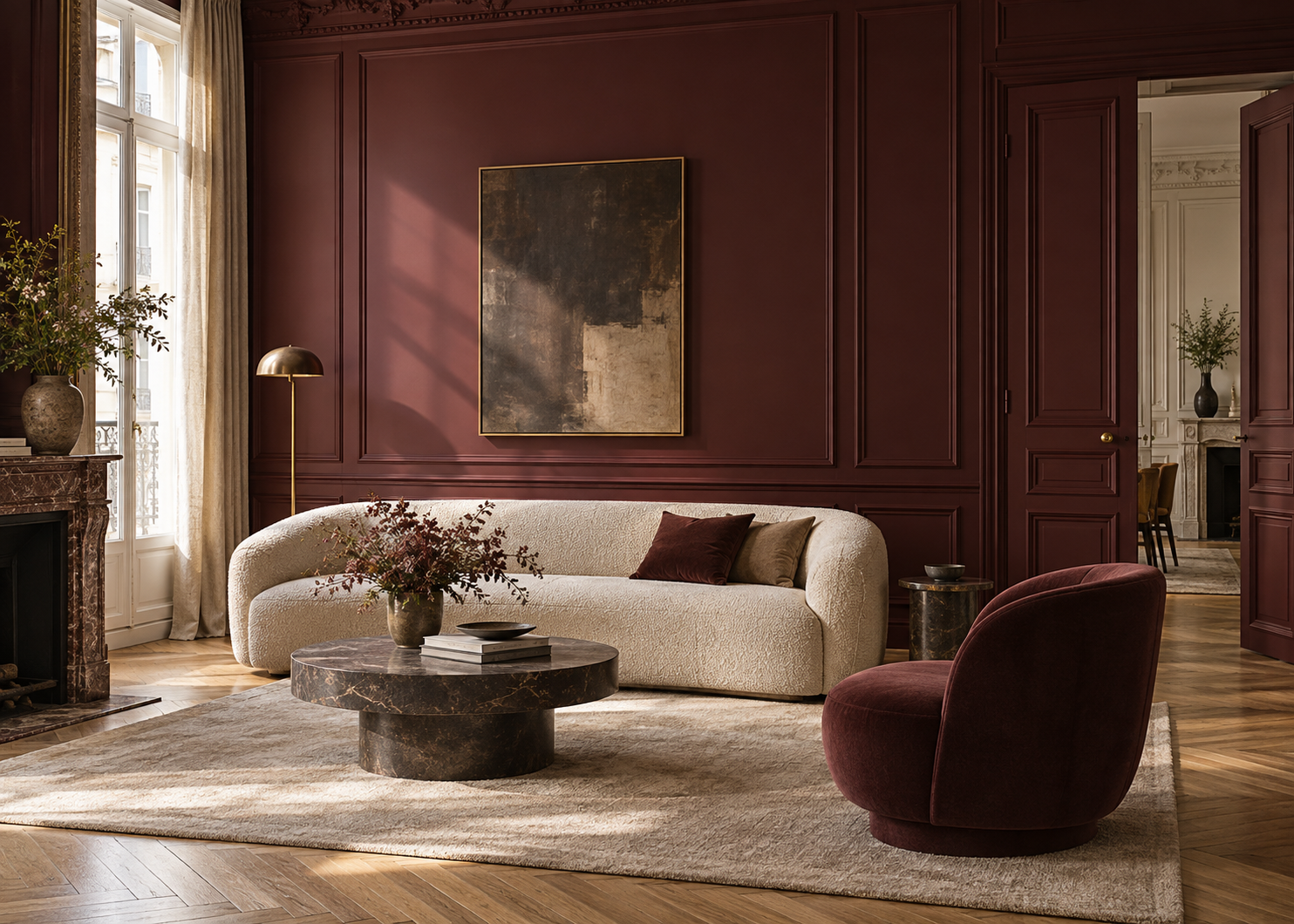
Painting walls and architectural details in the same color creates a more continuous reading of the space.
Benjamin Moore also recommends this approach, particularly with more expressive colors: carrying the same shade across the walls, trim, and doors can create a more immersive color experience.
The effect can be especially elegant in a sophisticated taupe, muted blue, earthy green, or deep brown.
To keep the room from feeling too uniform, consider varying the paint sheen rather than the paint color. A flatter finish on the walls paired with a higher sheen on doors or trim allows light to reveal the architectural details.
Benjamin Moore uses this principle in its own design recommendations: the same color can extend across walls, trim, doors, and even ceilings, while different sheen levels provide subtle contrast and dimension.
It’s an understated way to add sophistication without introducing multiple colors.
Color can also structure a wall without adding any new architectural elements.
Painting the lower portion of a wall in one color and using a different shade above creates a horizontal line that immediately changes the way the space is perceived.
In an older home, this treatment can echo traditional wainscoting. In a contemporary interior, the same idea can feel distinctly graphic and modern.
The contrast doesn’t need to be dramatic.
Two related tones—a mineral beige and taupe, pale green and deeper olive, or two shades of blue—can add dimension while preserving a cohesive look.
Benjamin Moore also recommends working with multiple shades from the same color family to create depth and emphasize a room’s architecture.
Where the two colors meet becomes a design decision in itself.
The dividing line might follow an existing molding, align with the top of a doorframe, or be deliberately positioned to visually alter the proportions of the room.
When paint is used as an architectural element, selecting the right shade is only part of the equation.
Finish matters, too.
A matte or low-sheen surface reflects less light and generally creates a softer appearance. On trim, doors, and millwork, satin or higher-sheen finishes can catch more light and emphasize architectural details.
There is also a practical advantage. Benjamin Moore notes that higher-sheen finishes generally offer greater resistance to stains and repeated cleaning, making them particularly well suited to trim, doors, and high-touch areas.
As a result, two surfaces painted in exactly the same color can look noticeably different simply because they reflect light differently.
This makes sheen an especially valuable design tool in monochromatic interiors.
Color never exists independently of its surroundings.
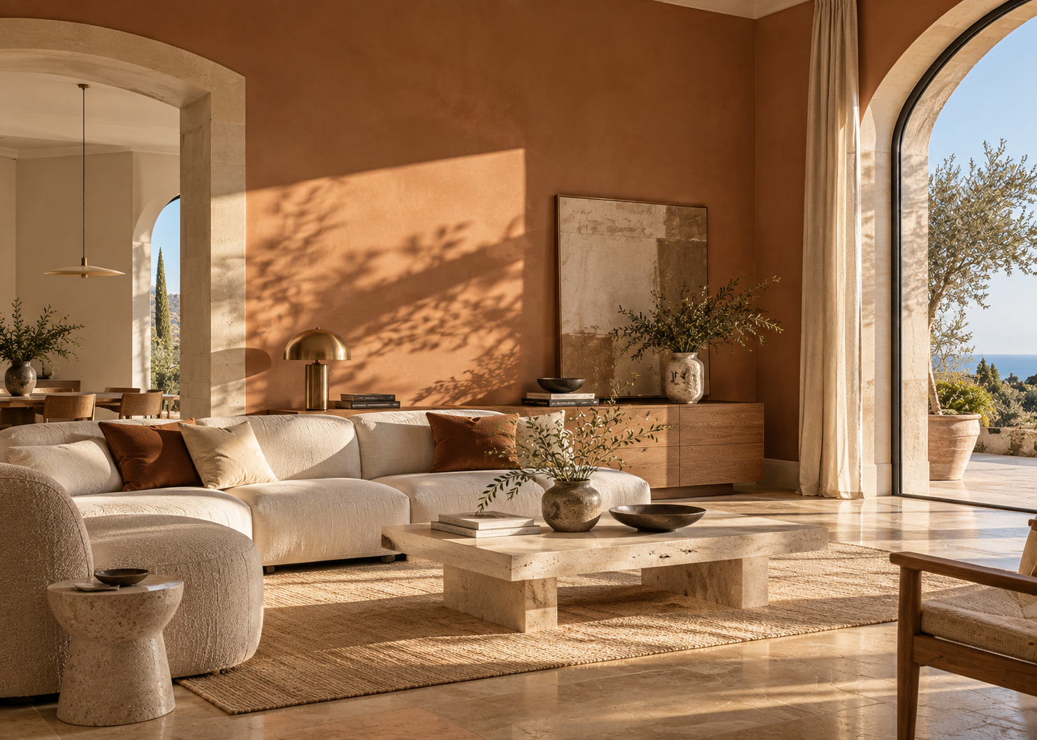
Natural light, the room’s orientation, flooring, materials, textiles, and even colors visible from adjoining rooms can influence how a paint color appears.
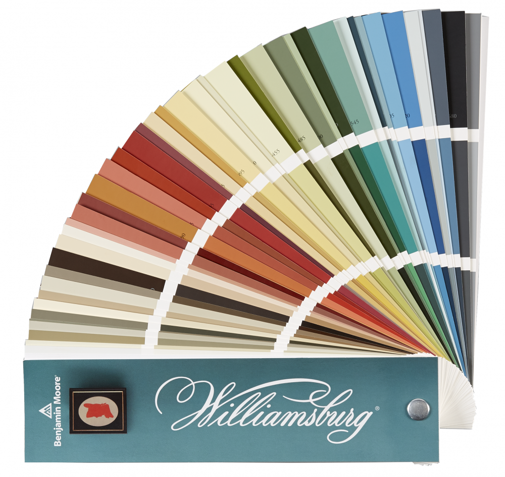
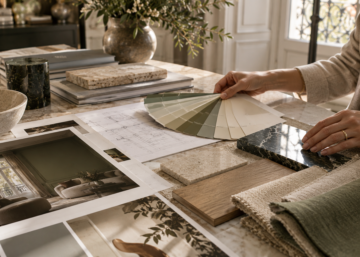
That’s why Benjamin Moore recommends testing colors in the actual space before making a final decision. Colors displayed on a screen cannot perfectly reproduce how a paint color will look once applied to a real surface.
Observe your sample at different times of day and, if your project includes both walls and trim, test it on different surfaces.
A color that seems understated on a small sample may become much more prominent when it surrounds an entire room. Conversely, a shade that initially feels bold can become remarkably balanced when paired with the right materials and lighting.
Paint is often treated as the final step in a design project: furnish the room first, then decide what color to paint the walls.
It can be far more interesting to reverse that logic.
Ceilings, doors, trim, niches, built-ins, and wainscoting all provide surfaces that can become part of the composition.
Color can highlight an architectural detail or allow it to recede. It can create continuity or contrast. It can draw the eye upward, add depth to an alcove, or turn an ordinary door into a deliberate design feature.
Transforming an interior doesn’t always mean adding more.
Sometimes, it simply means looking differently at the surfaces that are already there.