
Your Cart
0 products
Inspiration
Color doesn’t have to stop at the walls.
An original door, crown molding, wainscoting, a window frame, or built-in shelving can sometimes have a greater impact on how a room feels than an entire painted wall.
Yet these architectural elements are still often treated according to the same formula: color on the walls, white on the trim.
It’s a classic approach, and often a beautiful one. But it’s only one of many possibilities.
Color can highlight existing architecture, introduce contrast, connect adjoining spaces, or make certain elements visually recede. A door can become a focal point. Trim can give structure to a wall. Wainscoting can change the perceived proportions of a room.
Benjamin Moore treats trim and millwork as integral parts of a color scheme. They can remain understated or become some of the most distinctive color elements in an interior.
So instead of automatically reaching for white, start by looking at what the architecture already has to offer.
White remains a timeless choice for trim.
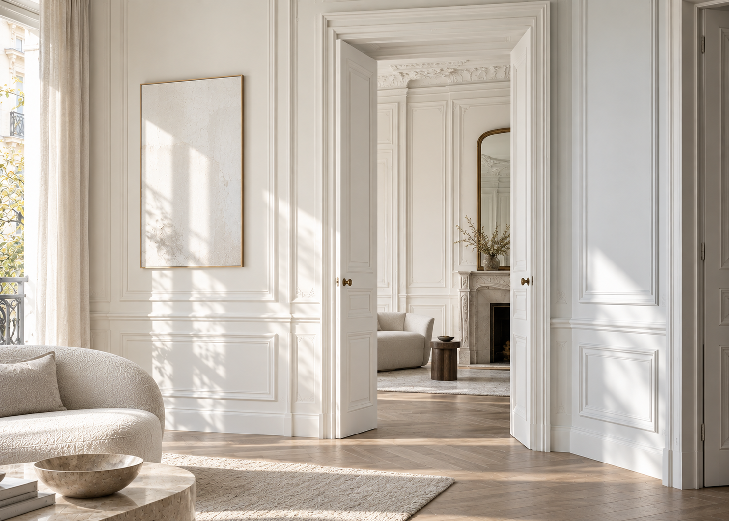
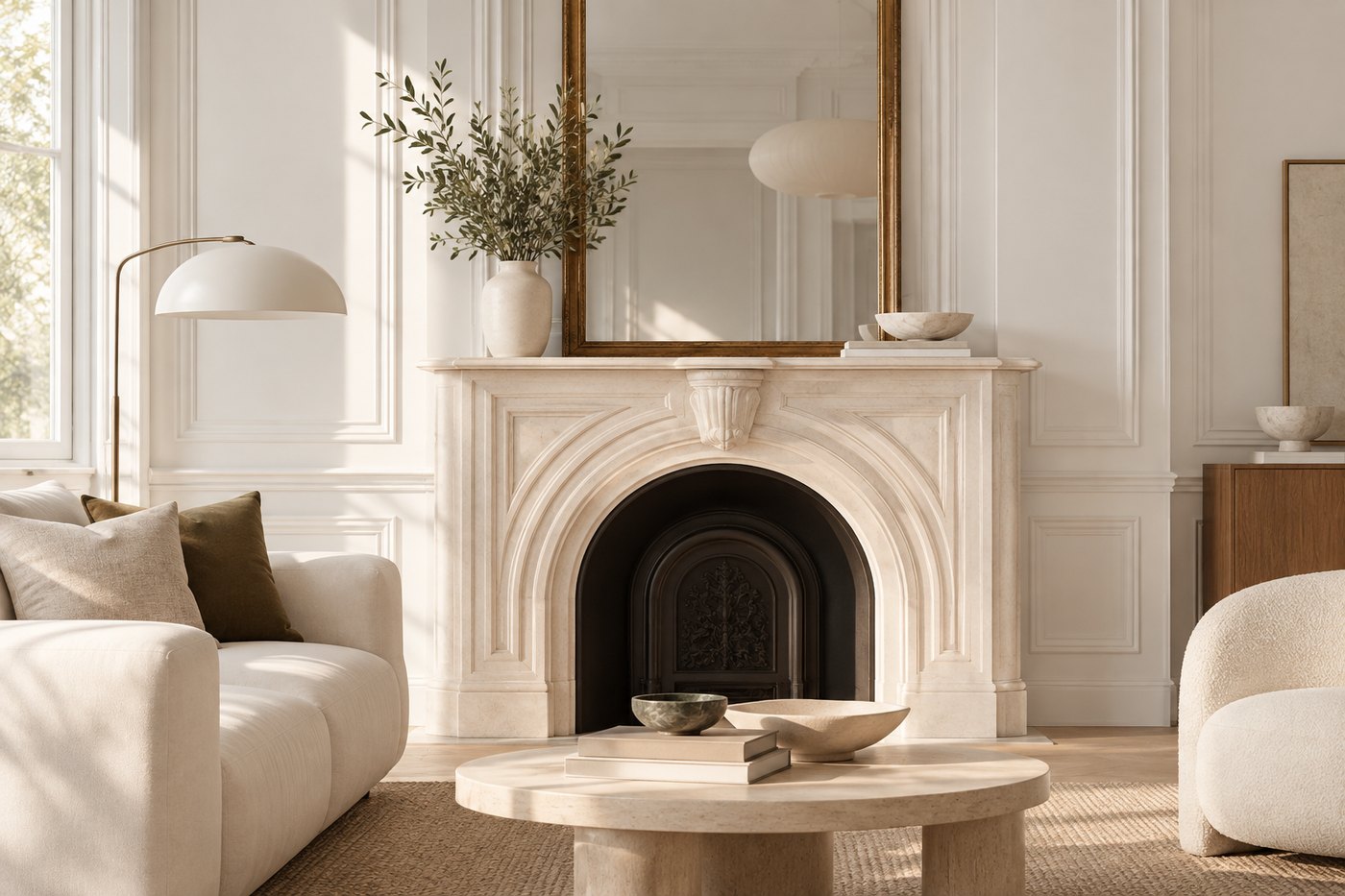
Against a colored wall, white molding creates a crisp architectural outline and adds brightness. In an all-light interior, it can maintain a sense of elegant continuity.
Benjamin Moore recommends clean whites when the goal is to create precise visual definition, and white trim can work equally well in a monochromatic palette or against a stronger wall color.
But trim can also become part of the color story.
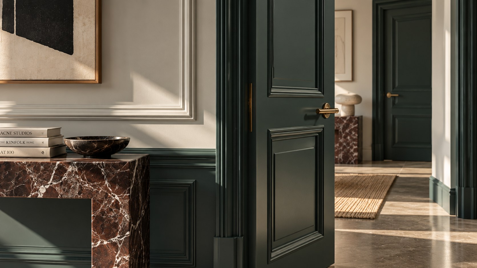
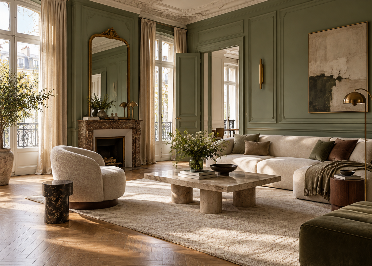
Against off-white, greige, or taupe walls, molding painted green, blue, brown, or nearly black immediately changes the way the architecture is perceived.
The contrast doesn’t have to be dramatic. Even a subtle difference between the wall and trim can be enough to bring dimension to the space.
Benjamin Moore shows, for example, Hale Navy HC-154 on French door muntins paired with Smoke 2122-40 on the surrounding trim. In another approach, Wrought Iron 2124-10 is used on the walls with Opulence OC-69 on the trim and Black 2132-10 on the door. Стаття 6
The point isn’t to reproduce these combinations exactly. It’s to understand the principle: trim is part of the palette.
An interior door occupies a significant amount of visual space.
Painting every door white therefore introduces a large white surface into the room, whether that decision was intentional or not.
A painted door can instead become an architectural anchor.
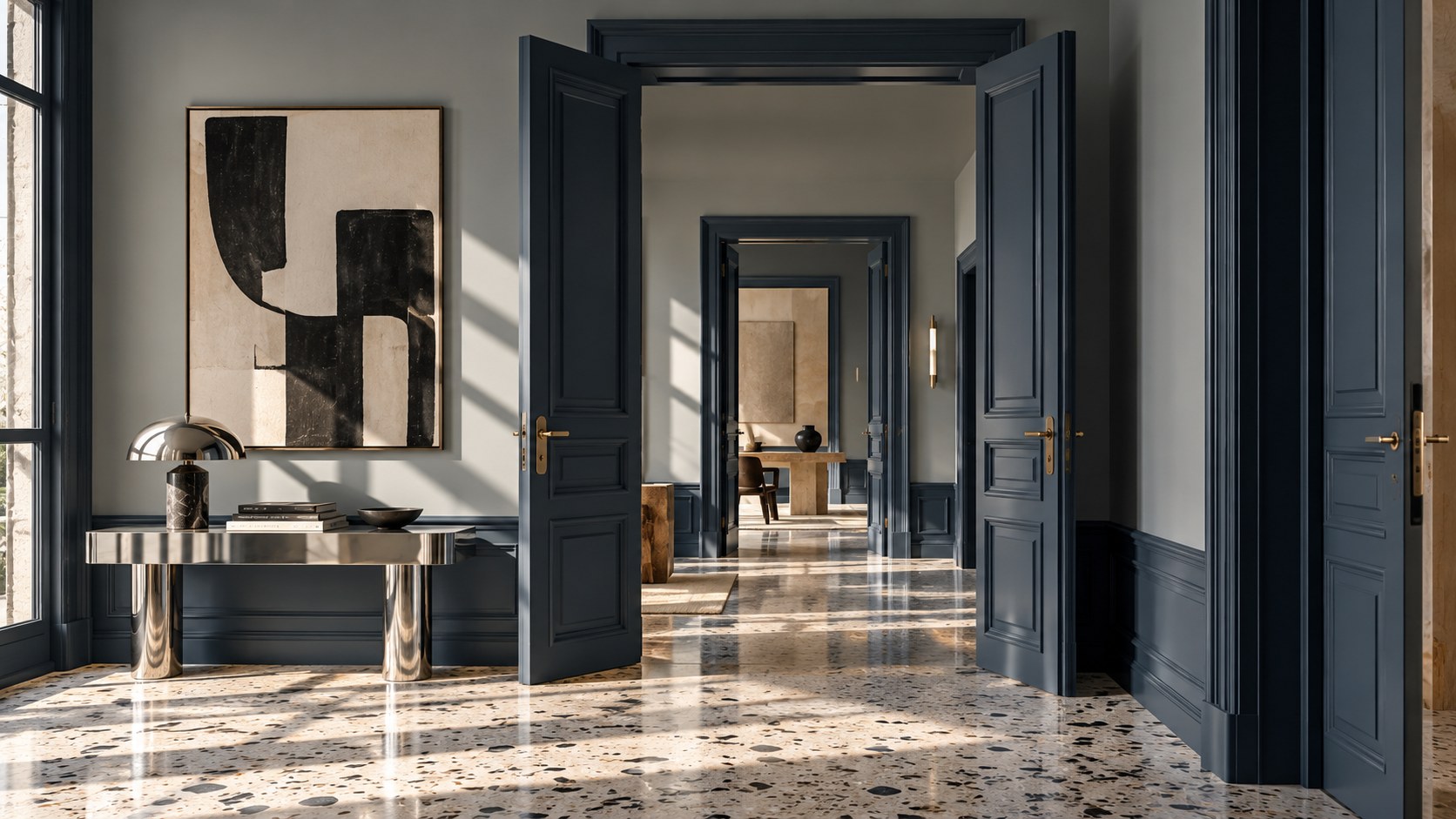
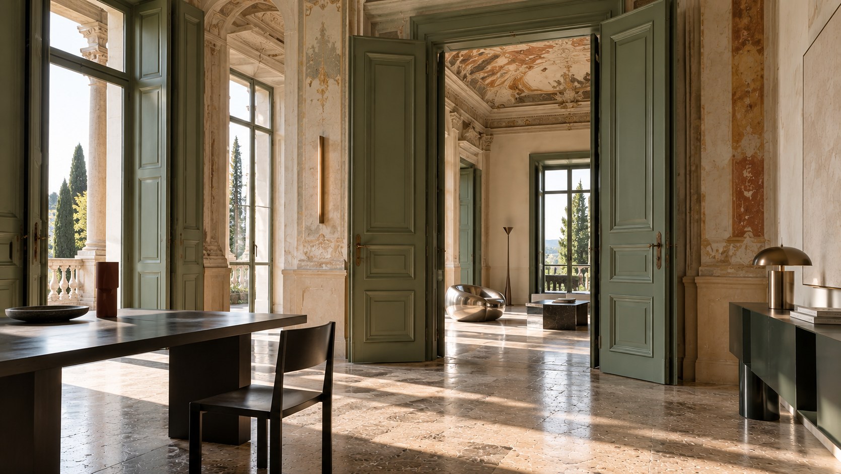
In a hallway with light walls, several doors painted the same deep green or brown can create rhythm and continuity. In a bedroom, painting the door the same color as the walls produces a calmer, more seamless effect. In a living room, a nearly black door can become a strong graphic element.
You can also choose to highlight just one particular door, perhaps the entrance to a library, home office, or entertaining space.
Color can then create a subtle hierarchy between rooms.
In interiors where several rooms connect visually, however, it’s important to consider how the door looks both open and closed. The color should work from each space it connects.
A door isn’t just a surface. It’s also a transition.
At the opposite end of the spectrum from high contrast is an approach that allows the millwork to visually blend into the room.
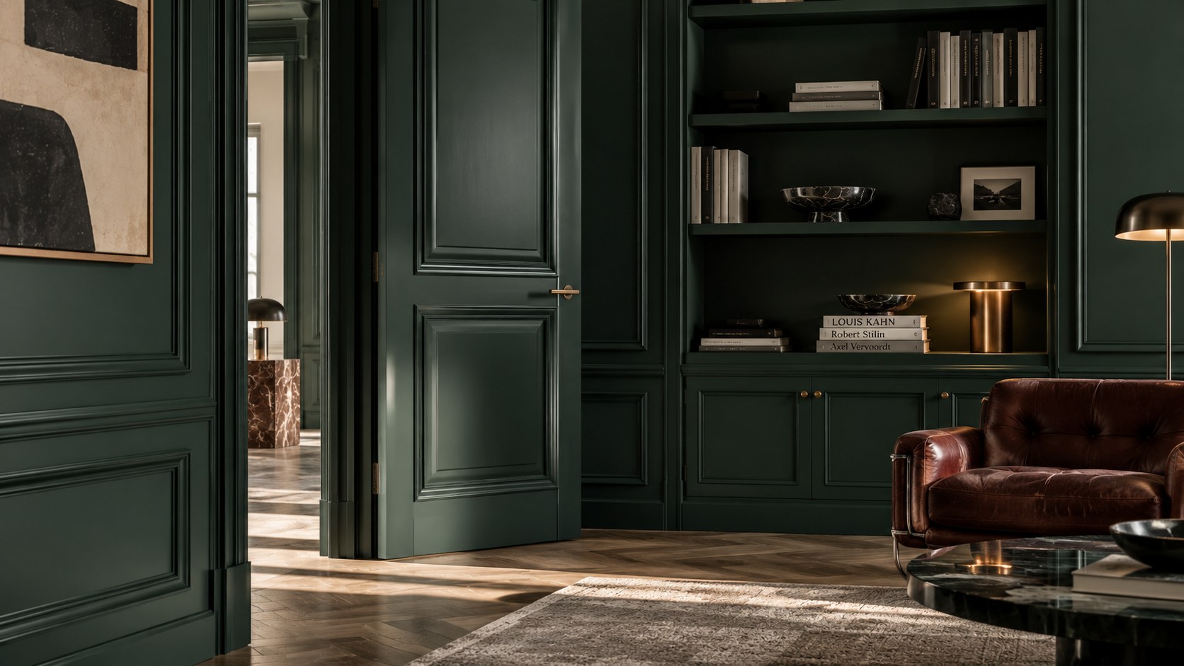
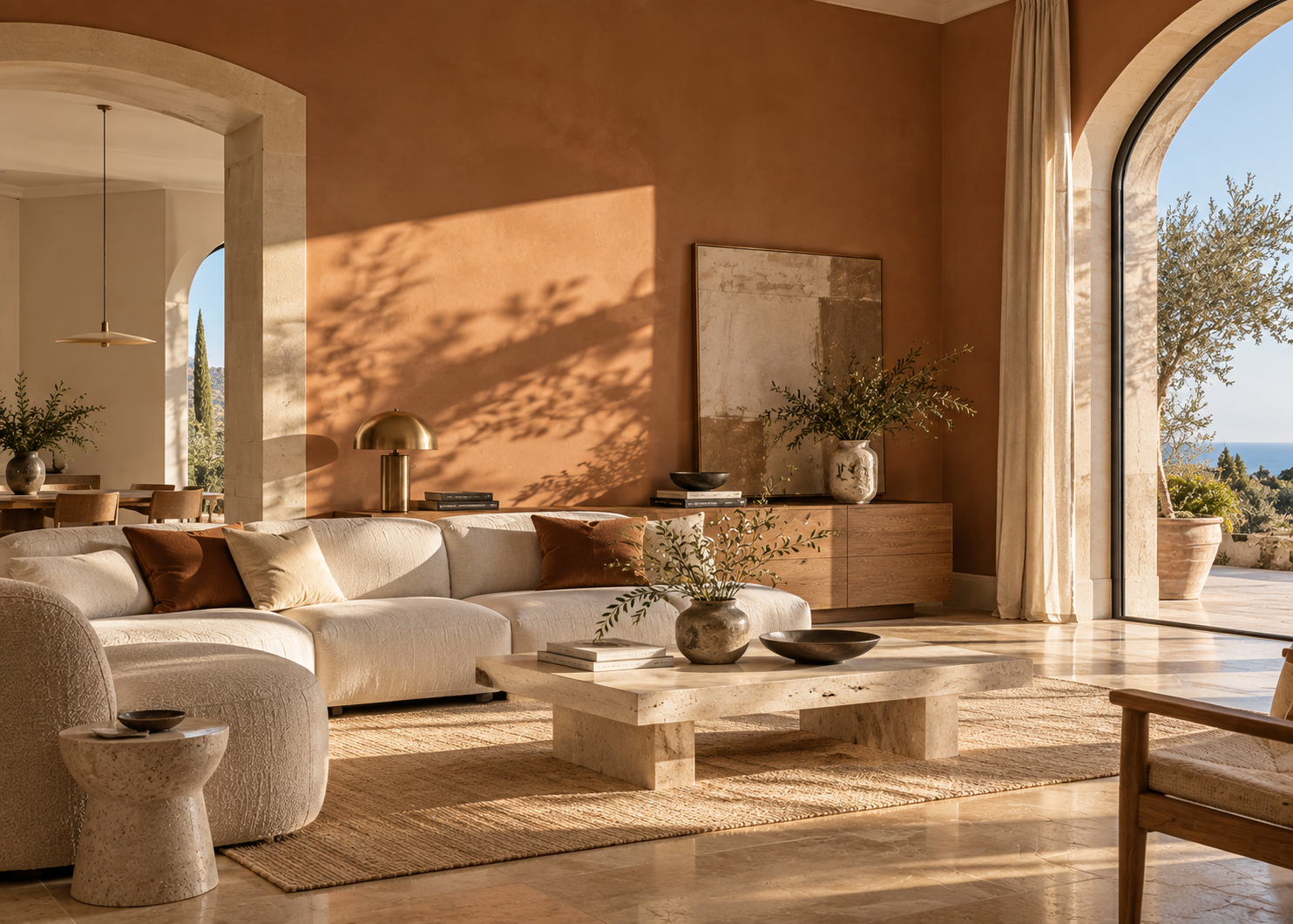
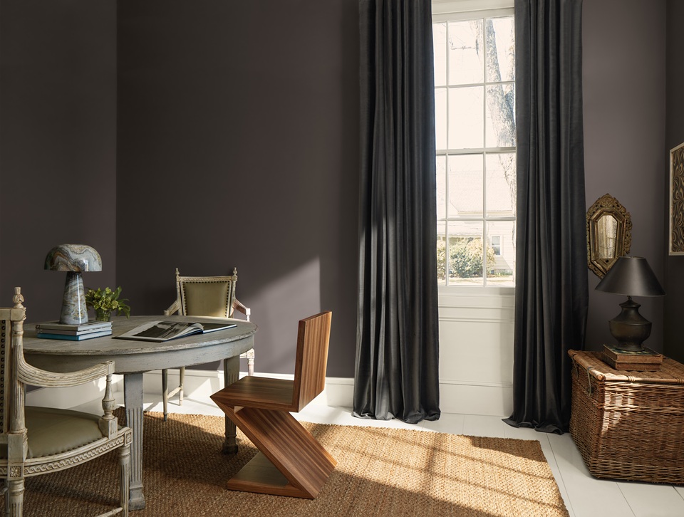
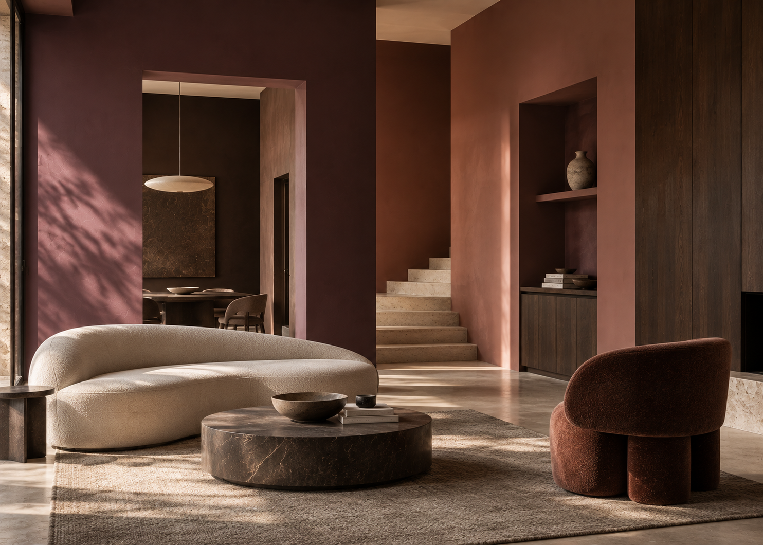
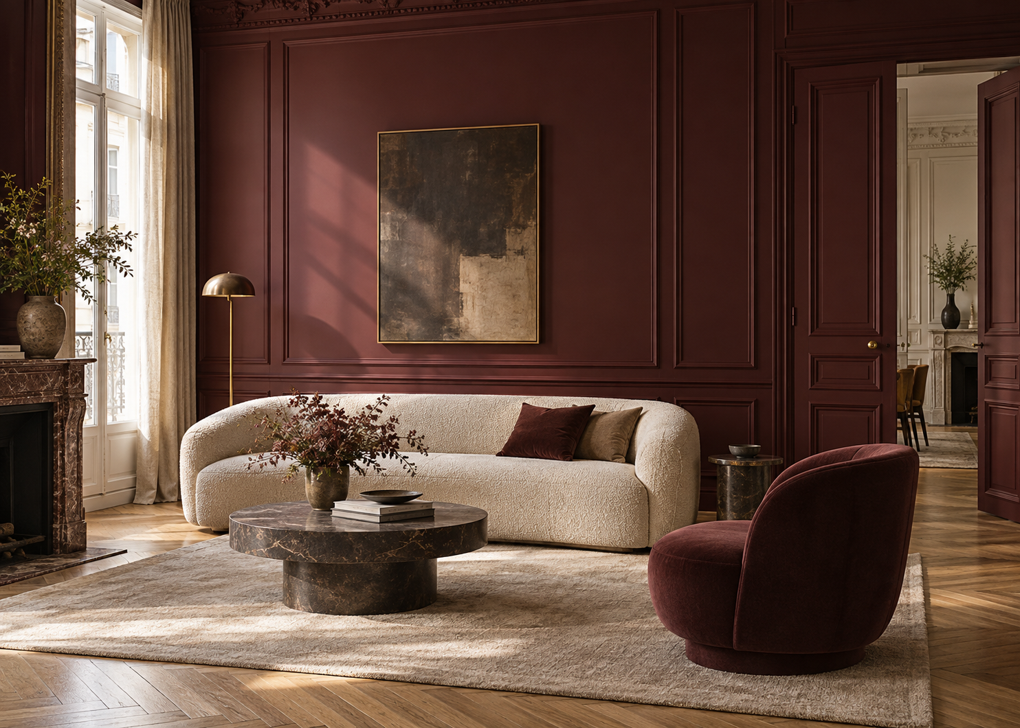
Benjamin Moore specifically recommends considering the same color on walls and trim and extending that color onto interior doors for a continuous look. With deeper shades, the effect can become especially immersive.
That doesn’t mean the architectural details disappear.
They simply reveal themselves differently.
Instead of being outlined by contrasting colors, molding and door frames become visible through shadow, relief, and changes in reflected light.
This approach works particularly well in spaces with rich architectural detailing: wall paneling, crown molding, paneled doors, or wainscoting.
In an older apartment or home, it can modernize traditional details without removing them.
And in a contemporary interior, it creates visual calm by reducing the number of color breaks.
Painting walls and millwork the same color doesn’t mean using the exact same finish on every surface.
In fact, this is where the approach can become particularly sophisticated.
A matte or low-sheen wall finish reflects less light and creates a softer surface. A satin or higher-sheen finish on doors and trim reflects more light.
The color remains the same, but the architecture becomes more visible.
Benjamin Moore recommends using different sheen levels to create subtle distinction within a single color. Walls can retain a more matte appearance, while doors and millwork can use a more reflective finish.
There’s also a practical reason for this distinction. Doors, baseboards, and frames are touched and cleaned more frequently than walls.
Finish should therefore respond to both the design intent and the way the surface will actually be used.
Wainscoting is a powerful compositional tool.
In a traditional interior, color can follow existing paneling or molding. In a contemporary space, a similar effect can be created visually with paint alone.
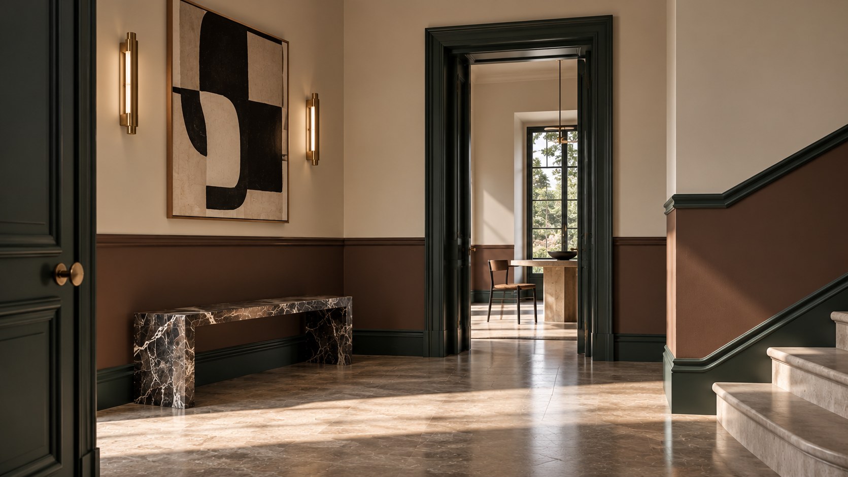
A deeper color on the lower portion of the wall gives the composition more visual weight and can help structure a long hallway or entryway.
A lighter lower section creates a softer effect.
You can work with two distinctly contrasting colors or stay within the same family: beige and taupe, pale green and deep green, light greige and smoky brown.
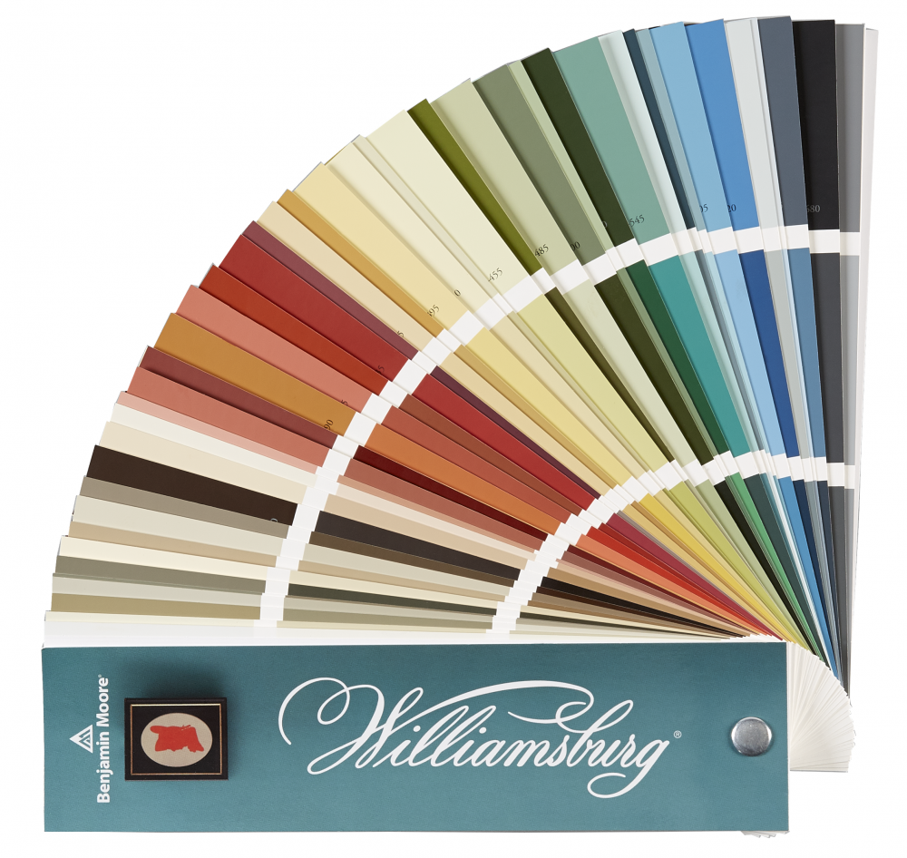
Benjamin Moore also explores layered color schemes in which the deeper shades are kept closer to the floor. In its Color Handbook, for example, the brand illustrates this idea using Green Grove 2138-20 on the baseboard, Briarwood HC-175 on the lower portion of the wall, and Bleeker Beige HC-80 above. Стаття 6
The height of the color break then becomes part of the design itself.
It can follow an existing molding line or align with a door handle, shelf, or another architectural feature.
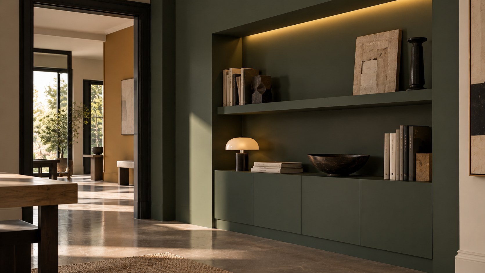
A niche or built-in bookcase is an ideal place to introduce color.
Painting only the back of a niche creates a subtle accent.
Painting the entire niche, including the back, sides, and shelving, creates greater depth and makes it feel more integrated into the architecture.
A built-in bookcase can match the walls and blend into the room, or it can be painted in a contrasting shade and become a focal point.
In a light living room, deep green, midnight blue, or brown built-ins can visually anchor the space. In a room that already contains several colors, choosing a shade close to the wall color will create a quieter effect.
Again, the most useful question isn’t simply, “What color should it be?”
First decide what you want the architectural element to become: a background, a transition, or a focal point.
Door and window frames are often treated as purely functional details.
Yet their color directly affects the way an opening is perceived.
Light trim against a deep wall emphasizes the geometry of a door or window.
Dark trim against a pale wall creates a strong graphic outline.
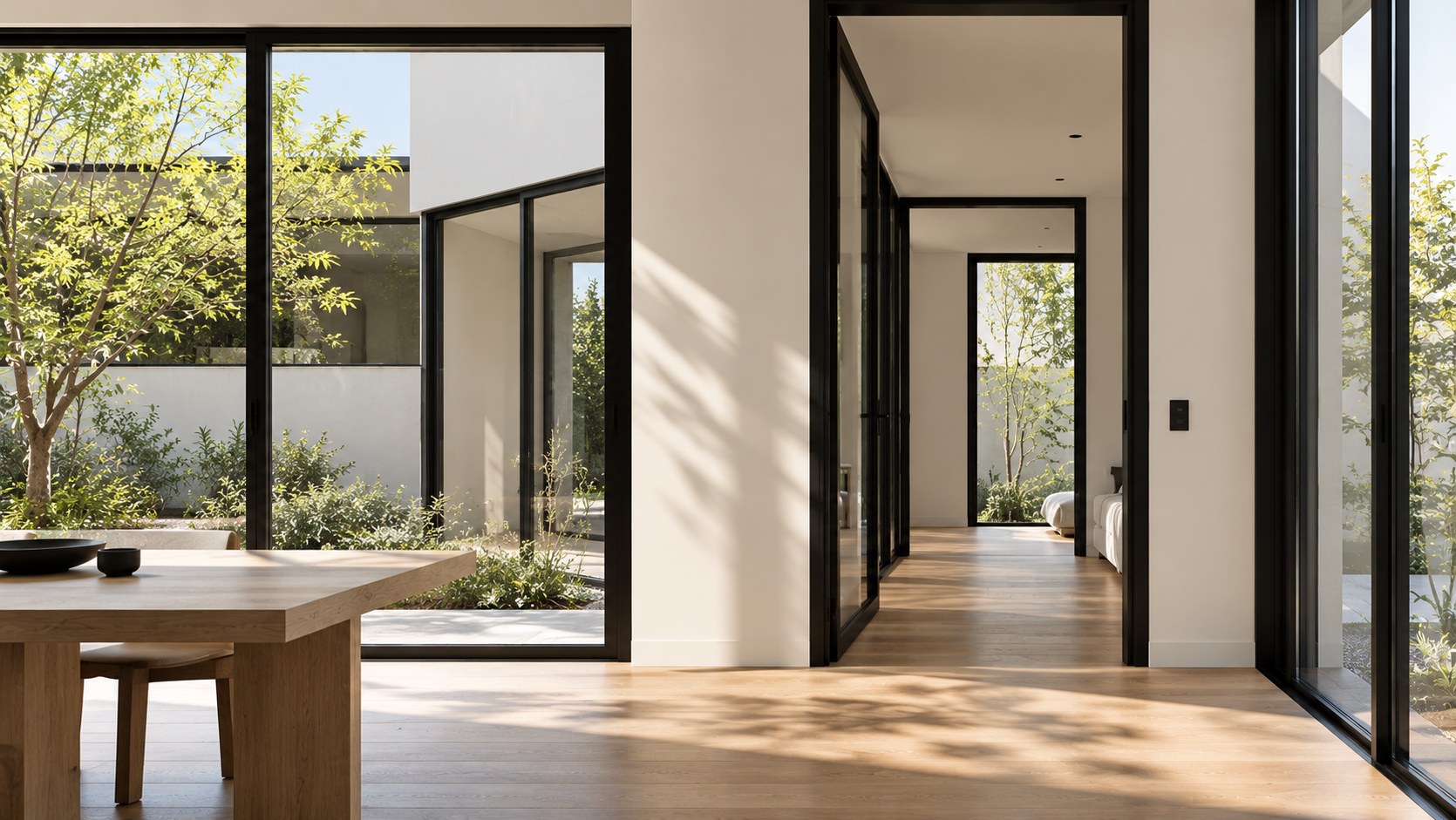
Trim painted the same color as the wall becomes much quieter, allowing the view, furniture, or other architectural features to take visual priority.
Benjamin Moore even explores black trim against white walls as a way to introduce fine dark lines that define a room and add a sense of depth.
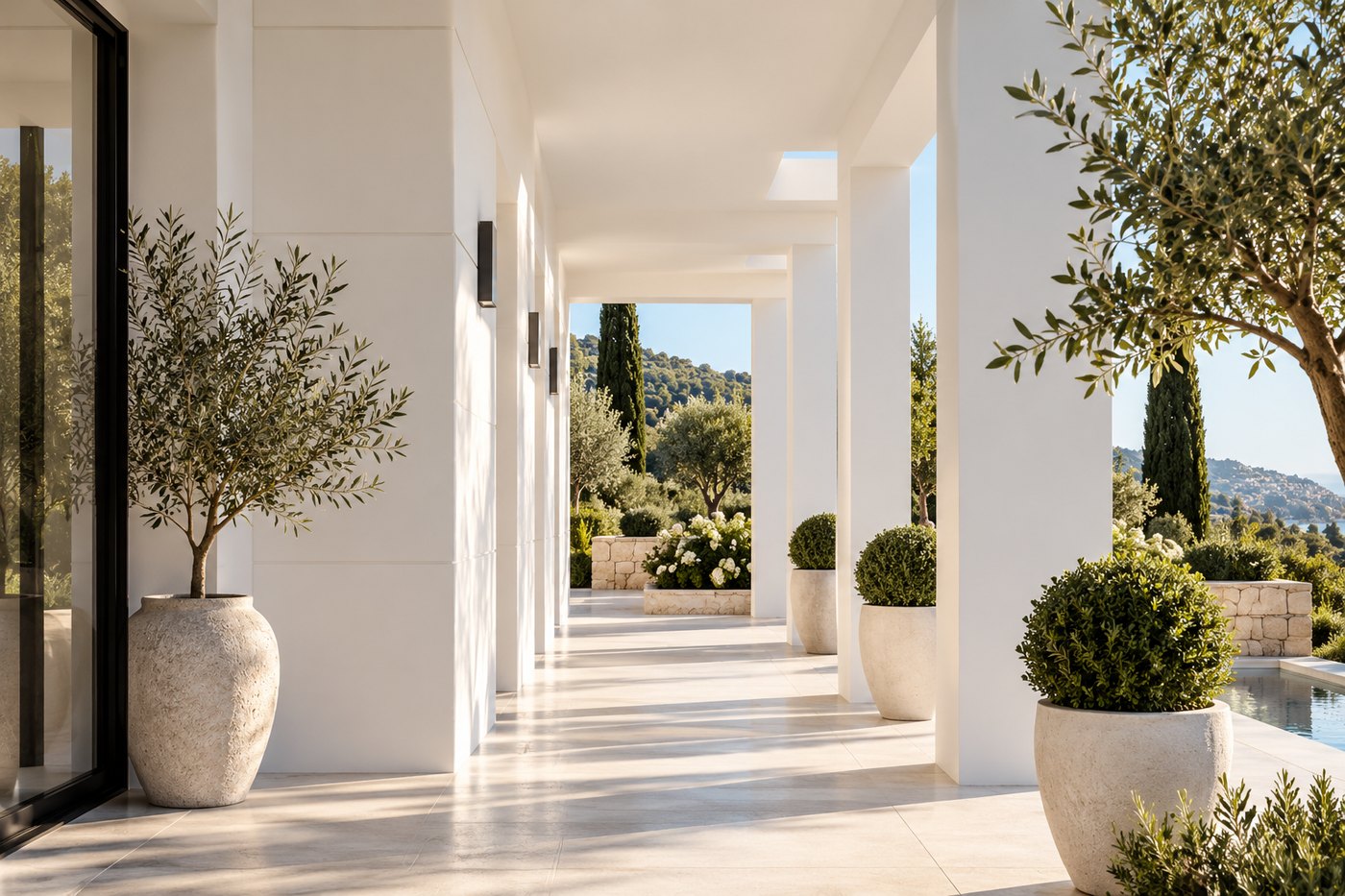
In a room opening onto a terrace, garden, or Mediterranean view, it’s worth considering how visible the window frames should be. Do you want to emphasize their architecture, or allow them to recede so the view becomes the focus?
Older apartments and houses often contain the very details that contemporary construction tries to recreate: paneled doors, crown molding, wall paneling, wainscoting, niches, and built-in cabinetry.
Modernizing them doesn’t mean painting everything white.
Applying a contemporary color to traditional architecture can create a much more interesting dialogue.
A muted green on paneled doors. Deep taupe on wainscoting. An almost-black brown on built-in shelving. Or a single shade carried across both walls and molding.
Color changes the way an architectural detail is perceived without changing its form.
This can be particularly effective in French interiors, where classical architecture and a contemporary palette don’t need to compete.
Paint can connect the two.
A beautiful color is only part of the equation. Doors and millwork have different performance requirements than walls.
They’re touched more frequently and need a coating suited to everyday use.
Within the range offered on the English version of the Benjamin Moore France website, ADVANCE - Satin 792 is an option for doors, trim, cabinetry, and other interior millwork when a satin finish is desired.
The right preparation, however, depends on the substrate, its condition, the existing finish, and how the surface will be used.
A previously painted antique door, new MDF paneling, and varnished woodwork may not require the same preparation.
With doors and millwork in particular, surface preparation is critical. Cleaning, sanding when necessary, and using an appropriate primer all contribute to a smoother, more durable result.
Once doors and millwork become part of the color scheme, another question arises: should they all be the same color throughout the home?
Not necessarily.
But having an overall logic helps.
You might choose one color for all interior doors to create a visual thread throughout the home. Or you might work by zone, using one color family in the main living spaces and another in private areas.
In a hallway, a painted door can hint at the palette of the room beyond it.
And in a sequence of interconnected rooms, painted frames can become a way to establish visual continuity from one space to the next.
The goal isn’t to make everything identical.
It’s to avoid treating every door, every molding, and every wall as an isolated decision.
A successful color palette should make sense from one room to the next.
When we want to transform an interior, our first instinct is usually to focus on the largest surfaces.
Yet sometimes it’s the details that change the personality of a room most dramatically.
A painted door can become a decorative feature in its own right. Contrasting trim can reveal architecture that previously went unnoticed. Wainscoting can restructure a wall. A tonal built-in bookcase can look as though it has always belonged in the room.
Paint can accomplish all of this without adding a single new object.
So before choosing the next color for your walls, take another look at the doors, frames, molding, and millwork.
They don’t just surround the design. They can become the design.