

Your Cart
0 products
Inspiration
In most interiors, the four walls receive a great deal of attention: warm or cool white, beige or greige, light or deep color, contrast or tone-on-tone.
And then there is the ceiling.
Very often, it is painted white almost automatically, without considering whether that choice actually supports the architecture of the room.
Yet the ceiling represents a significant surface. Benjamin Moore often refers to it as the “fifth wall,” a surface in its own right that can become part of the palette, highlight architectural features, and change the overall perception of a room.
Painting the ceiling does not necessarily mean choosing a dramatic color. A subtly tinted white, a lighter variation of the wall color, the same color as the walls, or a deeper contrasting shade can all create very different effects.
The question, then, is not simply, “Should the ceiling be painted a color?” A more useful question is: what role should the ceiling play in the room?
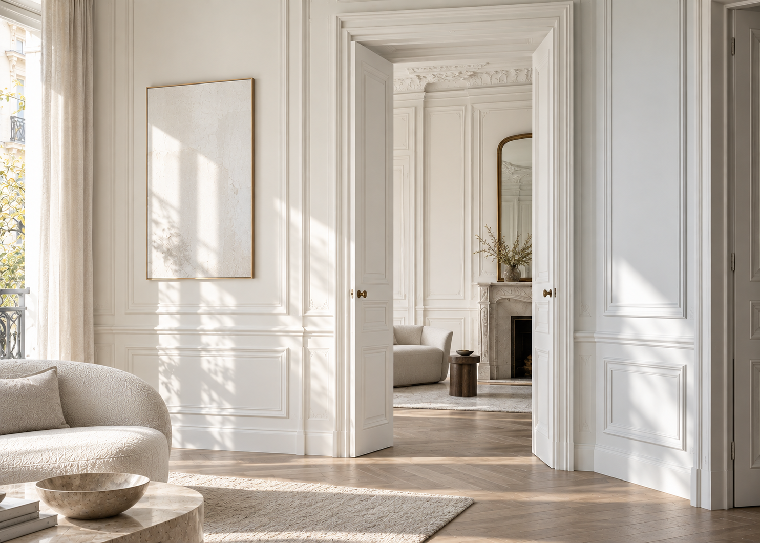
There is nothing outdated about a white ceiling.
In many interiors, it remains the right solution. It reflects light, creates a clear separation from colored walls, and can reinforce a sense of openness.
But not every white creates the same effect.
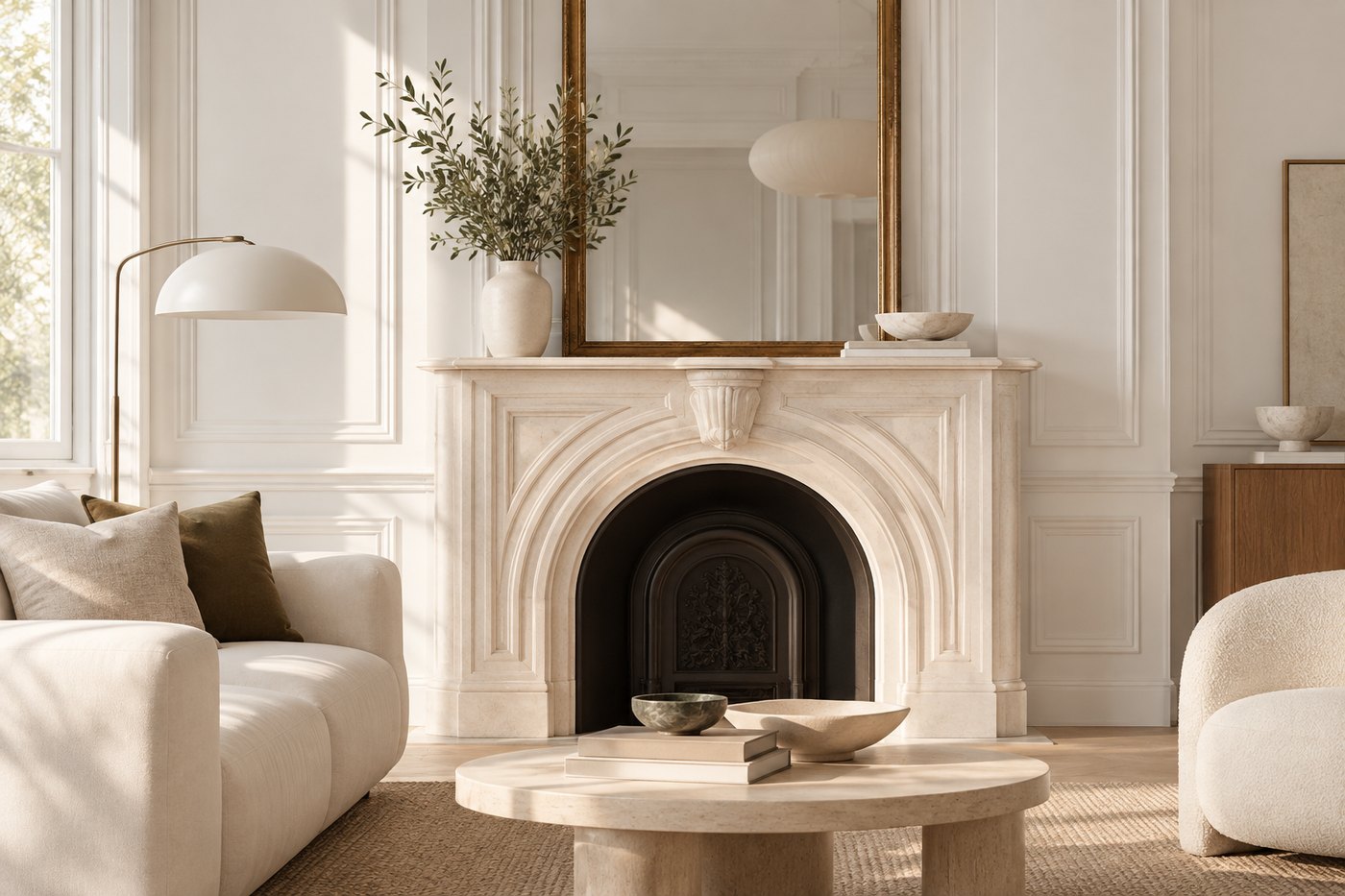
A crisp white paired with warm walls can create a noticeable contrast. An off-white or slightly warmer white will generally create a softer transition with beige, taupe, and certain earthy colors.
That is why the white selected for a ceiling deserves the same consideration as the color selected for the walls.
Benjamin Moore colors such as Chantilly Lace OC-65 offer a particularly clean, crisp white, while White Dove OC-17 has a softer presence. The right choice will always depend on the other colors, materials, and lighting within the room.
White then becomes an intentional design decision rather than a default option.
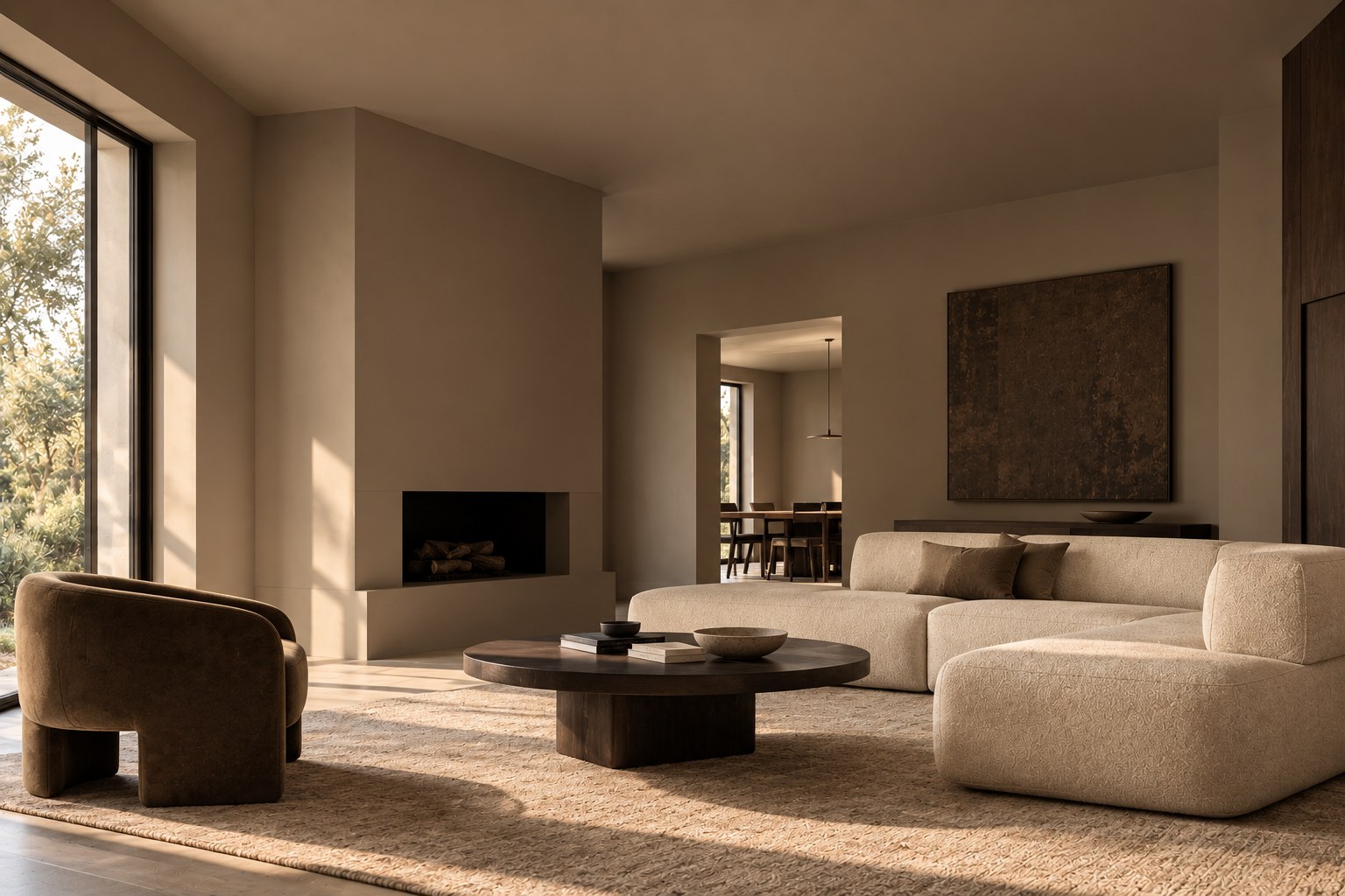
For those who want to move away from a white ceiling without introducing an entirely new color, one of the most natural approaches is to stay within the same color family as the walls.
Benjamin Moore recommends considering a lighter shade or subtle variation of the wall color to create depth and dimension while maintaining a cohesive palette.
Imagine walls in a substantial greige with a ceiling in a much paler shade from the same family. The transition becomes softer, and the ceiling feels more integrated into the room.
This approach works particularly well in bedrooms and living rooms where the goal is to create a calm, cohesive atmosphere.
It also avoids the sometimes graphic contrast between a nuanced wall color and a bright white ceiling.
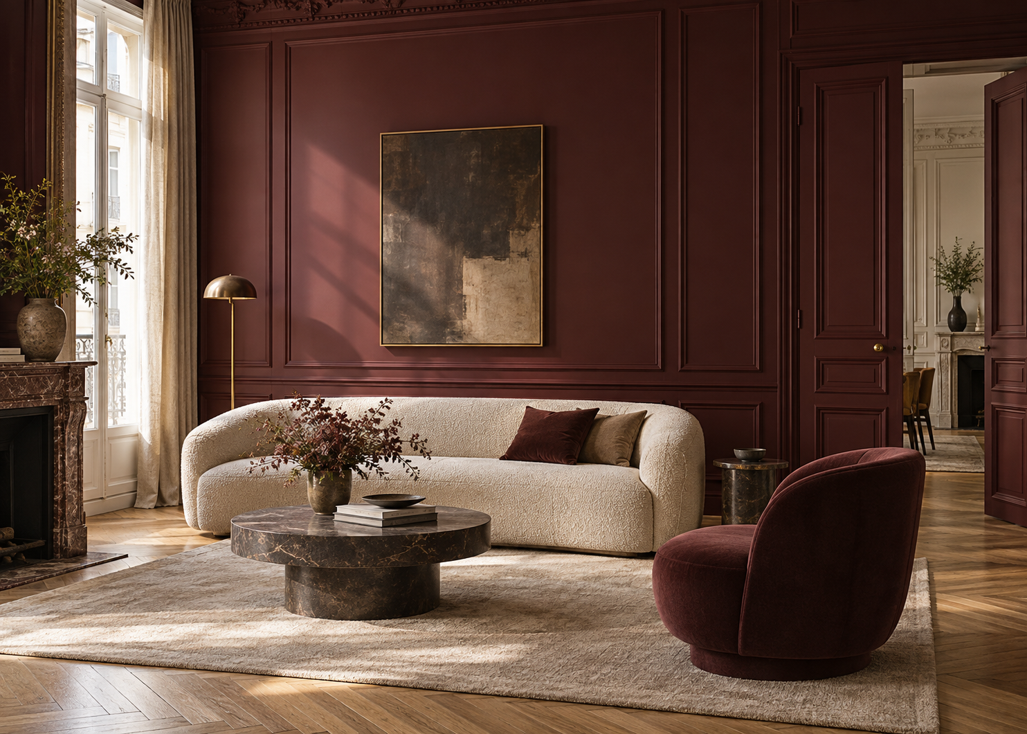
This is the most enveloping approach.
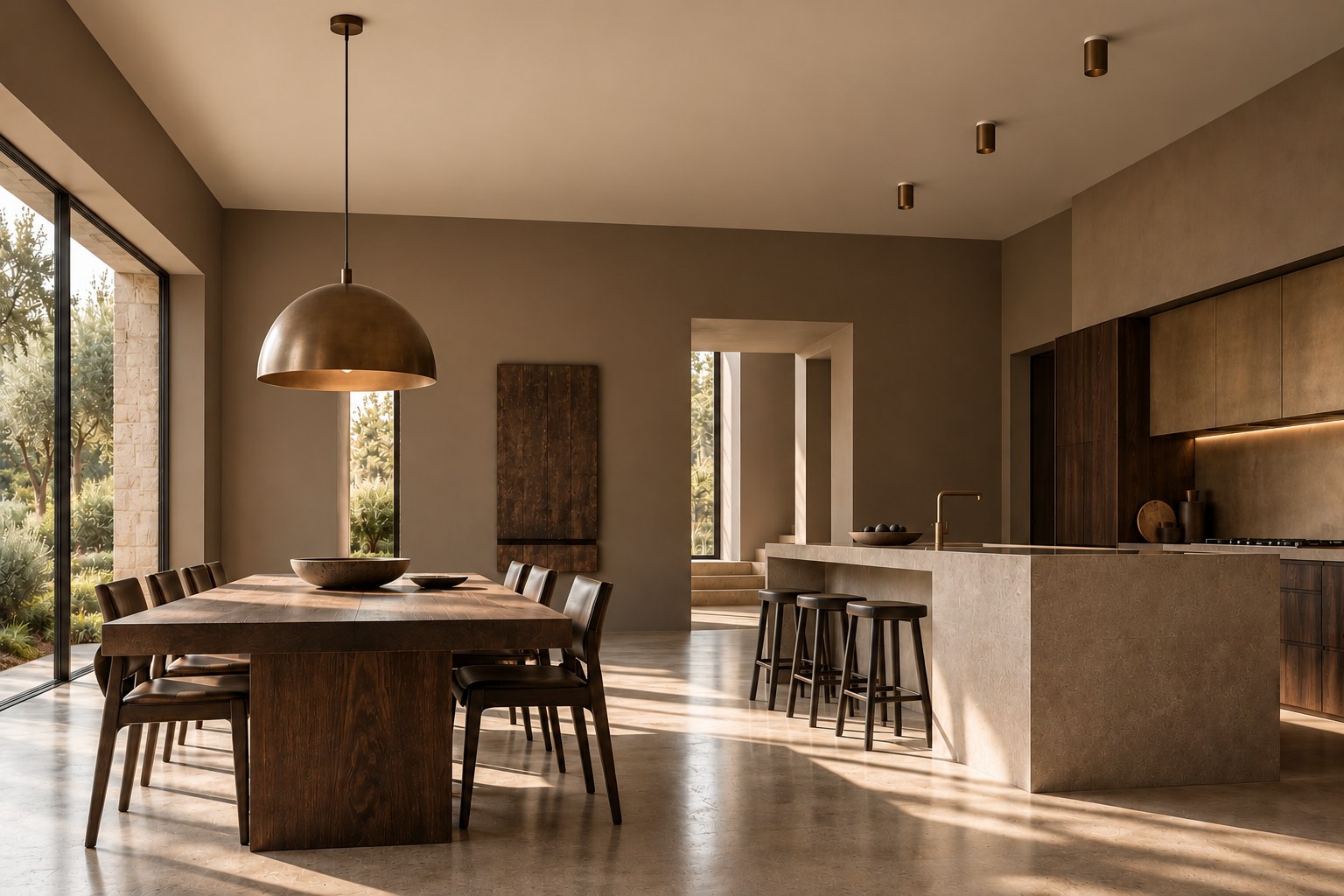
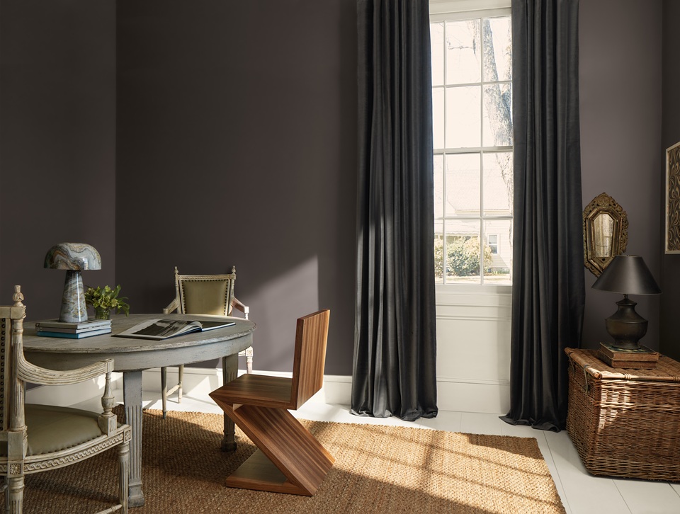
When the same color continues from the walls onto the ceiling, the boundaries between surfaces become less prominent. The room reads more as a continuous volume than as a collection of separate planes.
The effect can be particularly successful in a bedroom, home office, library, entryway, or living room where a more intimate atmosphere is desired.
With a light or mid-tone color, the result can remain subtle. With a deeper color, the experience becomes much more immersive.
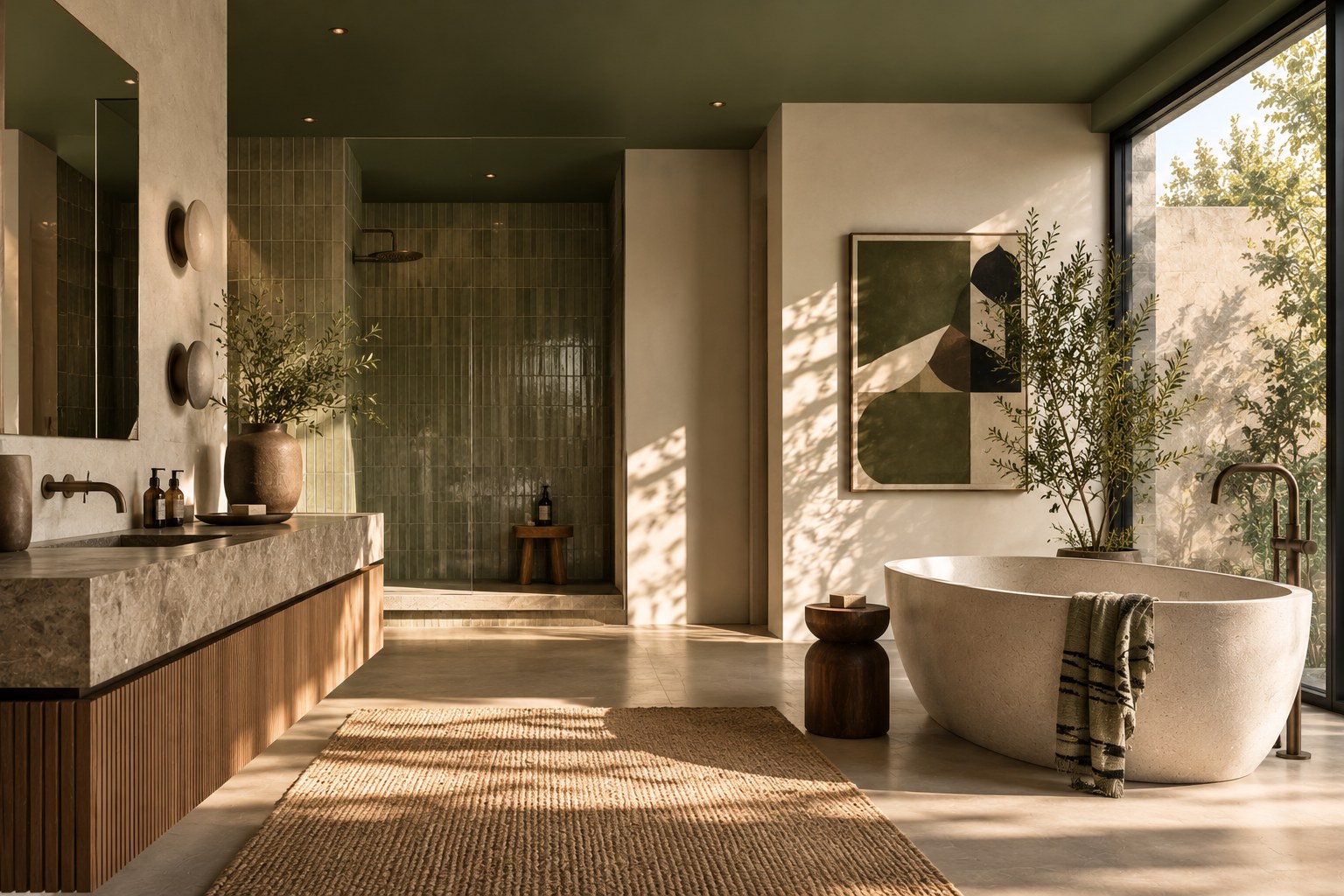
A midnight blue, dark green, substantial taupe, or brown can completely envelop a room.
This approach also works particularly well in spaces with architectural irregularities such as sloped ceilings, beams, niches, or changes in ceiling height. Reducing contrast between surfaces can create a more unified reading of the volume.
However, the color should always be evaluated in the actual lighting conditions of the room. A color applied to a horizontal ceiling does not receive light in the same way as that same color on a vertical wall. As a result, it may appear different even when the exact same color reference is used.
The opposite approach is to keep the walls relatively neutral and use the ceiling as an expressive surface.
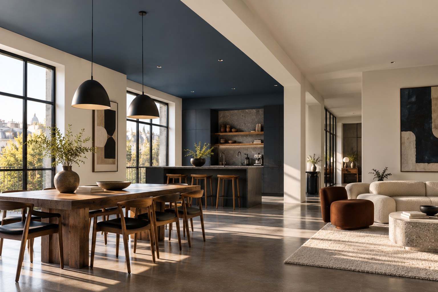
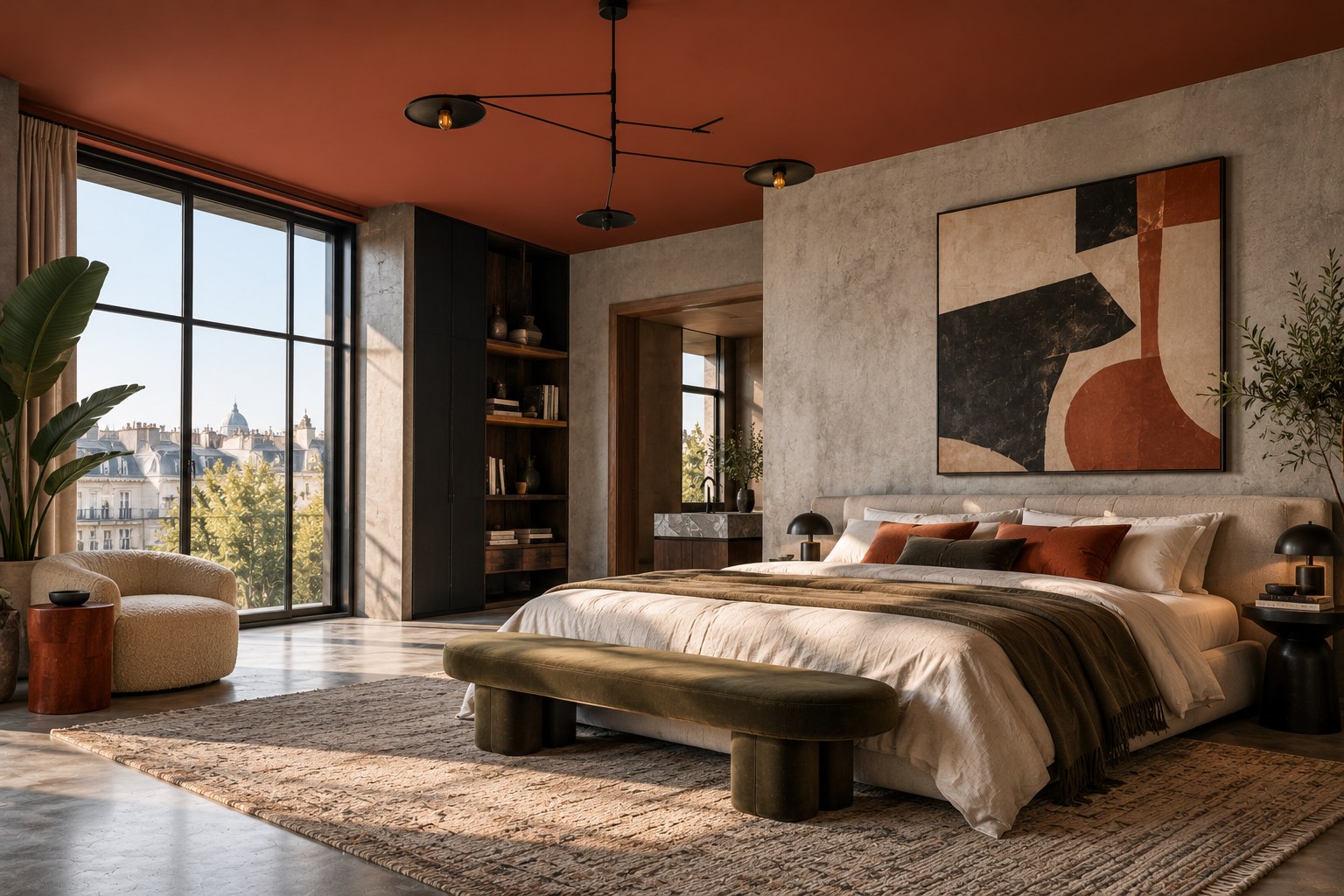
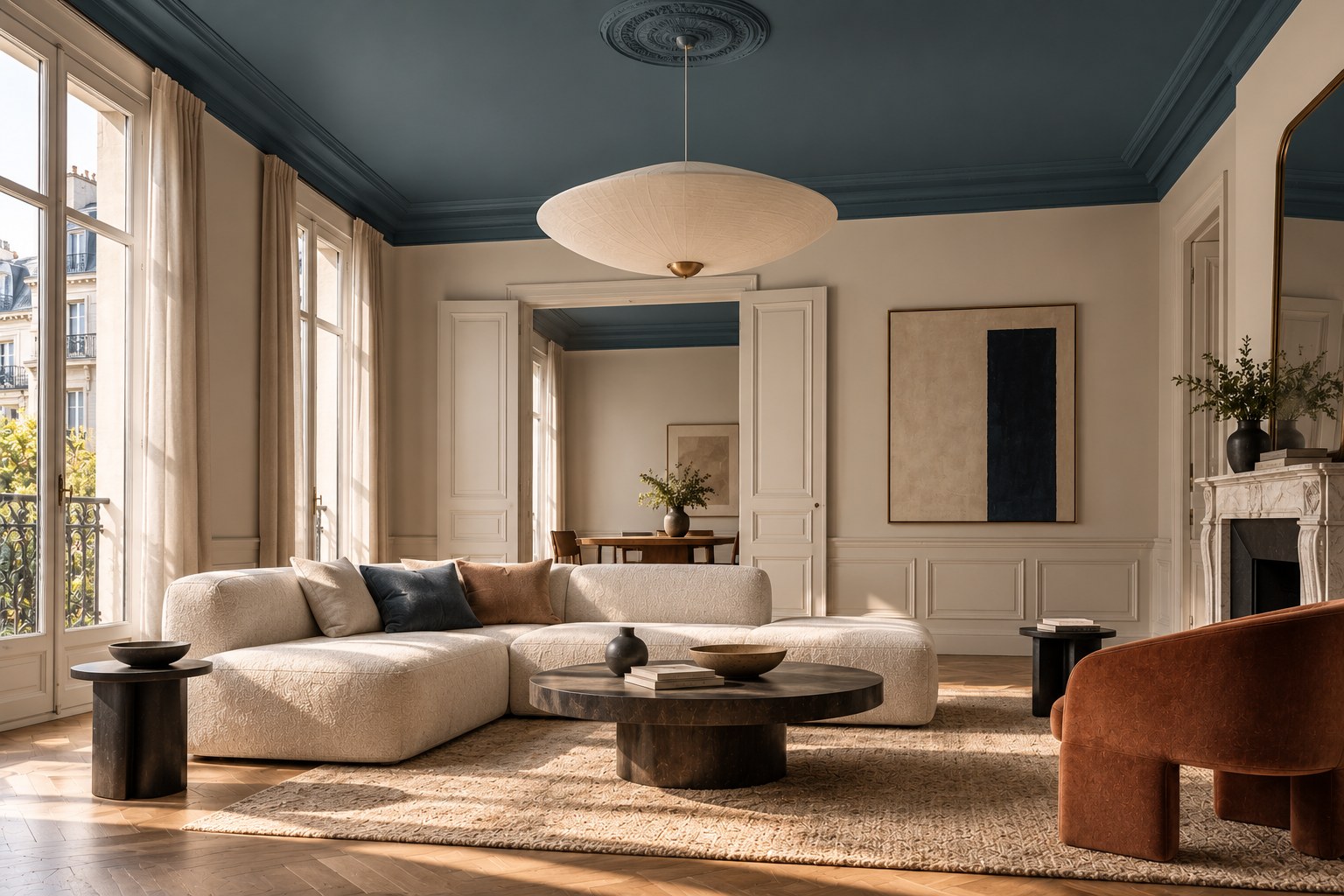
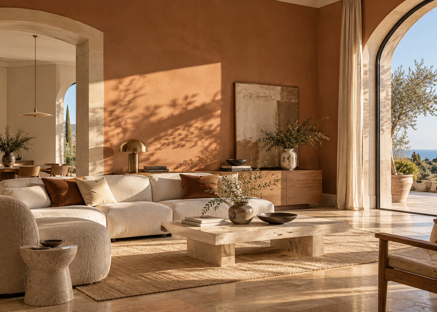
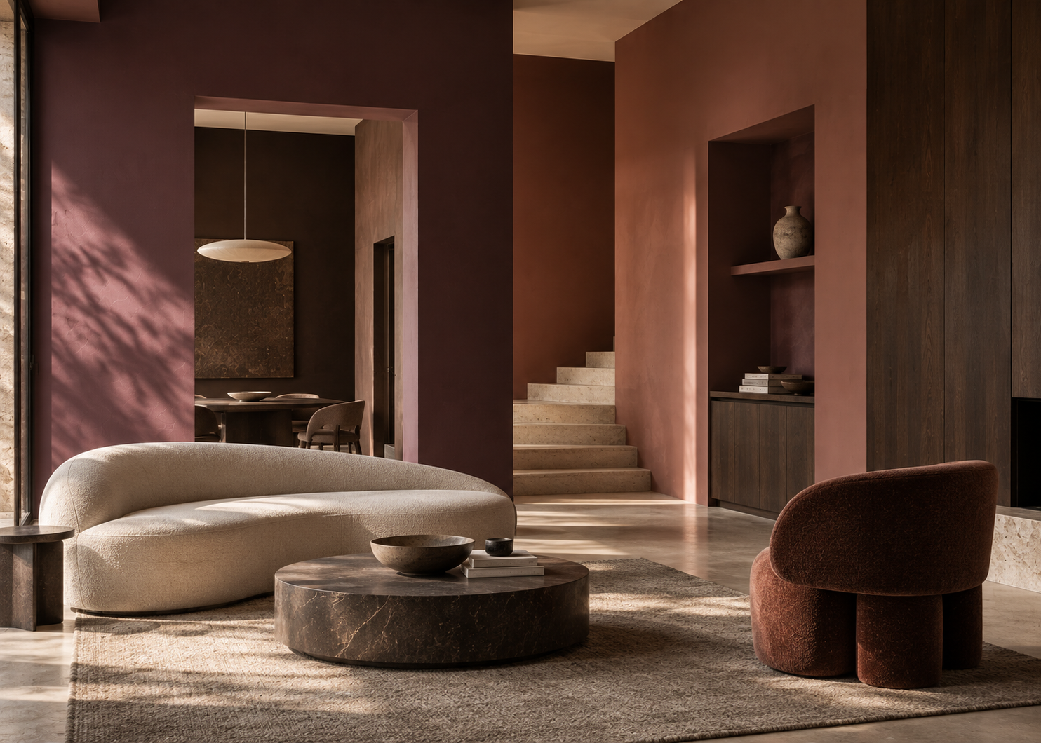
A muted blue above cream walls, soft terracotta with mineral beige, or a subdued green above a warm white introduces color where it is least expected.
Benjamin Moore encourages this approach and offers numerous examples in which the ceiling becomes an intentional decorative element.
There are two advantages.
First, the eye is naturally drawn upward, which can highlight generous ceiling height, crown molding, a ceiling medallion, beams, or a statement light fixture.
Second, color alone can give a room a strong identity without adding more decorative objects.
In an interior where the walls, furniture, and materials remain restrained, a painted ceiling can become the element that gives the entire project its personality.
This is probably the option that creates the most hesitation.
A dark ceiling is often assumed to automatically make a room feel smaller or lower. In reality, the effect depends on ceiling height, lighting, wall color, and the level of contrast between the surfaces.
Benjamin Moore notes that a deep navy or nearly black ceiling can visually soften the boundaries of a room and create an atmosphere that feels both intimate and dramatic.
In a room with high ceilings, a deeper color overhead can visually bring the ceiling closer and make the volume feel warmer.
In a smaller room, a dark ceiling does not have to be used to create a sense of spaciousness. It can instead intentionally create a more intimate atmosphere.
A dark ceiling can also be particularly effective in a dining room, bedroom, or evening entertaining space, where atmosphere may be more important than maximizing brightness.
As with any deep color, testing the shade in the actual space before making a final decision is important.
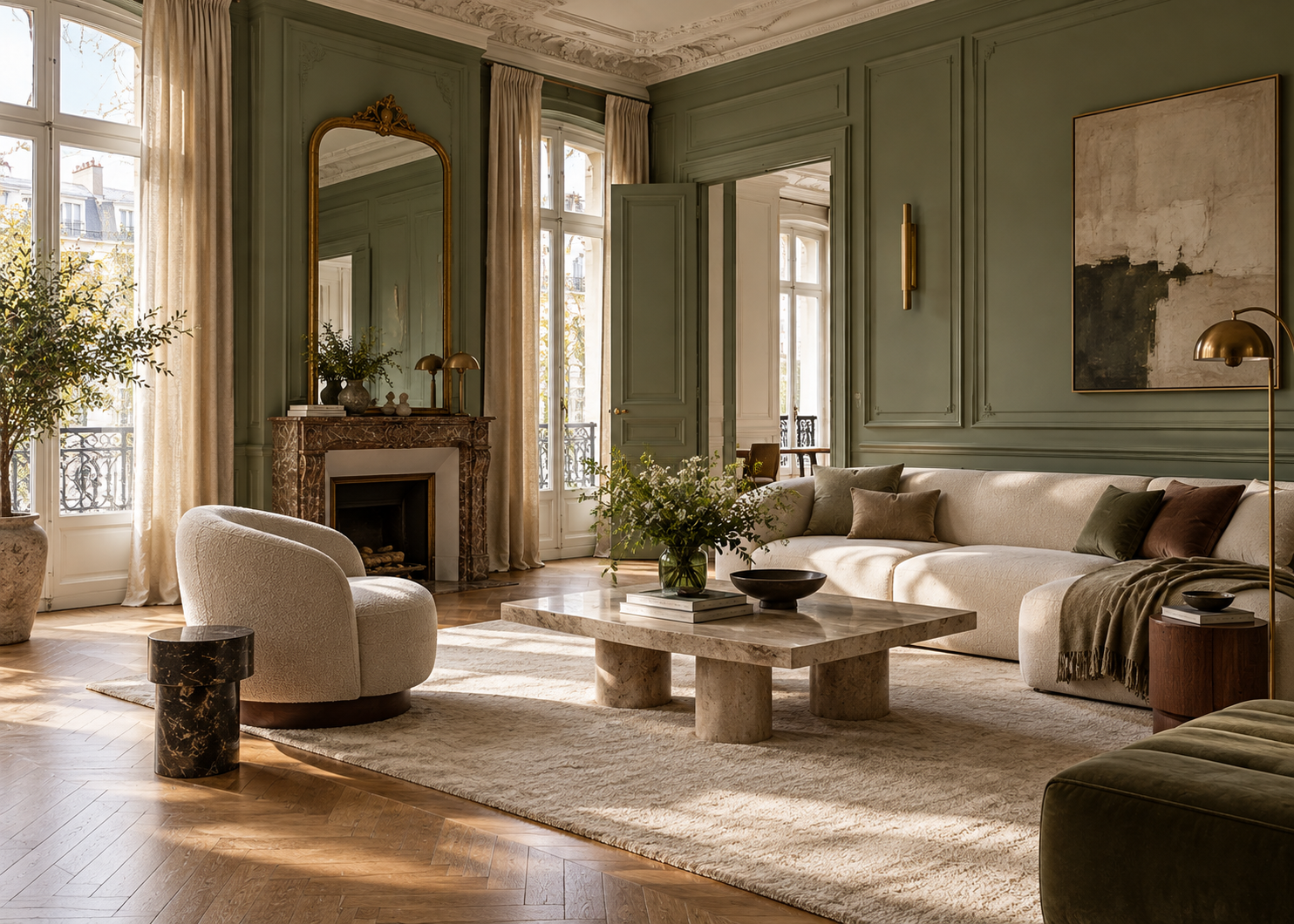
In older apartments or homes with distinctive architectural details, the ceiling offers even more possibilities.
Crown molding can remain light while the walls and ceiling are painted in color, creating a graphic line around the room.
Alternatively, the walls, crown molding, and ceiling can all be painted the same color, allowing the relief and architectural details to become more important than color contrast.
A ceiling medallion can be treated tone-on-tone or given a subtle contrast.
Beams can follow the ceiling color to blend into the volume or be intentionally differentiated.
There is no single correct solution.
The goal is to identify what should be emphasized.
If the architecture already contains beautiful details, paint can reveal them. If the ceiling has numerous lines or irregularities that should be visually softened, a more uniform palette can make them less prominent.
In a large living area, color does more than decorate. It can help define different functions.
A painted ceiling above the dining area, for example, can visually identify that zone without separating it from the living room.
The same principle can be used above a kitchen island, reading area, or workspace.
It is an effective way to structure an open-plan interior while maintaining the fluidity of the space.
In this context, the ceiling almost becomes an architectural zoning surface.
The color should still remain connected to the overall palette. Repeating a shade already present in textiles, furniture, millwork, or another area of the room will generally create a more natural connection than introducing an entirely new color only on the ceiling.
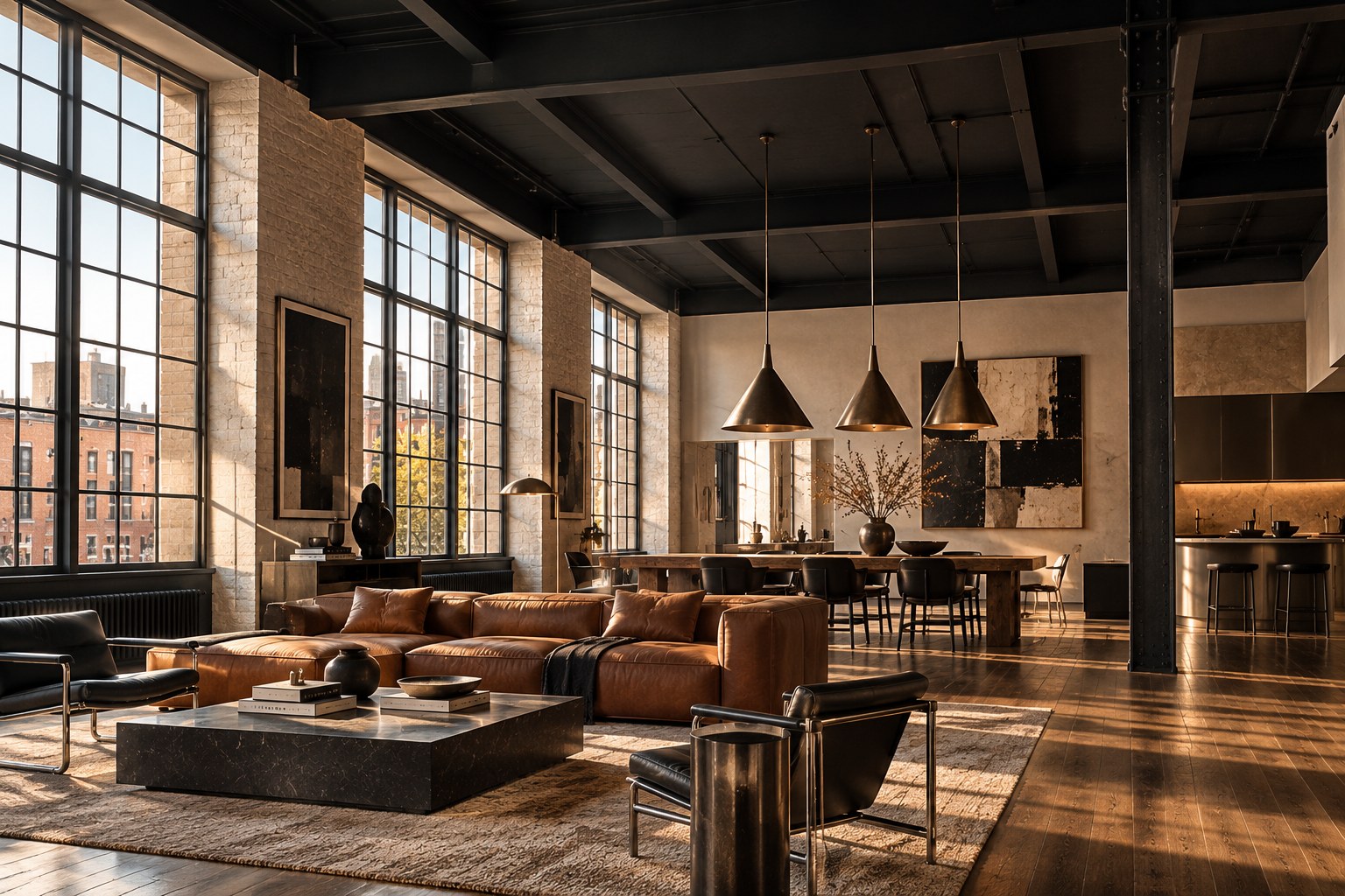
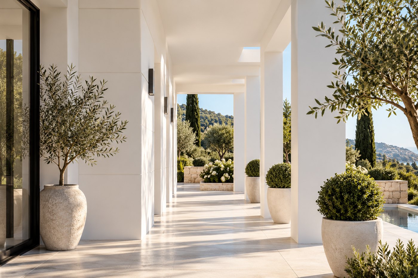
The abundant natural light of Southern France deserves particular attention.
A ceiling does not receive light in the same way as a wall. Its color may therefore appear darker or more muted than expected depending on the room’s orientation and the way light is reflected by floors and walls.
In a very bright room, a deeper ceiling color can create an interesting counterpoint and balance the intensity of natural light.
In a darker room, a lighter shade can help preserve a sense of brightness, but that does not mean a colored ceiling should automatically be avoided.
The choice should primarily reflect the atmosphere the designer wants to create.
As with walls, artificial lighting also plays a significant role in the evening. The color temperature of the light sources, the presence of pendants or sconces, and the direction of the light can substantially change the way a color is perceived.
A ceiling should therefore be evaluated both during the day and at night.
Color is only one part of the result.
The finish directly affects how light reflects from the surface and how visible surface imperfections become.
Very low-sheen finishes are particularly useful on ceilings because they reduce reflections and can help make minor surface irregularities less noticeable.
In its English-language French catalog, Benjamin Moore offers Ceiling Paint 508, designed specifically for ceiling applications.
The product selection should still take into account the substrate, the condition of the ceiling, and the specific requirements of the space.
In every case, preparation remains essential. A sophisticated color cannot compensate for a poorly prepared surface.
A sample viewed vertically on a wall does not necessarily predict exactly how the same color will appear on a ceiling.
The orientation of the surface in relation to the windows changes both the amount and quality of light it receives.
If you are considering a painted ceiling, ideally test the color directly overhead on an area large enough to evaluate properly.
Look at it in the morning, at midday, and in the evening under artificial light.
Then consider how it interacts with the walls.
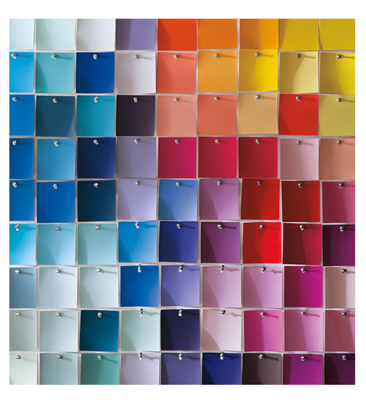
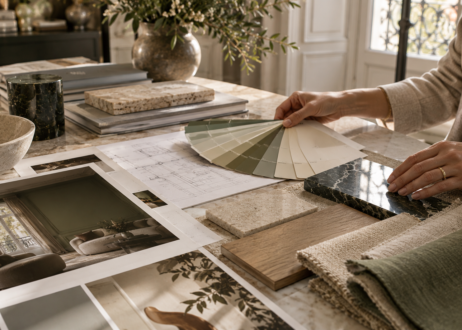
A color may look beautiful on its own but create too much contrast with the wall color. Conversely, two colors that appear very similar on a fan deck may reveal just enough difference once they are applied.
Testing reveals what a fan deck cannot: how the color behaves in your actual light and architecture.
The ceiling is often the largest surface we forget to design.
Yet it can extend the wall palette, introduce contrast, envelop a room, highlight architecture, or simply add another layer of nuance to a restrained interior.
It does not need to be dramatic.
Sometimes, replacing a cool white with a softer white is enough to change the balance of a room. In another space, continuing the wall color onto the ceiling can immediately create greater cohesion. And in some interiors, a deep ceiling color may be exactly what the project was missing.
The next time you choose a color for a room, do not look only at the four walls.
The fifth wall deserves color too.