Your Cart
0 products
Inspiration
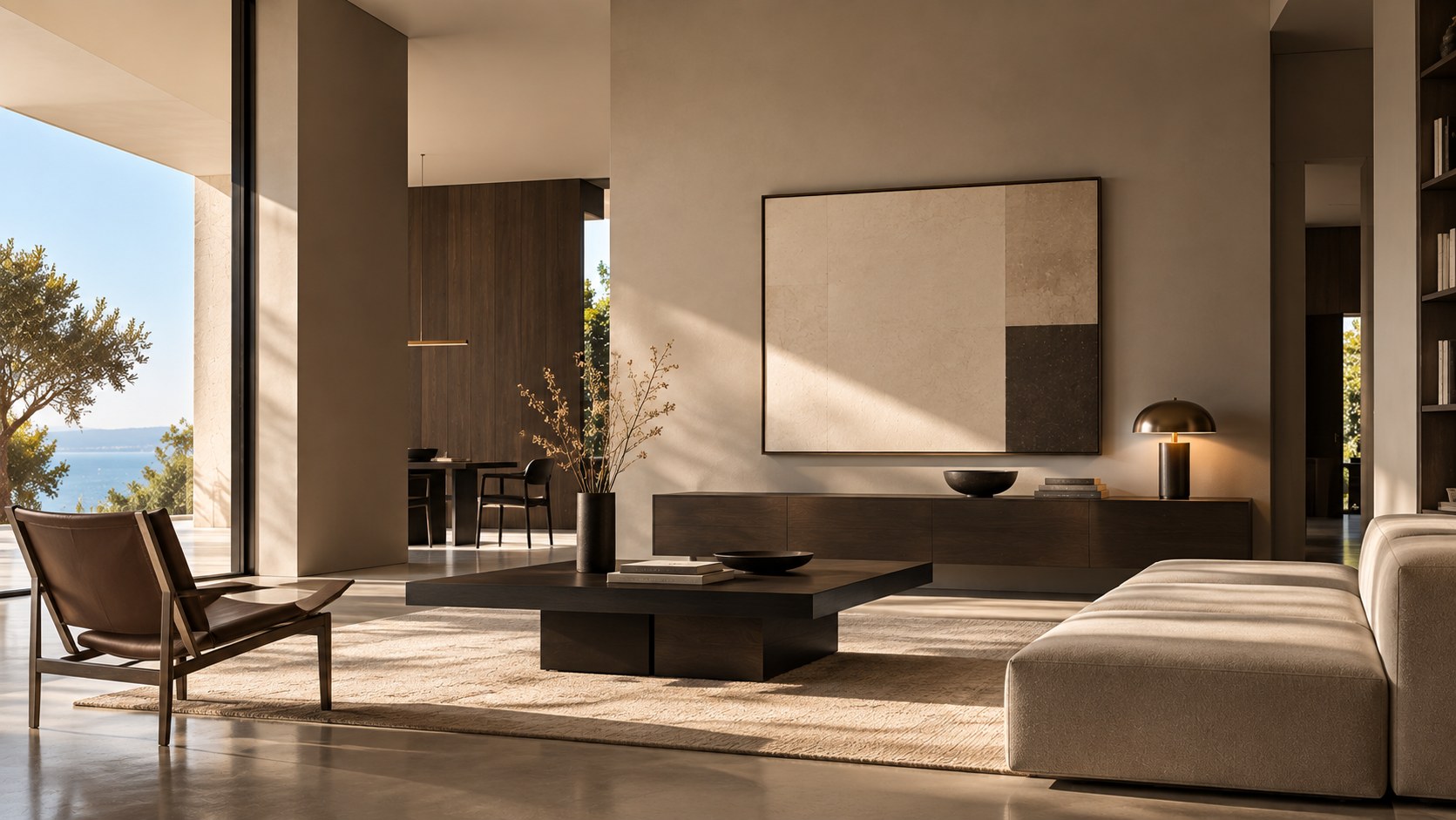
Beige, greige, taupe, sand, linen, clay, smoky brown—neutral colors have evolved considerably. No longer simply a quiet backdrop, today’s neutrals can create interiors that feel layered, warm, sophisticated, and deeply personal.
Because a neutral is never truly “neutral.”
Behind a color that appears beige or gray at first glance, there are often subtle undertones of yellow, red, green, violet, or blue. These nuances determine how a color interacts with natural light, furniture, wood, stone, and textiles.
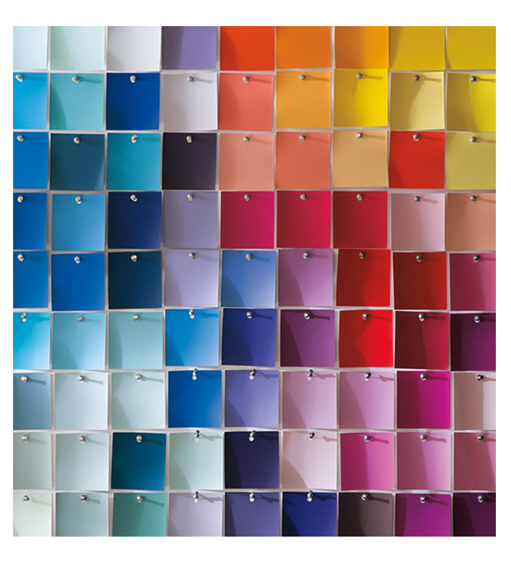
They also explain why two beiges that look almost identical on a color card can create completely different atmospheres once they’re on the wall.
So how do you choose neutral paint colors without creating a space that feels bland or impersonal? And how can you layer multiple neutrals to add character while maintaining a sense of harmony?
For years, neutral colors were often treated as the safe choice: white for brightness, gray for a modern look, beige for warmth.
Today, their role is much more interesting.
A neutral can become the defining color of a room and give an interior just as much personality as a more saturated shade.
Benjamin Moore describes neutrals as exceptionally versatile but also surprisingly complex. Depending on their undertones, they can create an atmosphere that feels warm and enveloping or cooler and more airy.
Beige alone covers an extensive spectrum, from creamy off-whites and sandy hues to deeper shades with brown or gray undertones. Greige, which sits somewhere between gray and beige, expands those possibilities even further.
The question is no longer simply which beige to choose. It’s about finding the neutral whose temperature, depth, and undertones truly work with the space.
These three color families are closely related, but they create distinctly different effects.
Beige typically leans toward warm undertones such as yellow, cream, brown, or occasionally soft pink.
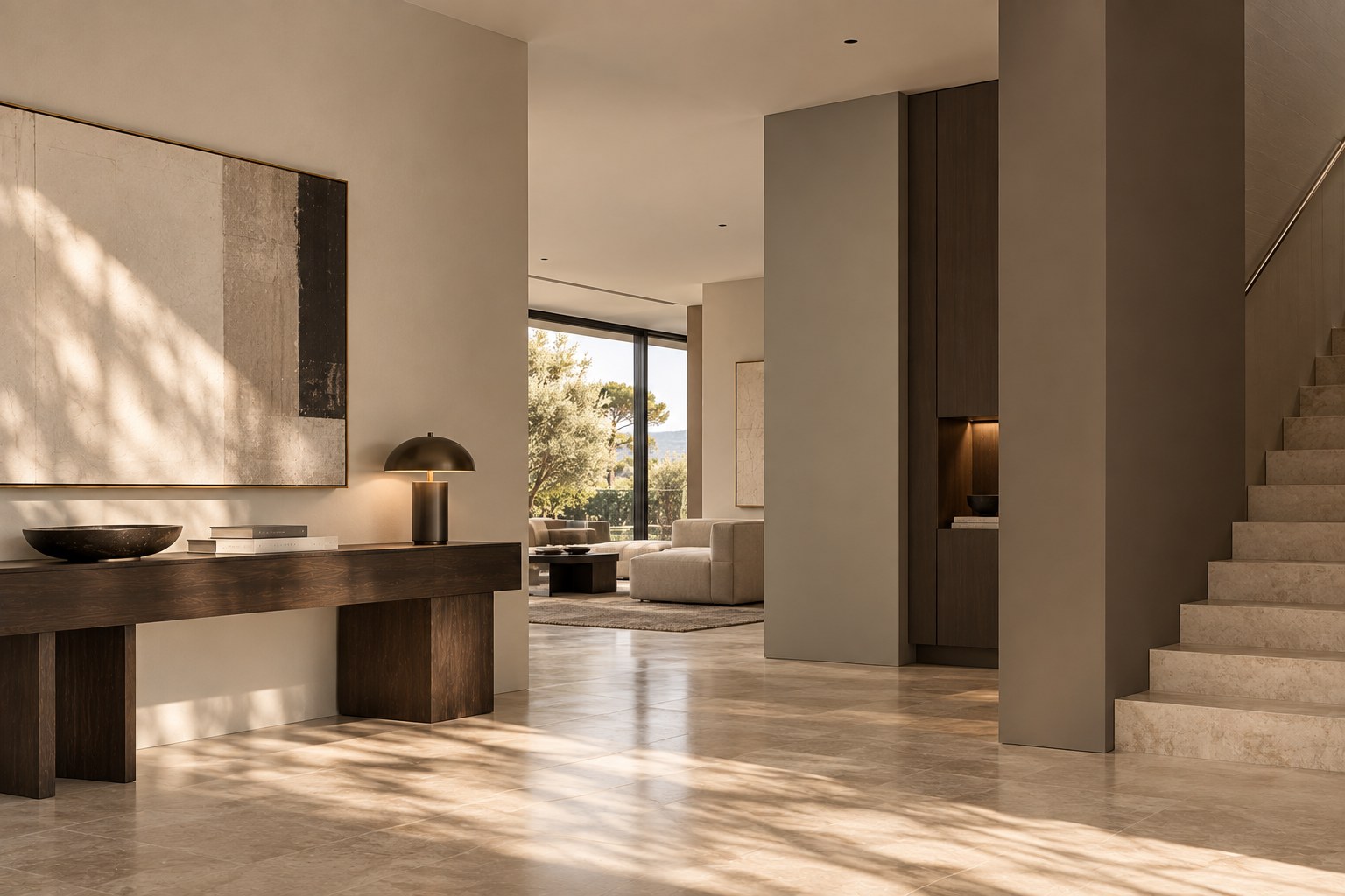
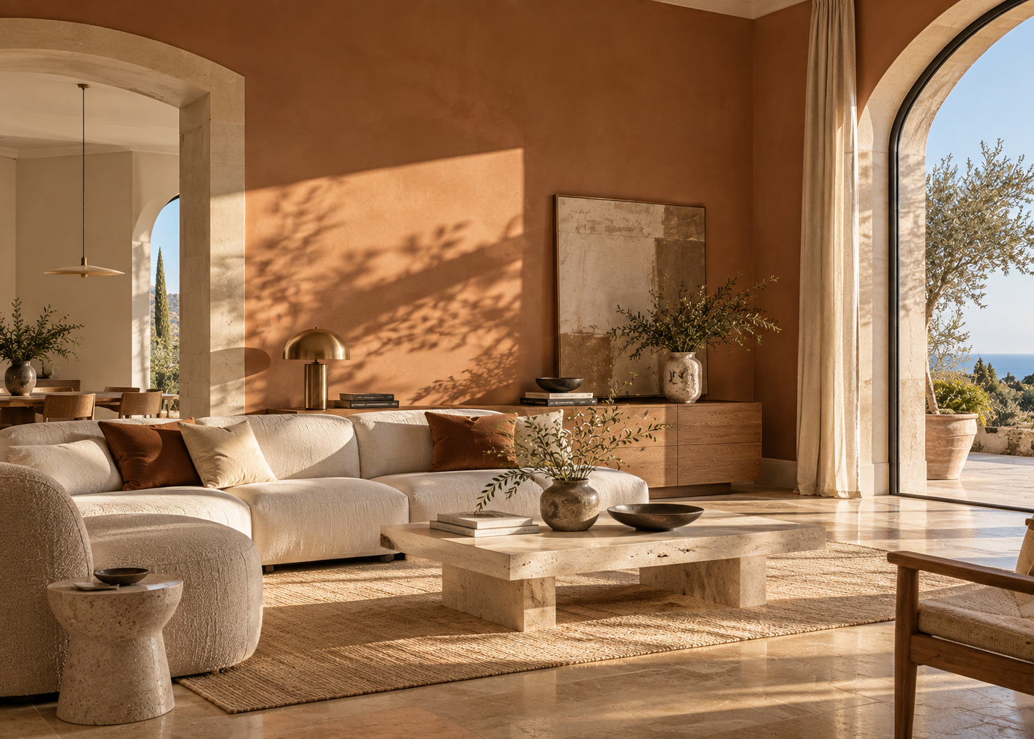
It pairs particularly well with natural wood, travertine, limestone, linen, leather, and other materials with warm undertones.
In a room filled with natural light, a mineral-inspired beige can soften the brightness and avoid the sometimes stark effect of a pure white.
Benjamin Moore colors such as Muslin OC-12, Shaker Beige HC-45, and Manchester Tan HC-81 illustrate different interpretations of beige, ranging from subtle and understated to warmer and more noticeable.
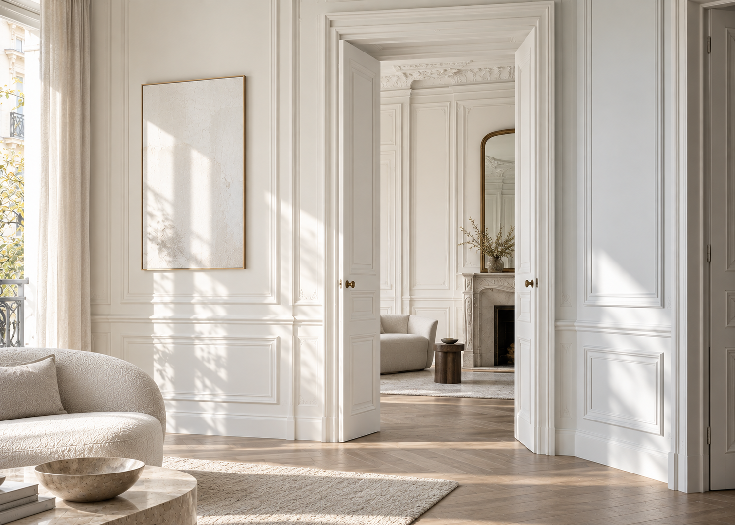
Greige combines the warmth of beige with the restraint of gray.
That balance is precisely what makes it so versatile. Depending on the light and the colors around it, a greige can appear warmer, grayer, or sometimes almost like an off-white.
Revere Pewter HC-172 is one of Benjamin Moore’s best-known examples of this color family. Edgecomb Gray HC-173, Classic Gray OC-23, Balboa Mist OC-27, and Pashmina AF-100 explore different depths and interpretations of greige.
Greige is particularly effective when you want a contemporary interior without the coolness that some traditional grays can create.
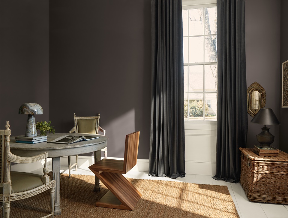
Taupe generally sits somewhere between brown and gray.
Deeper than a traditional beige, it immediately brings more dimension to a room. Some taupes lean toward warm brown, while others reveal gray or even subtle violet undertones.
Benjamin Moore describes this family as a balance of brown and gray that can feel rich, grounding, and highly versatile.
Colors such as Pashmina AF-100, Weimaraner AF-155, and Sparrow AF-720 offer a more enveloping approach to neutrals and can work beautifully in living rooms, bedrooms, libraries, studies, and entryways.
This is perhaps the most important thing to understand when choosing a neutral paint color.
A yellow-based beige will behave differently from one with subtle pink undertones. A violet-leaning taupe won’t interact with honey-toned hardwood the same way a warmer brown taupe will. And a perfectly balanced greige in one room may look noticeably grayer in another.
The surrounding colors can also emphasize particular undertones.
Warm hardwood flooring, for example, may make the cooler notes in a greige more apparent. Beige stone may do the opposite, bringing out its warmth. A gray sofa, marble countertop, or large area rug can all influence how the wall color is perceived.
That’s why a neutral should never be selected in isolation.
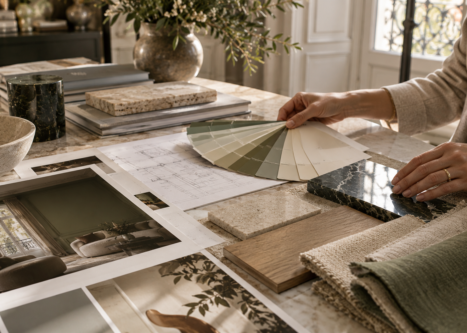
Before choosing a paint color, look at the elements that will remain in the room: flooring, stone, wood, furniture, textiles, and millwork. Together, they already form a color palette.
The paint should work in conversation with them.
The more subtle a color is, the more noticeable changes in lighting can become.
Neutrals are particularly sensitive to this effect.
A shade may feel warm in the morning, considerably lighter when direct sunlight enters the room, and grayer or deeper toward the end of the day.
Benjamin Moore points to Revere Pewter HC-172, for example, as a greige whose appearance can shift between beige, gray, and an off-white impression as lighting conditions change.
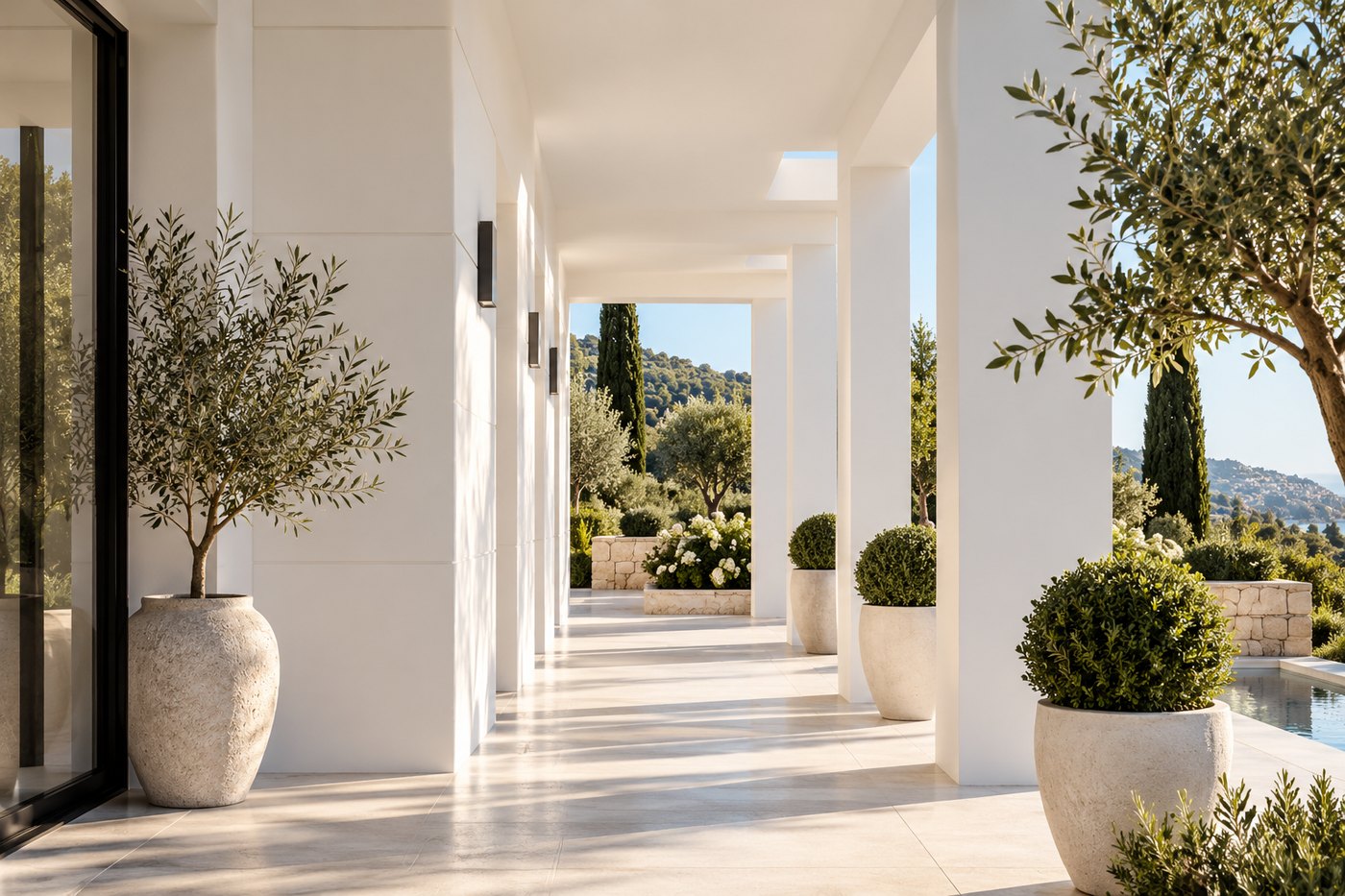
On the French Riviera, where natural light can be especially intense, this becomes particularly important. A color viewed on a small sample in a showroom may behave very differently when applied across several walls flooded with Mediterranean sunlight.
Always test the color in the actual room and observe it at different times of day, as well as under the artificial lighting you use in the evening.
A successful neutral interior rarely comes from repeating the exact same beige throughout the entire space.
Its richness comes from layering closely related tones.
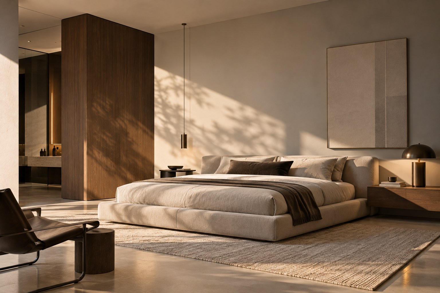
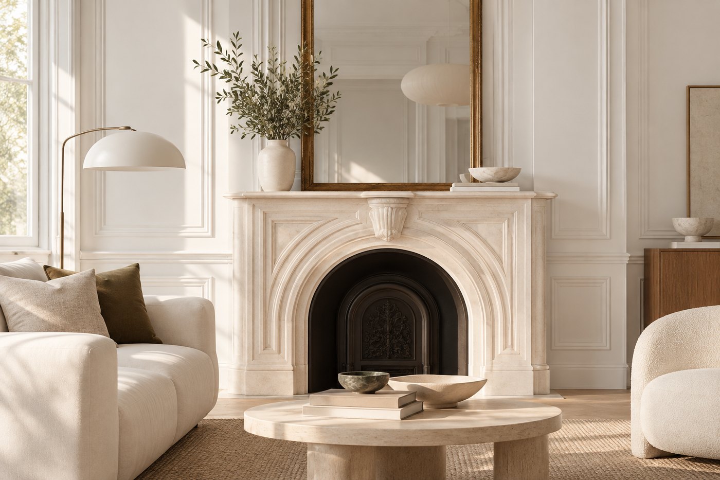
Imagine soft greige walls paired with warm white trim, a linen-colored sofa, a sandy rug, natural oak, and a few deep brown accents.
No single color dominates, yet the room has depth.
The same principle can be applied through paint alone.
A light neutral can be used on the walls with a slightly deeper shade on doors or millwork. Or you can stay within one color family while varying the depth between walls, ceilings, and architectural details.
Benjamin Moore also recommends pairing neutrals with natural materials such as linen, leather, wood, and woven fibers to add warmth and dimension to minimalist interiors.
The result is no longer monochromatic in the strict sense. It becomes tonal.
A neutral interior doesn’t have to consist entirely of pale colors.
In fact, a few deeper elements often reveal the sophistication of sand, beige, and greige more effectively.
Chocolate brown, olive green, deep blue, or charcoal can all serve this purpose.
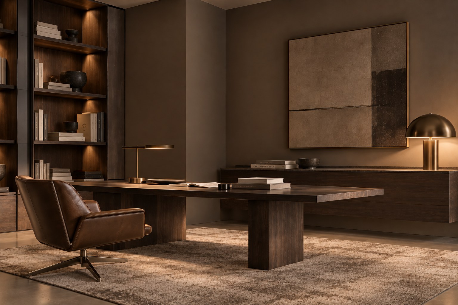
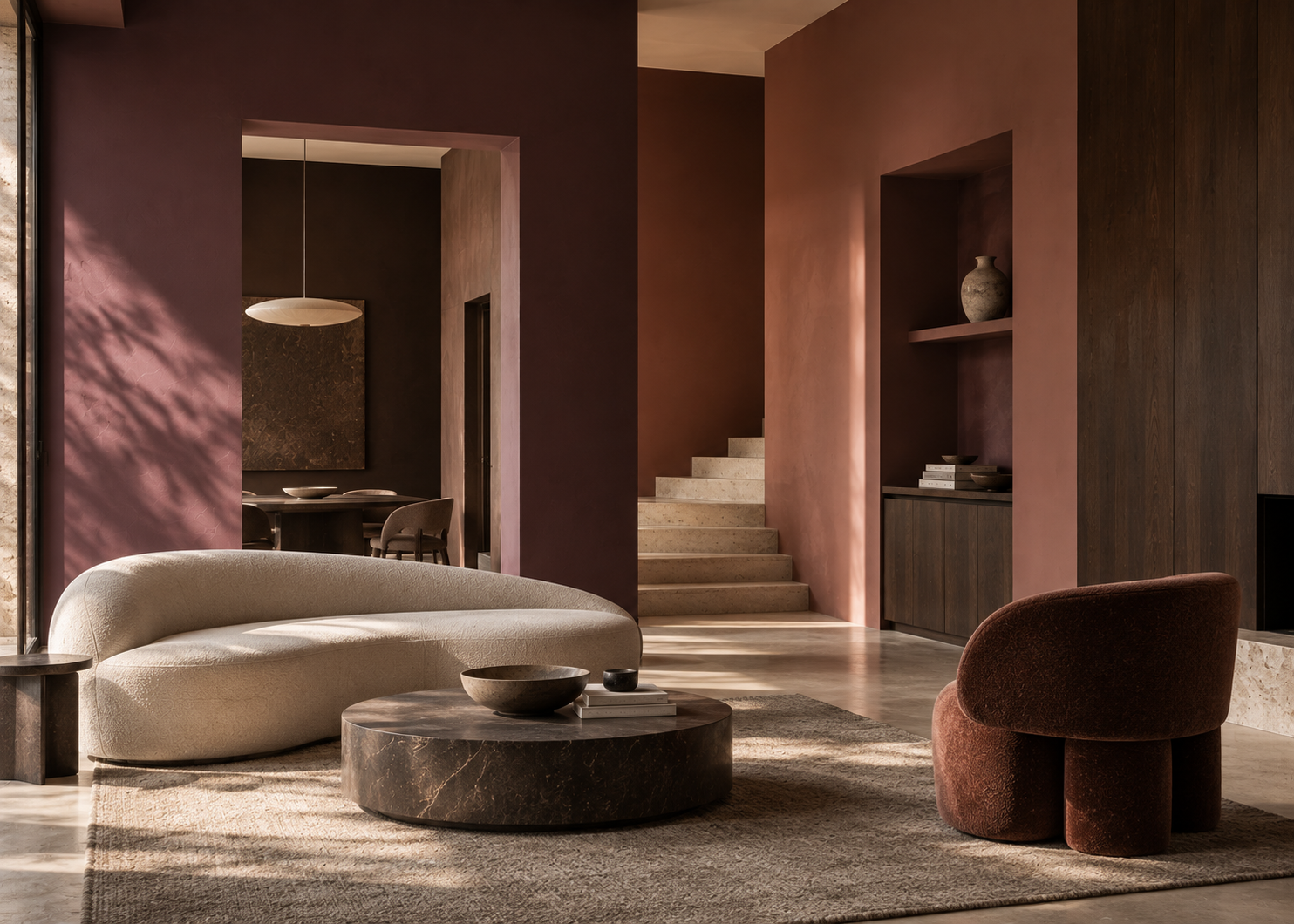
Against a neutral backdrop, a dark built-in bookcase, painted door, or substantial piece of furniture can create a visual anchor.
Contrast can also come from materials: dark wood, aged metal, veined marble, textured stone, or richly woven fabrics.
The goal isn’t to add a bold color simply to “wake up” a beige room. It’s to create different levels of visual depth.
A neutral interior becomes interesting when there is something to discover at different distances: first the overall composition, then the variations in tone, texture, and light.
When working with neutrals, texture becomes almost as important as color itself.
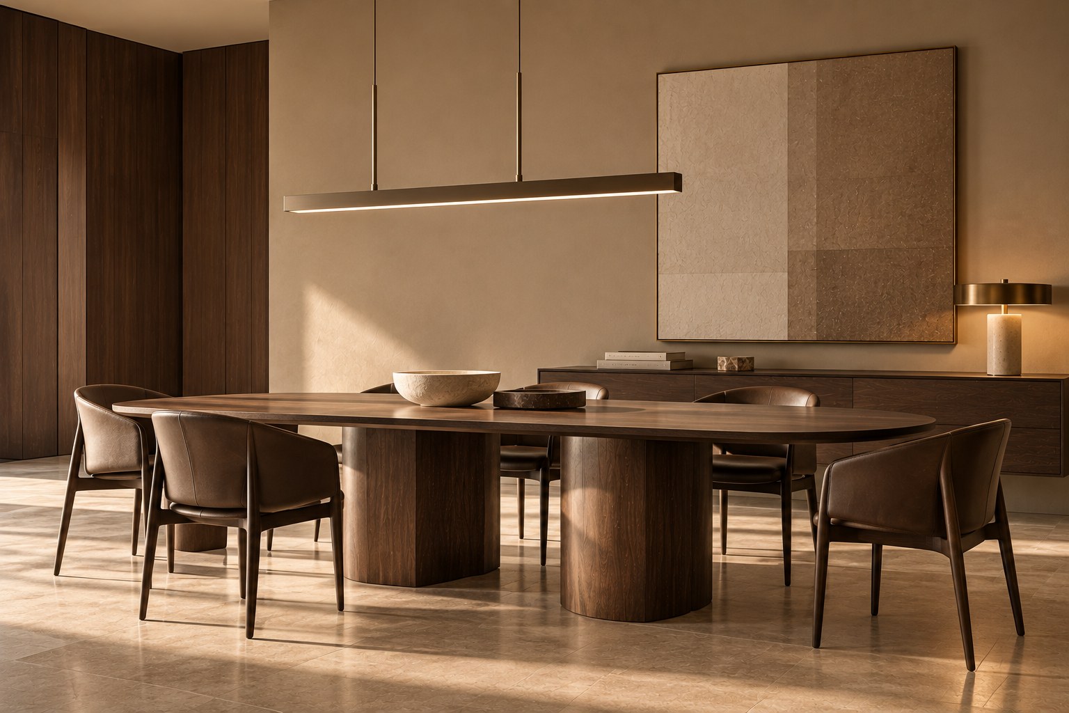
A room filled entirely with smooth surfaces in similar beige tones can quickly feel one-dimensional. Use those same colors alongside stone, wood, linen, wool, ceramics, or textured finishes, and the effect changes completely.
This is particularly relevant in contemporary Mediterranean interiors.
A greige wall can complement pale stone flooring. A deeper taupe gains dimension beside natural linen drapery. A sandy beige becomes more sophisticated when paired with dark wood or handcrafted ceramics.
The palette, therefore, doesn’t end with the paint swatches.
The tone of the wood, the warmth of the stone, the texture of the fabric, and the way each material reflects light are all part of the design.
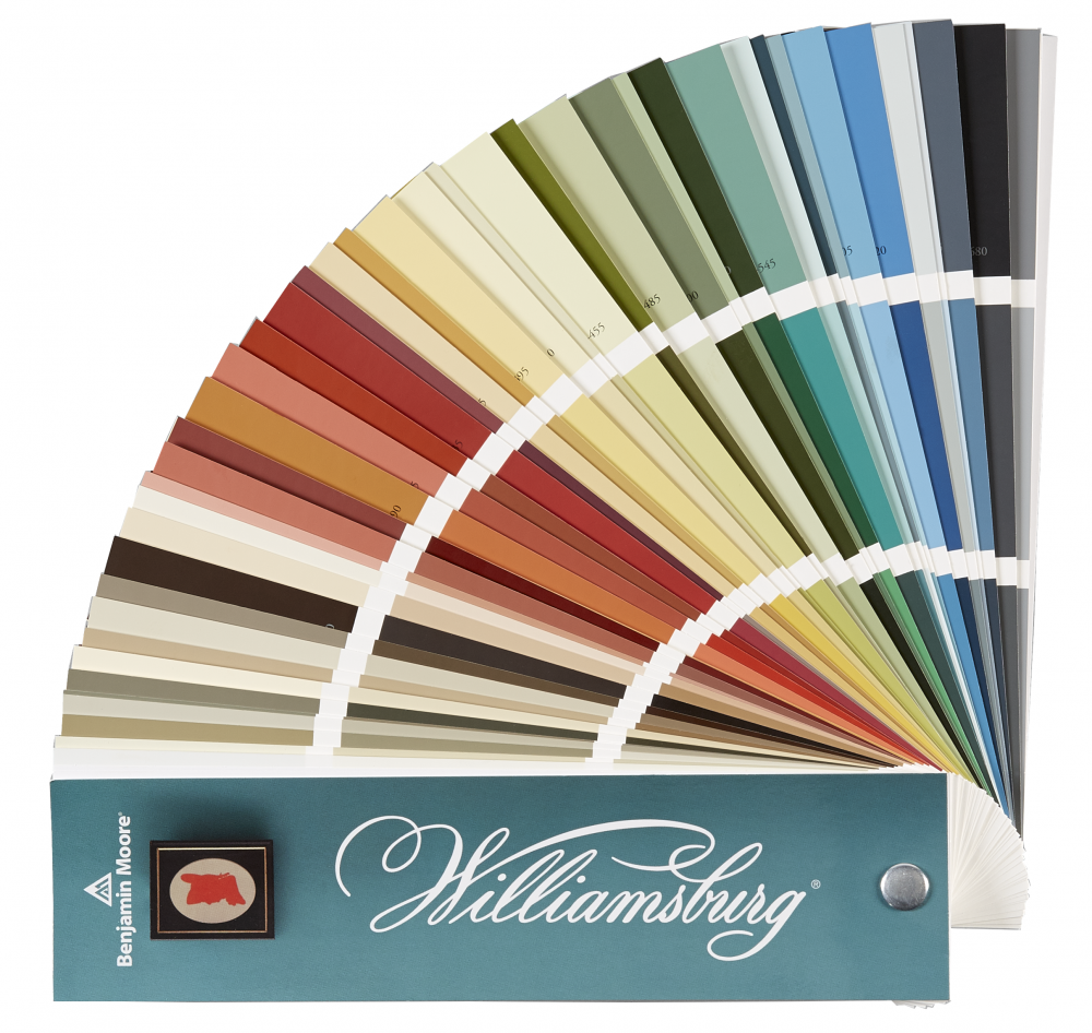
There is no universal “perfect beige.” But several Benjamin Moore colors illustrate just how varied the neutral spectrum can be.
Pale Oak OC-20 offers a light, delicate approach to neutral color.
Edgecomb Gray HC-173 sits comfortably between beige and gray and is particularly versatile.
Revere Pewter HC-172 is a more pronounced greige whose appearance can shift significantly depending on the light.
Tapestry Beige OC-32 balances warm and cool undertones and offers an interesting interpretation of a light greige.
Pashmina AF-100 introduces greater depth while retaining the sophistication and versatility of a neutral.
For those ready to move beyond very pale palettes, Weimaraner AF-155 and Sparrow AF-720 offer richer, more enveloping interpretations of taupe.
These colors aren’t meant to serve as a ready-made formula. Instead, think of them as starting points for understanding the different directions a neutral palette can take.
The final choice should always be tested and evaluated in the actual space.
That may be the greatest strength of today’s neutrals.
They don’t necessarily need to be the most dramatic element in a room. Instead, they create the conditions for everything else to work: light feels softer, materials become more noticeable, architectural volumes feel more cohesive, and furnishings settle naturally into the space.
A well-chosen neutral can appear simple at first.
Then, throughout the day, it begins to shift. It feels warmer in sunlight, deeper in the evening, slightly grayer beside stone, or softer next to natural wood.
That quiet complexity is exactly what gives it character.
Choosing a neutral doesn’t mean choosing less color. It means working with color in a more nuanced way.