Your Cart
0 products
Inspiration
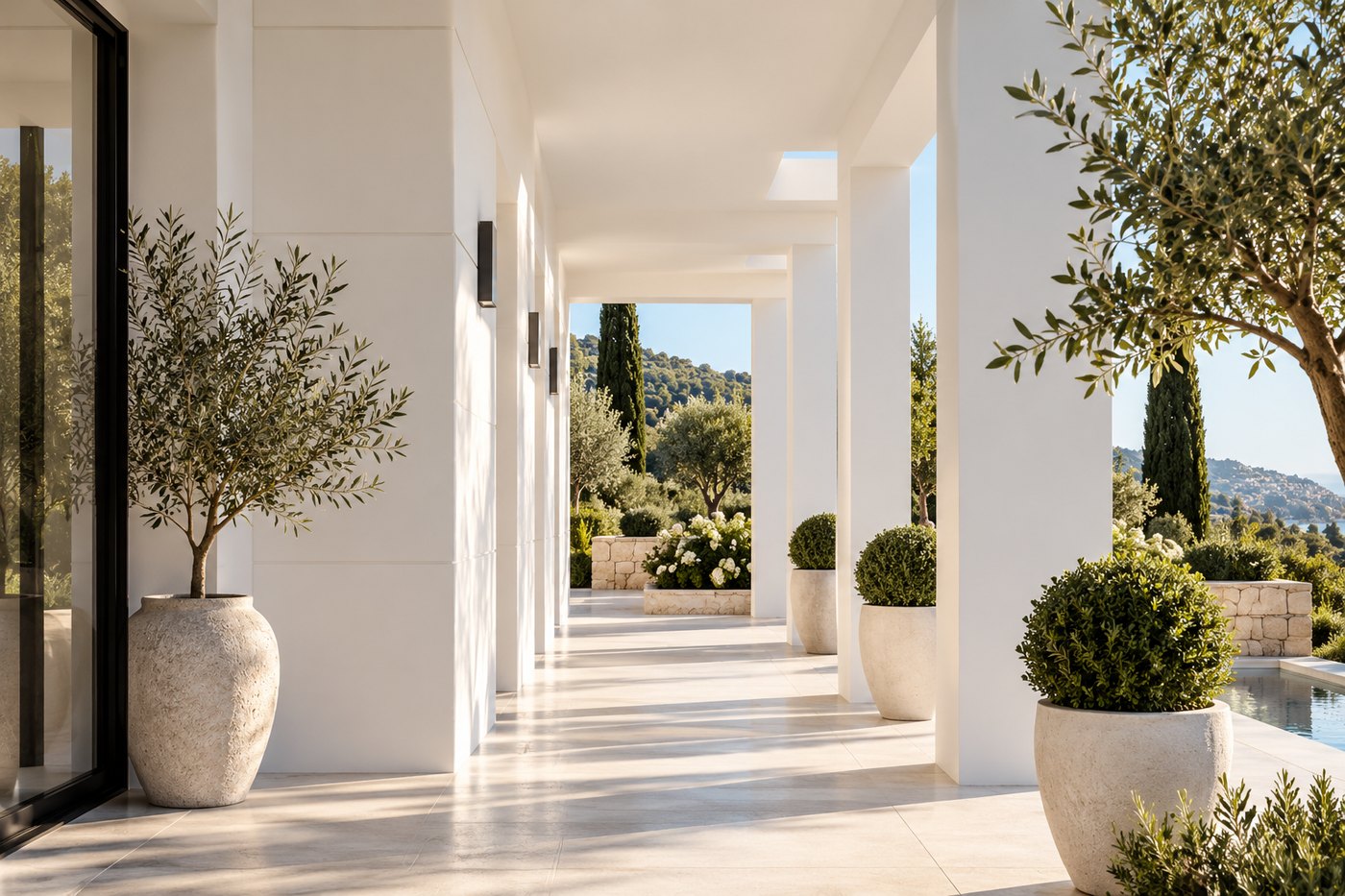
On the French Riviera, color is everywhere. It lives in the golden light of late afternoon, the pale stone of historic façades, the ochre earth of the hills, the silvery green of olive trees, and the ever-changing blues of the Mediterranean.
But creating a Mediterranean-inspired interior doesn’t necessarily mean pairing white walls with a few bright blue accents. Today, Mediterranean style is far more nuanced: mineral tones, warm neutrals, sun-washed colors, and carefully chosen deeper shades come together to create spaces that feel natural, sophisticated, and contemporary.
The goal is not to reproduce the landscape literally, but to capture its balance: the warmth of the earth, the softness of stone, the muted greens of Mediterranean vegetation, and the depth of certain blues.
So how do you build a palette for a home or apartment in Nice, Cannes, Antibes, or Monaco without falling into familiar clichés—and, more importantly, how do you choose the right shades?
The starting point for a successful Mediterranean palette isn’t a decorating rule. It’s the landscape itself.
Consider the colors found throughout the French Riviera: limestone and natural stone, sand, terracotta, softly weathered façades, natural wood, the gray-green foliage of olive trees, and, of course, the many shades of the sea and sky.
These colors have one thing in common: they rarely feel artificial. Even when they are rich or saturated, they retain an organic or mineral quality.
That is precisely what makes it possible to create a contemporary Mediterranean interior without turning your living room into a themed vacation home.
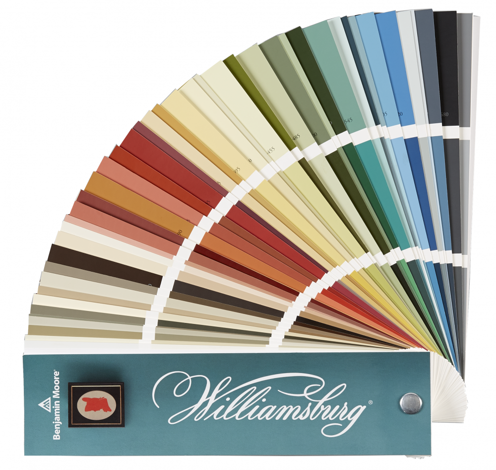
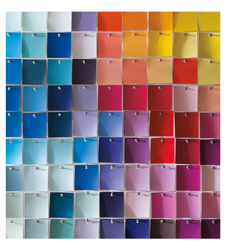
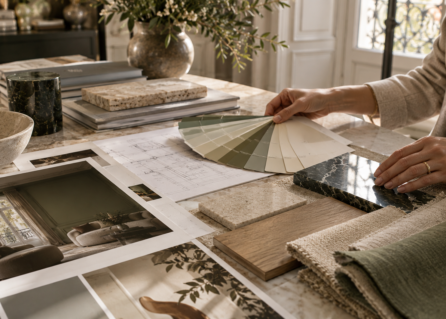
Our advice: before you even open a color fan deck, look at what will remain in the room—the flooring, stone, wood, millwork, countertops, and key textiles. Together, these elements already form a palette. The paint should work in conversation with them rather than being chosen in isolation.
For large surfaces, warm-leaning neutrals are often an excellent place to begin.
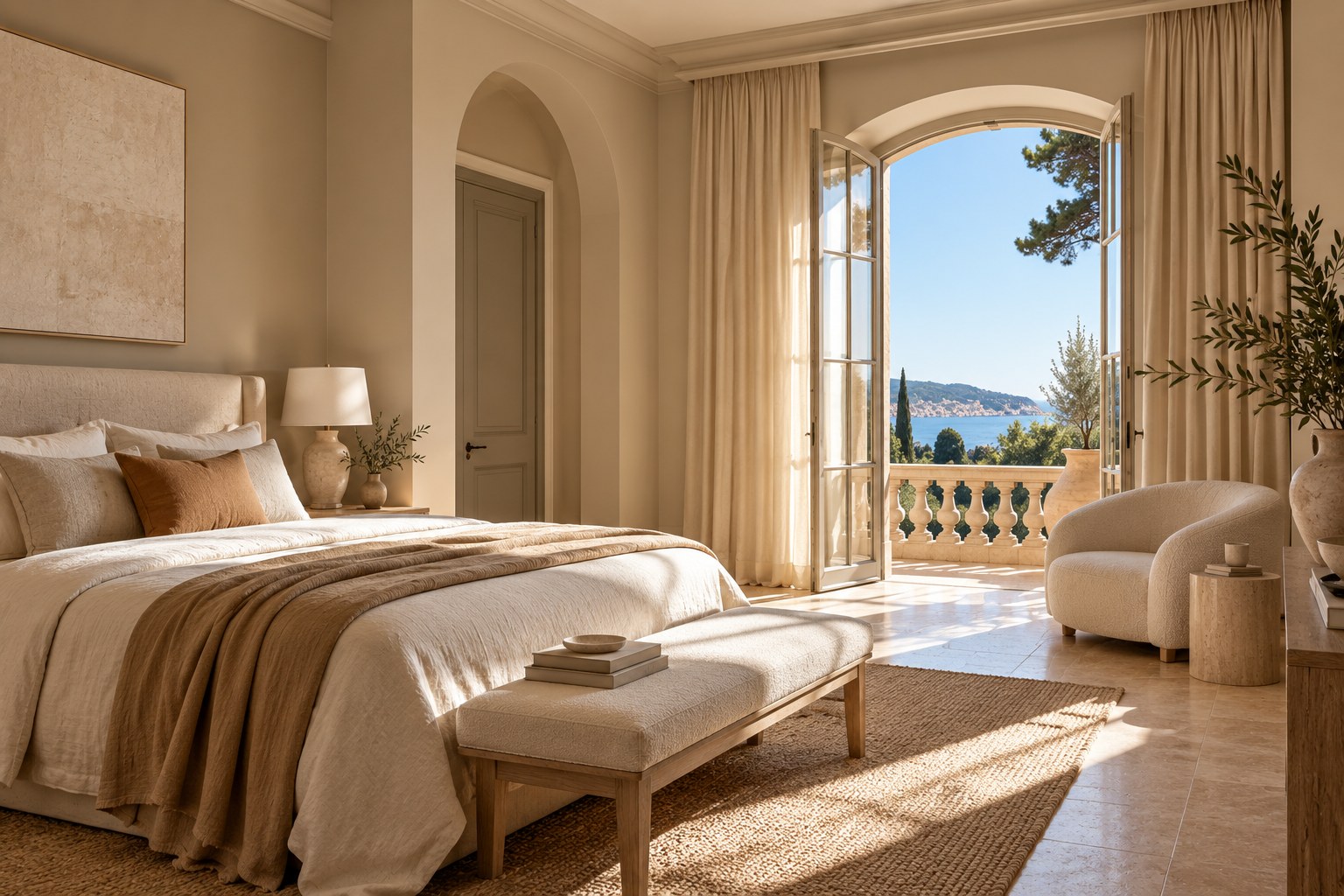
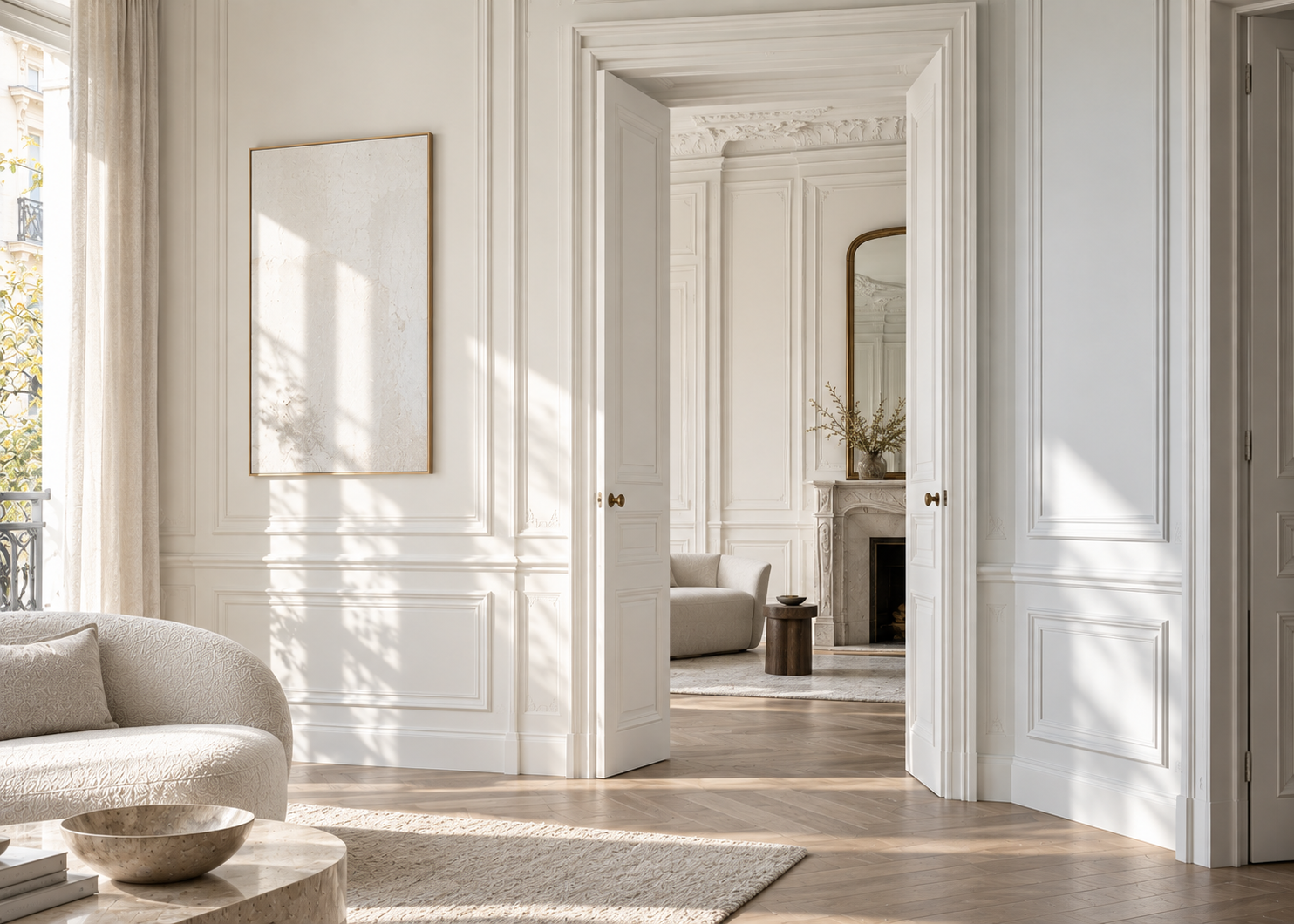
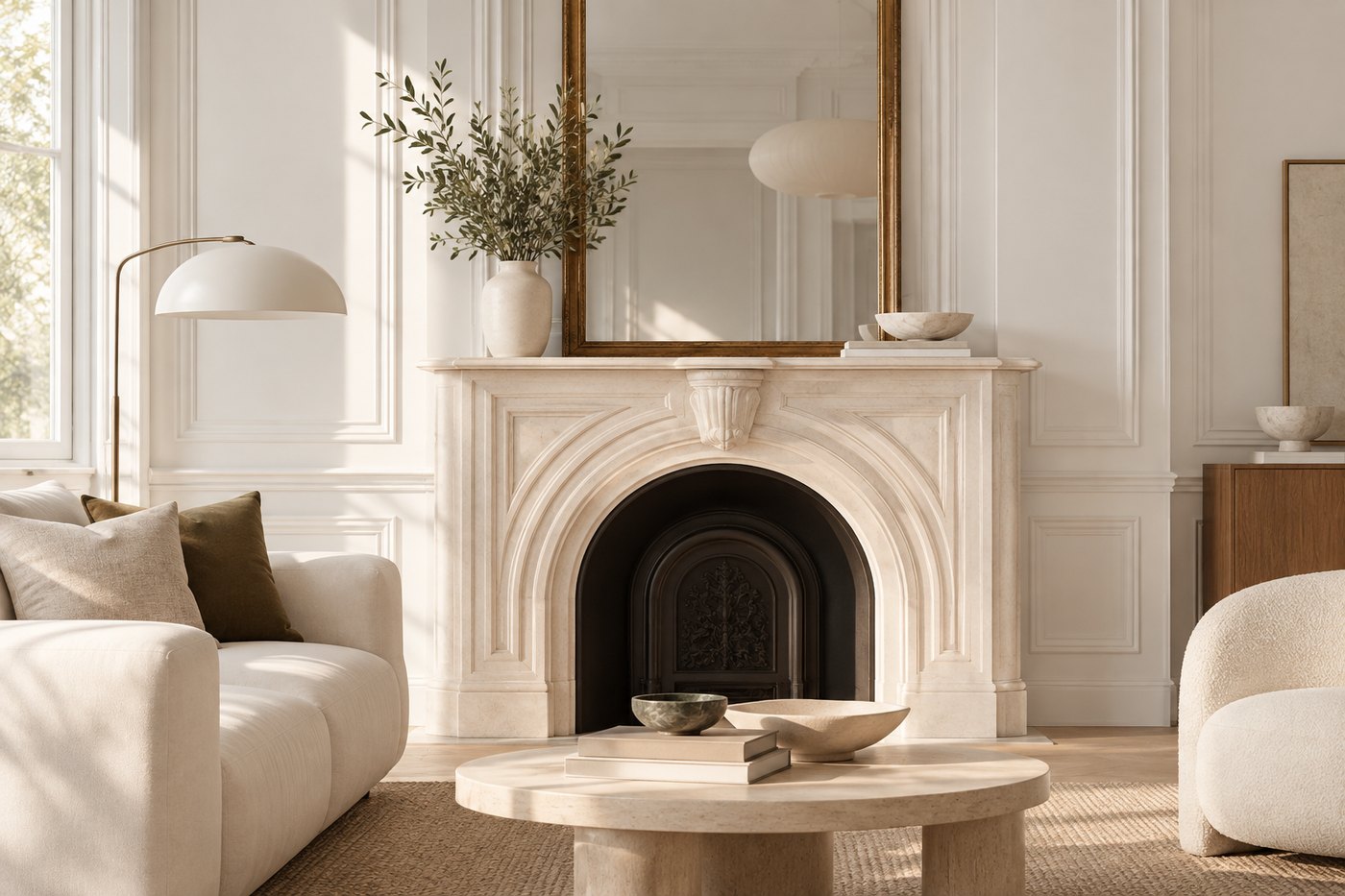
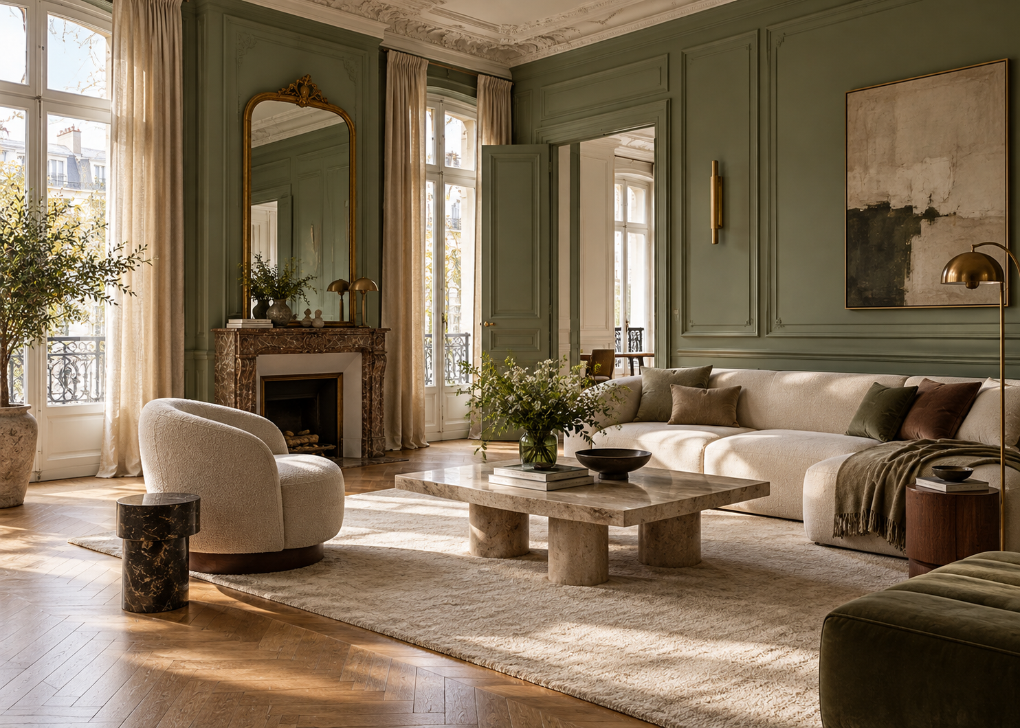
Instead of a stark, cool white, consider soft off-whites, sandy beiges, warm greiges, or subtle taupes. These shades pair particularly well with natural stone, travertine, light oak, linen, and other organic materials.
Colors such as Niveous OC-36, Sandy Brown 1046, and Edgecomb Gray HC-173 offer different ways to introduce understated warmth. They give the walls presence without allowing them to overpower the architecture.
Sand and beige: Sandy Brown 1046 · Muslin OC-12 · Shaker Beige HC-45 · Manchester Tan HC-81 Greige: Edgecomb Gray HC-173 · Classic Gray OC-23 · Pale Oak OC-20 · Balboa Mist OC-27 Taupe: Pashmina AF-100 · Kingsport Gray HC-86 · Rockport Gray HC-105
The choice between these color families depends largely on the light and the materials already present in the room.
In a south-facing room, naturally warm sunlight can emphasize the yellow undertones of a beige. A balanced greige may create a more subtle result. In a darker or north-facing room, on the other hand, a slightly warmer neutral can help prevent the space from feeling too gray.
If you have travertine or beige stone flooring, compare several neutrals directly against the stone. Two beiges that appear almost identical on a color card can reveal very different undertones once placed beside the floor.
The goal isn’t to make the walls disappear. It’s to allow them to become a natural backdrop for the architecture, furnishings, and materials around them.
Earthy colors are an essential part of the Mediterranean landscape.
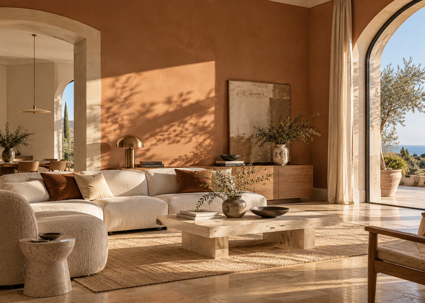
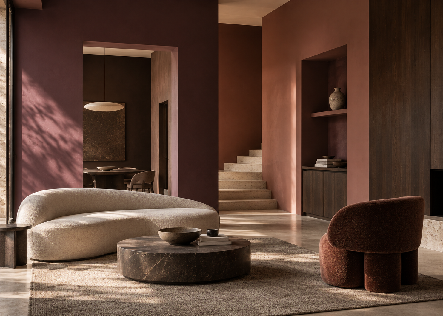
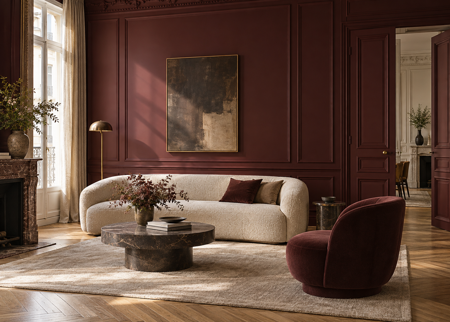
Terracotta, clay, dusty brown-pinks, soft ochres, and weathered reds can immediately add depth and warmth to an interior. But the contemporary approach to these colors is more nuanced than it once was.
Rather than filling a room with decorative objects that reference the South, we prefer to use color itself as an architectural element—on a wall, in an entryway, inside a niche, on built-in shelving, or across millwork.
Terracotta: Terra Cotta Tile 2090-30 · Firenze AF-225 · Rustique AF-275 Clay: Potters Clay 1221 · Baked Clay 035 · Fresh Clay 2093-20 Ochre: Ochre 2151-30 · Golden Straw 2152-50 · Marblehead Gold HC-11 Dusty brown-pink: Antique Rose 2173-40 · Badlands 1293 · Moroccan Spice AF-285
These are all official Benjamin Moore color names and codes; for example, Benjamin Moore describes Moroccan Spice AF-285 as a muted pink-undertoned red, while its current palettes also include Antique Rose 2173-40 and Badlands 1293.
How much surface you paint matters just as much as the shade itself.
In a large, sun-filled room, a muted terracotta can cover an entire wall without making the space feel heavy. In a more compact interior, the same color family may work better inside a niche, on a door, or across built-in cabinetry.
With pale stone, clay or terracotta creates an elegant warm contrast. With dark brown wood, choose an earthy shade whose undertone is sufficiently distinct from the wood itself—the subtle contrast will give the room more depth.
A clay-colored wall paired with an ivory sofa, dark wood, and a few stone elements creates a far more sophisticated result than filling the room with overtly “Mediterranean” decorative accessories.
Here, color itself becomes part of the architecture.
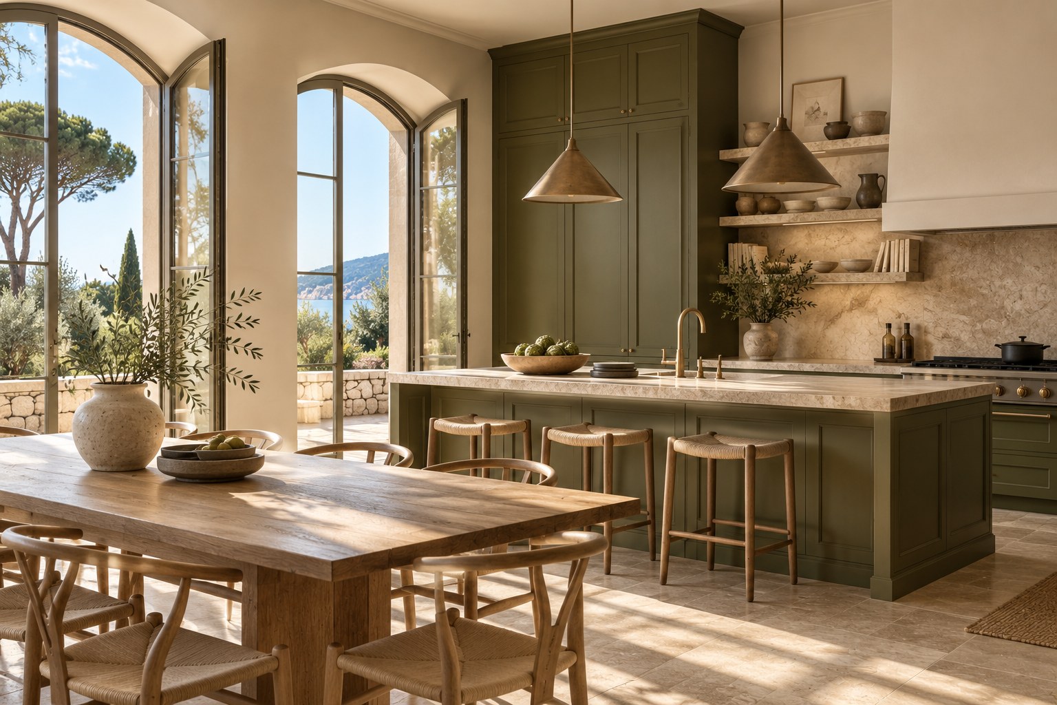
When we think of the South of France, blue often comes to mind first. Yet muted greens are just as characteristic of the Mediterranean landscape.
Olive trees, pines, cypress trees, and native vegetation create a spectrum of gray-green, earthy, and deep green tones that translate beautifully into interiors.
Mediterranean Olive 2142-10 is an excellent option for introducing a deep, earthy green. It can be paired with White Dove OC-17 and Fieldstone 1558 to create a more layered palette.
Deep olive: Mediterranean Olive 2142-10 Sage and muted green: October Mist 1495 · Saybrook Sage HC-114 · Gloucester Sage HC-100 · Thornton Sage 464
Again, there is no need to paint the entire room.
In a kitchen, green can be introduced through cabinetry rather than walls. In a bedroom, a softer sage can create a cocooning atmosphere. In an entryway, study, or library, a deeper olive can give the space greater architectural presence.
With mineral beige or warm stone, an earthy olive naturally extends the palette. If the room already contains a significant amount of warm wood, a grayer sage can create a more interesting contrast and prevent the overall scheme from becoming too yellow.
It would be impossible to talk about the French Riviera without mentioning blue.
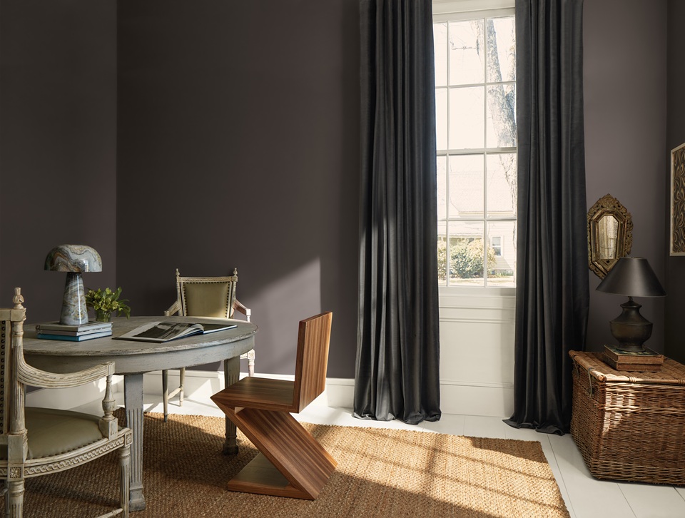
The mistake, however, is trying to reproduce the exact blue of the Mediterranean. In contemporary interiors, slightly grayed, muted, or deeper blues are often easier to integrate than highly saturated shades.
Blue-gray: Boothbay Gray HC-165 · Brewster Gray HC-162 · Van Courtland Blue HC-145 · Smoke 2122-40 Deep blue: Newburyport Blue HC-155 · Hale Navy HC-154 · Van Deusen Blue HC-156 · Gentleman’s Gray 2062-20
A blue-gray can work across a relatively large surface while remaining understated. A deep blue is particularly effective when it becomes an architectural element: custom built-ins, millwork, a door, or integrated cabinetry.
In a room flooded with natural light, that depth can also provide the contrast needed to give the architecture greater definition.
Our advice: if your palette already includes sand, ochre, terracotta, or olive, use blue as a visual anchor rather than the dominant theme. This is often what separates a contemporary Mediterranean-inspired interior from a literal “seaside” scheme.
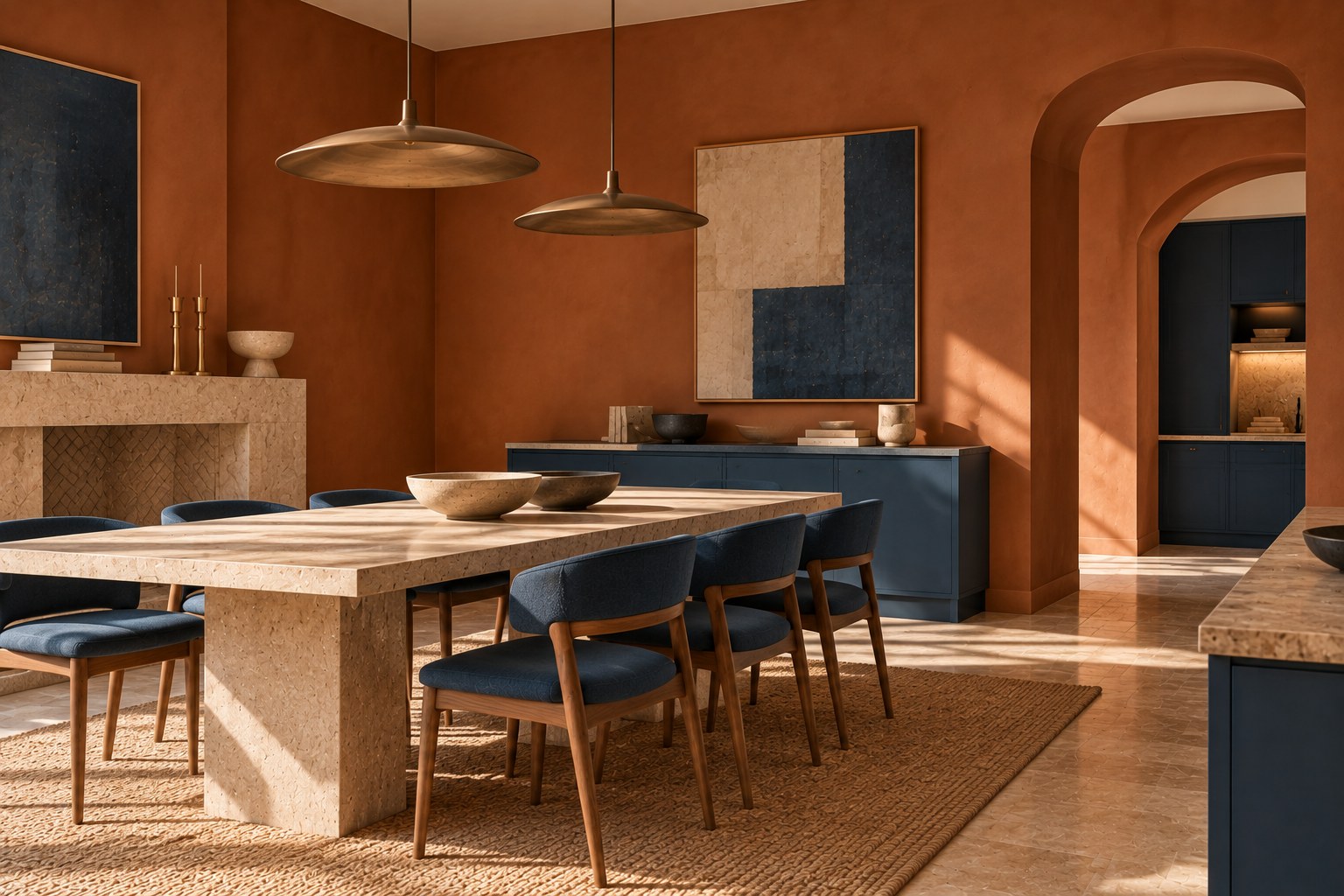
A harmonious interior is rarely built around a single paint color.
To simplify the process, we often work with three levels of color:
1. A dominant shade for the largest surfaces. 2. A secondary color to create depth. 3. An accent color used more selectively.
For example, Sandy Brown 1046 can form the foundation of the room, while Mediterranean Olive 2142-10 appears on millwork or built-ins and terracotta is introduced as an accent.
For a lighter scheme, Edgecomb Gray HC-173 can cover the main surfaces, paired with a soft off-white and a deeper taupe on a door or built-in bookcase.
In a more expressive interior, an earthy shade can become the dominant color, while Niveous OC-36 provides breathing room and deep brown accents give the composition structure.
This approach also helps avoid a common mistake: choosing several beautiful colors individually that no longer feel connected once they are brought together.
Before finalizing your palette, place your paint samples next to the flooring, stone, wood, and key textiles. If a color suddenly appears too yellow, too pink, too gray, or too cool, the color itself has not necessarily changed—the surrounding materials are simply revealing its undertones.
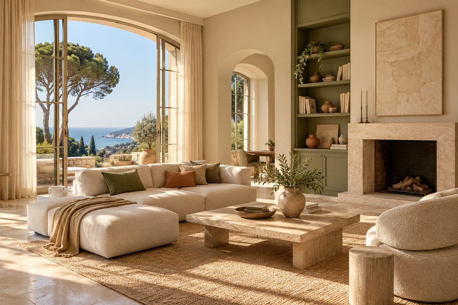
The same paint color can look remarkably different depending on the time of day, the room’s exposure, and the artificial lighting used at night.
This becomes particularly important in the bright interiors of Southern France. A color viewed in a showroom or on a small sample can appear significantly lighter and warmer once it covers several square meters of wall exposed to strong sunlight.
That is why we never recommend making a final color decision based solely on a screen or a color card.
Test your shortlisted shades in the actual room and observe them:
Most importantly, test a sufficiently large area. A few centimeters of color are rarely enough to evaluate subtle undertones accurately.
If you are deciding between three beiges or two greiges, don’t necessarily look for the one that seems “prettiest” on the color card. Look for the one that remains right in your light and alongside your materials.
That is often when a color reveals its true character.
The Mediterranean isn’t a combination of three colors. It is first and foremost a relationship between light, materials, and color.
A French Riviera-inspired interior can be bright and airy or rich and enveloping, minimalist or more traditional. What gives it coherence is a palette that feels naturally connected to its surroundings.
Mineral neutrals bring lightness. Terracotta and ochre introduce warmth. Muted greens create a connection to the landscape. Deep blues add contrast and perspective.
But what matters most is the balance between them.
Start with the elements you are not going to change—stone, hardwood flooring, millwork, and key pieces of furniture—then choose your dominant shade. Add a secondary color and, only if the space needs it, a deeper accent.
And before making the final decision, always evaluate the entire palette in the actual light of the space.
That may be the essence of contemporary Mediterranean elegance: not recreating the landscape indoors, but bringing its atmosphere into the home.
La Méditerranée n’est pas une combinaison de trois couleurs. C’est avant tout une relation particulière entre lumière, matière et couleur.
Un intérieur inspiré de la Côte d’Azur peut être très clair ou profondément coloré, minimaliste ou plus classique. Ce qui lui donne sa cohérence est une palette qui semble appartenir naturellement au lieu.
Des neutres minéraux pour apporter de la lumière. Des terres et des ocres pour introduire la chaleur. Des verts sourds pour créer un lien avec le paysage. Des bleus profonds pour apporter contraste et perspective.
Mais le plus important reste l’équilibre entre ces couleurs.
Commencez par les éléments que vous ne changerez pas — pierre, parquet, menuiseries, mobilier important — puis choisissez votre teinte dominante. Ajoutez ensuite une couleur secondaire et, seulement si l’espace en a besoin, un accent plus profond.
Et avant toute décision définitive, regardez toujours la palette dans la lumière réelle du lieu.
C’est peut-être là que réside l’élégance méditerranéenne contemporaine : ne pas reproduire le paysage, mais en faire entrer l’atmosphère dans la maison.
---