Your Cart
0 products
Inspiration
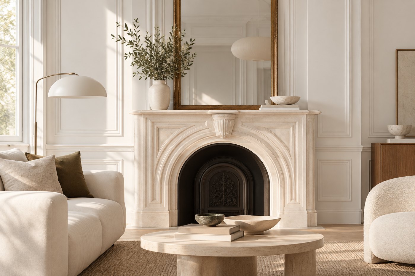
For years, one decorating rule seemed almost unquestionable: light colors make a room feel larger, while dark colors make it feel smaller. As a result, white, beige, and pale gray dominated walls, while deeper shades were often reserved for a pillow, an armchair, or—at most—a single accent wall.
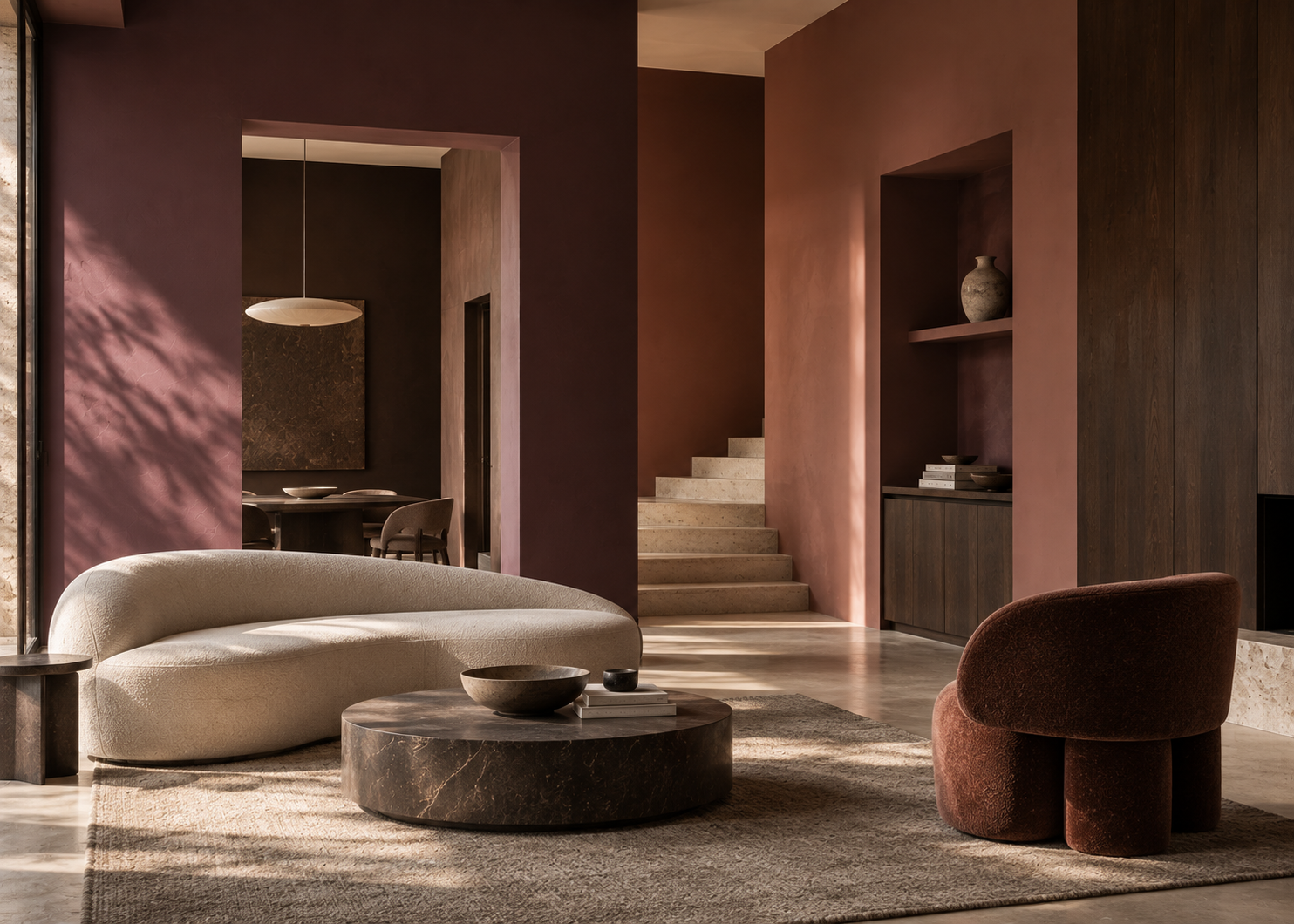
Yet chocolate brown, burgundy, forest green, and midnight blue can transform an interior in ways lighter colors simply cannot. They create depth, emphasize architecture, and give a room a more intimate, enveloping quality.
Benjamin Moore considers dark colors a powerful way to introduce sophistication, intimacy, and character. Deep browns can function almost like rich neutrals, while saturated greens, blues, and burgundies create spaces with a stronger sense of identity.
So the real question isn’t whether you can use a dark color.
It’s how to use one in a way that truly enhances the space.
This may be one of the most persistent misconceptions in interior design.
Yes, darker colors absorb more light than very pale ones. But our perception of space depends on more than brightness alone.
When walls are painted in a deep shade, corners and boundaries can become less visually pronounced. Instead of focusing on each individual wall, the eye begins to experience the room as a more continuous volume.
This can be especially effective in a small space.
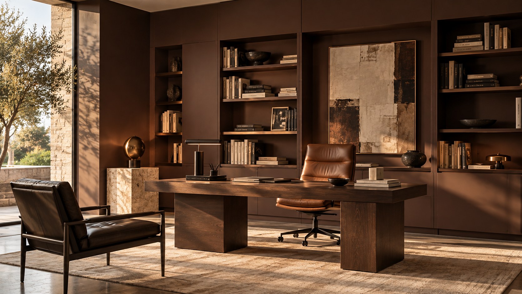
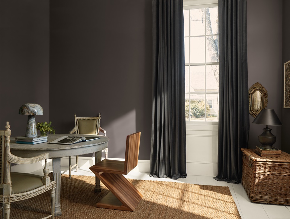
Rather than trying to make every small room appear larger, consider embracing its proportions and creating a deliberately intimate atmosphere: a midnight blue entryway, a chocolate brown home office, a deep green bedroom, or a burgundy powder room can have far more personality than the same spaces painted white by default.
The goal shifts. Instead of trying to correct the room, you begin to work with its character.
Among darker colors, brown is one of the easiest to incorporate.
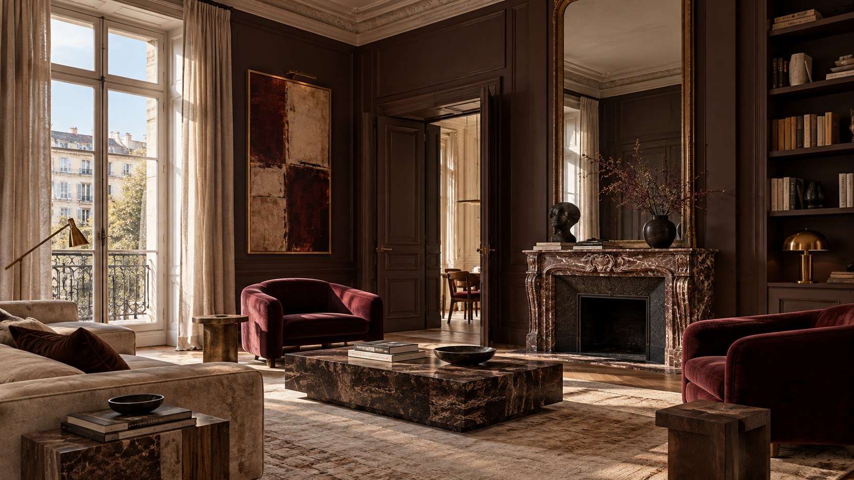
Chocolate, coffee, mahogany, burnt earth—these shades immediately bring warmth and depth while retaining much of the versatility of a neutral.
Benjamin Moore describes deep browns as a sophisticated alternative to lighter neutrals, capable of creating spaces that feel warm, grounded, and refined.
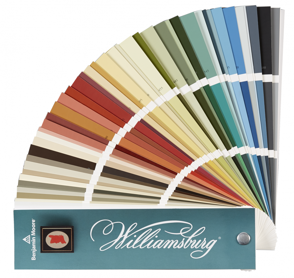
Colors such as Wenge AF-180, French Press AF-170, Hearthstone Brown 2109-20, and Char Brown 2137-20 demonstrate just how varied this color family can be.
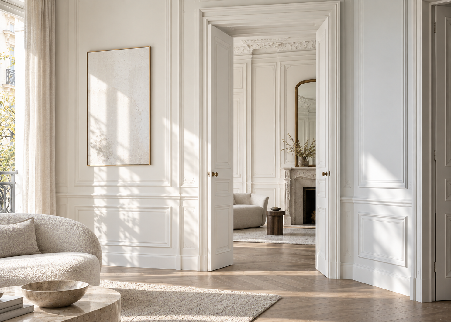
Brown pairs particularly well with creamy whites, warm beiges, natural woods, leather, stone, and warm-toned metals.
In a living room, it can create a sophisticated backdrop for a light-colored sofa and artwork. In a home office or library, it immediately adds intimacy. On kitchen cabinetry or built-in shelving, it creates depth without the visual severity that black can sometimes bring.
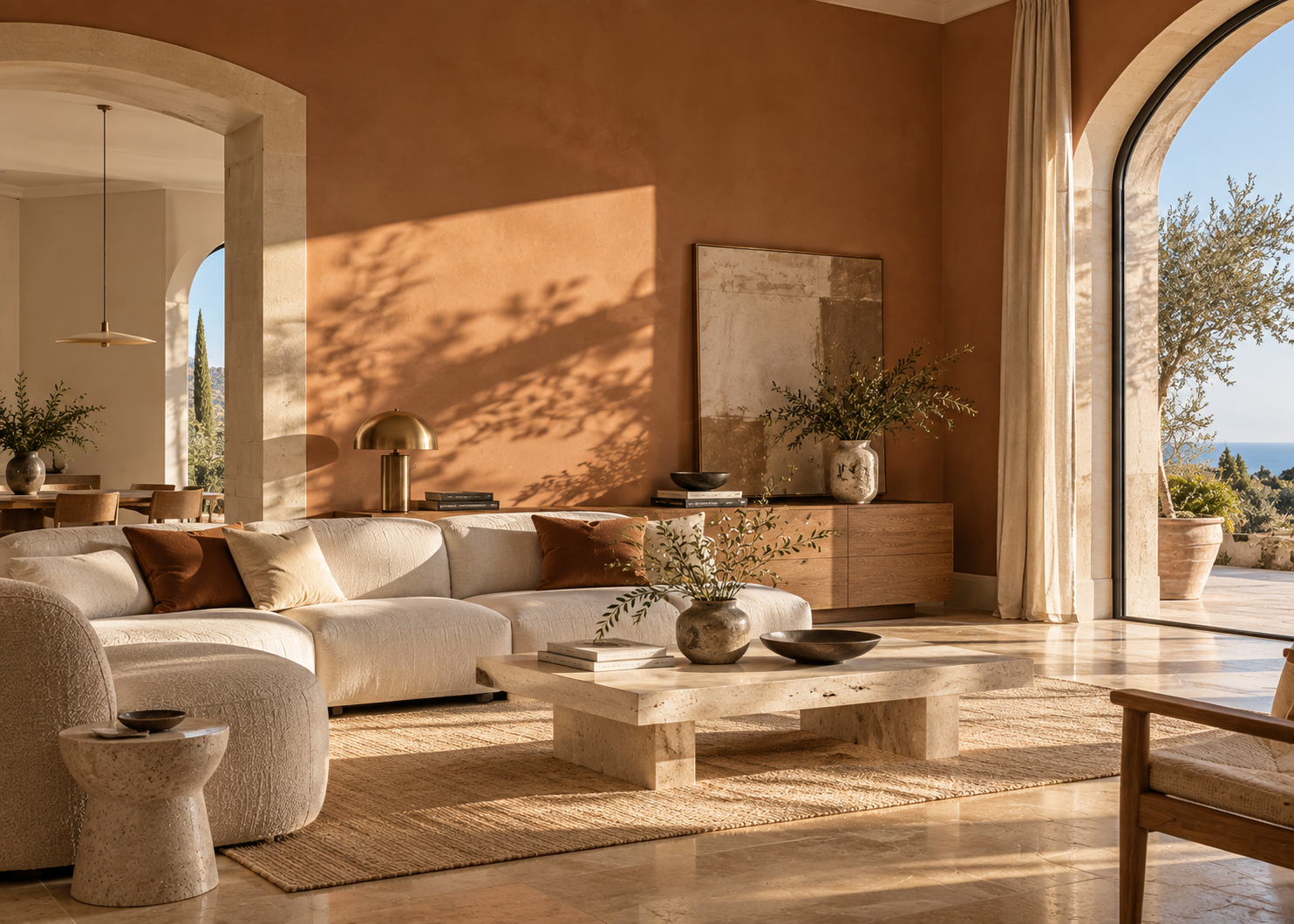
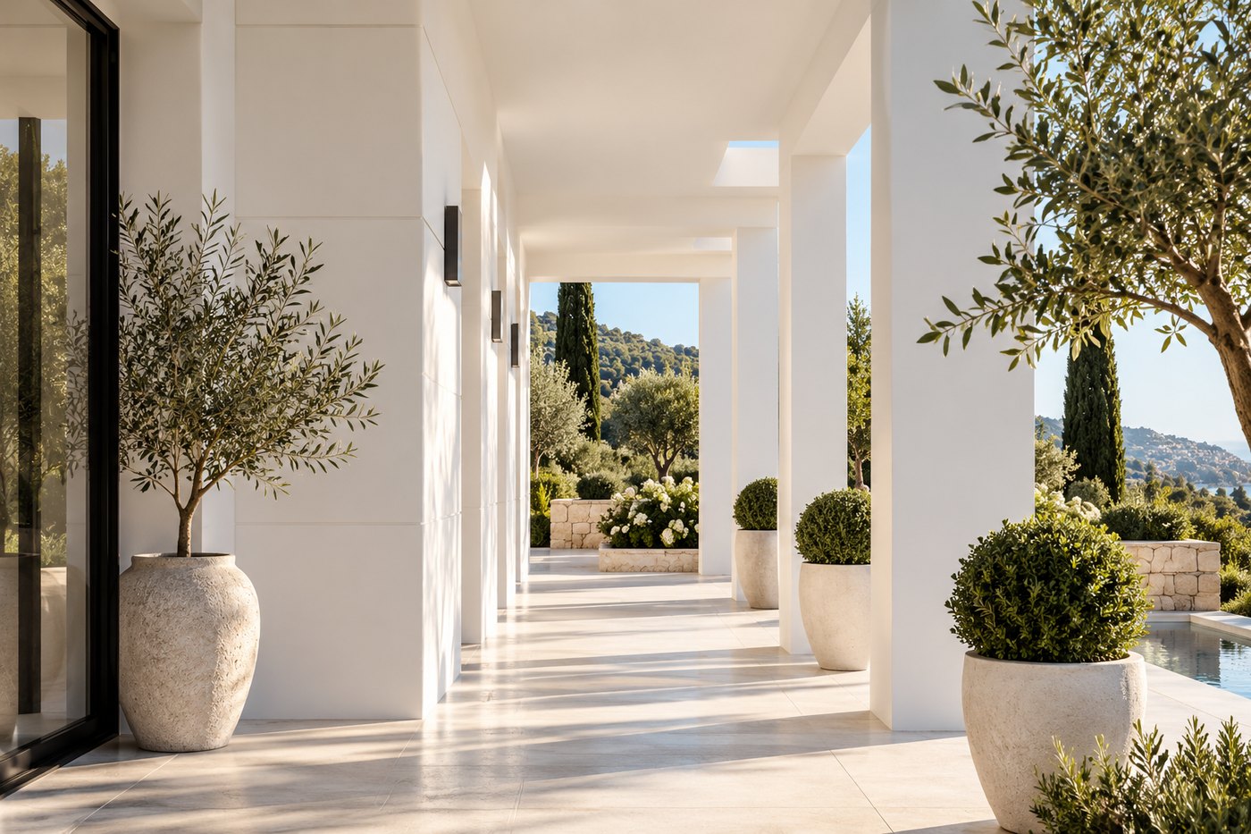
Deep brown also works beautifully in contemporary Mediterranean interiors. Paired with pale stone, linen, and natural wood, it creates a contrast that feels organic rather than overly decorative.
Deep red has a distinctive presence.
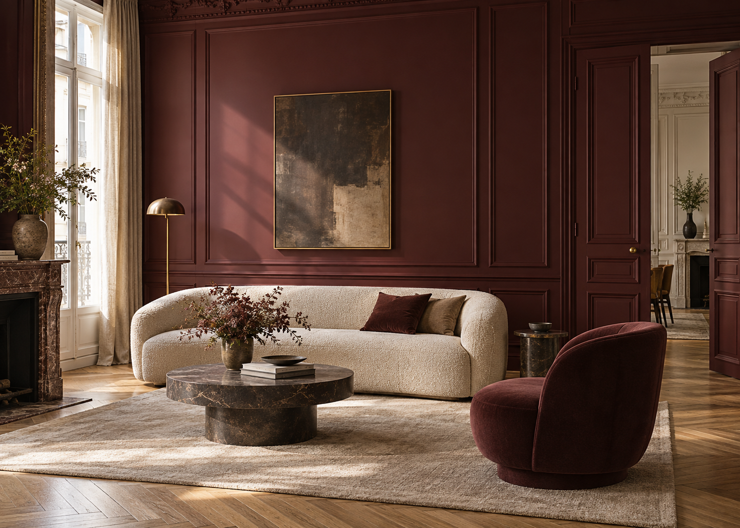
Unlike a bright red, burgundy has greater depth and can read as brown, plum, or wine depending on its undertones and surroundings.
Benjamin Moore’s red family extends well beyond vivid primary reds. Earthy reds, burgundies, and mahogany-inspired shades can behave almost like neutrals when paired with brown, taupe, natural wood, and warm whites.
Among the brand’s deeper shades are Dinner Party AF-300, Raisin Torte 2083-10, New London Burgundy HC-61, and Dark Burgundy 2075-10.
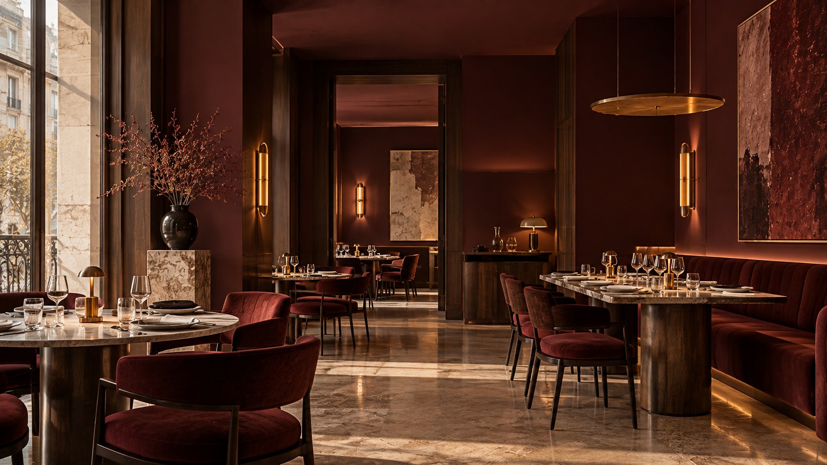
Burgundy works particularly well in dining rooms, entryways, libraries, and bedrooms.
Paired with dark wood, velvet, brass, or pale stone, it takes on a sophisticated quality. Combined with natural textiles and warm neutrals, it becomes softer and more contemporary.
Burgundy doesn’t have to be treated as a dramatic statement color. With the right surroundings, it can be surprisingly easy to live with.
Deep greens have a unique quality: despite their intensity, they maintain an immediate connection to the natural world.
Forest green, bottle green, deep olive, and nearly black green can add considerable character without feeling artificial.
Benjamin Moore’s deeper green palette includes shades such as Essex Green HC-188, Hunter Green 2041-10, Vintage Vogue 462, and Salamander 2050-10.
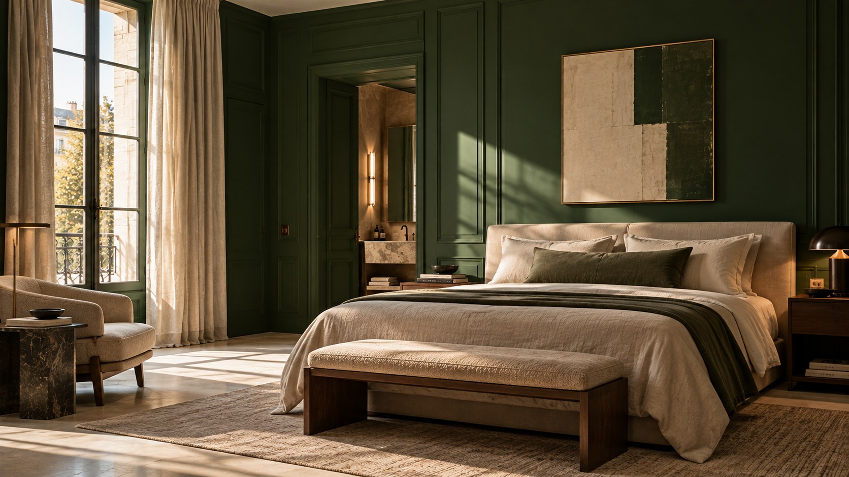
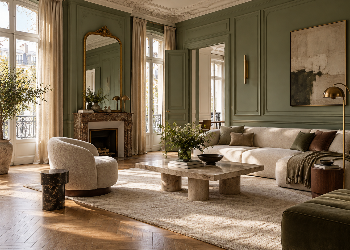
Deep green pairs especially well with natural wood, cream, beige, brown leather, and stone.
In a kitchen, it can completely transform cabinetry. In a living room, it looks particularly striking on built-in bookcases or paneled walls. In a bedroom, extending it across several surfaces can create a calm, enveloping atmosphere.
And there is no reason to limit it to walls.
Doors, trim, wainscoting, and built-ins are often ideal places to introduce a deep color in a more architectural way.
For anyone who wants to introduce a dark color without moving toward brown or black, deep blue is an excellent alternative.
Midnight blue or navy retains a clear sense of color while being structured enough to function almost like a neutral.
Hale Navy HC-154 and Van Deusen Blue HC-156 are among Benjamin Moore’s best-known deeper blues.
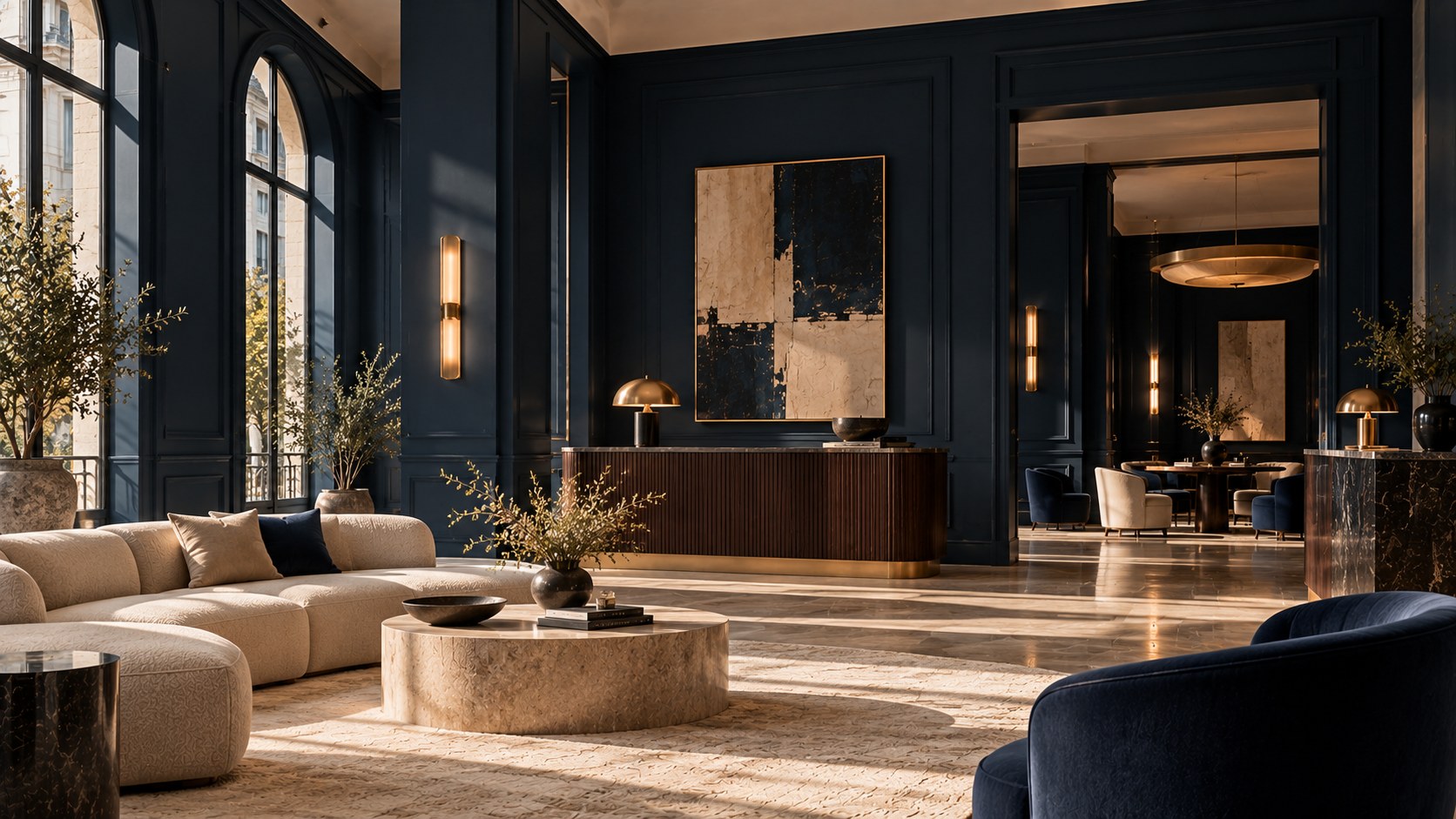
Midnight blue works beautifully with warm whites, beige, medium and dark woods, and metallic accents. It can feel classic alongside crisp trim, more contemporary when paired with earthy tones, or deeply immersive when carried across doors and millwork.
In a room with abundant natural light, a deep blue can also provide an effective counterpoint. Instead of simply making everything appear brighter, daylight reveals the complexity and changing undertones of the color.
The familiar “accent wall” isn’t the only way to introduce a deep color.
In some spaces, a single painted wall works beautifully—behind a bed, built-in shelving, or a strong architectural feature, for example.
But in other rooms, stopping a very deep color after one wall can make the choice feel disconnected from the rest of the space.
Painting several walls—or even the entire room—can create a more cohesive result.
You can take the idea further by carrying the color onto doors, baseboards, and trim. As visual boundaries begin to disappear, the room becomes more immersive.
The important question is what you want the color to accomplish.
Should it create a focal point? Define a zone? Envelop the entire room? Highlight the architecture?
The amount of color you use should follow that intention, rather than a rule that says dark shades must always be limited.
A successful dark room doesn’t mean everything in it needs to be dark.
Quite the opposite: contrast is often what allows deep colors to reveal their full richness.
Think chocolate brown walls with an ivory sofa. Forest green beside pale limestone. Midnight blue with natural oak. Deep burgundy paired with light linen.
Light itself becomes part of the contrast.
A wall sconce creates a more noticeable pool of light against a dark wall than against a white one. Pale artwork stands out more clearly. Molding and doors can be emphasized through a change in sheen.
Materials matter, too. Glass, metal, marble, wood, velvet, and natural textiles all absorb and reflect light differently, preventing a deep palette from feeling flat or one-dimensional.
With deep shades, paint finish becomes especially noticeable.
A matte or low-sheen finish reflects less light and generally emphasizes the depth of a color. It can give walls a soft, enveloping appearance.
Satin and higher-sheen finishes reflect more light, drawing greater attention to surfaces and architectural details.
Another option is to use the exact same color in different sheen levels: flatter on the walls, with more sheen on doors, trim, or built-ins.
The palette remains monochromatic, while reflected light creates the contrast.
This technique is particularly effective with very deep shades because it creates a layered, sophisticated interior without requiring multiple colors.
A room with limited natural light doesn’t automatically need to be painted white.
Light-colored paint cannot create daylight where very little exists. It can reflect available light, but it won’t necessarily turn a naturally dark room into a bright, sun-filled space.
Sometimes, embracing the room’s lower light levels and choosing a deeper color produces a far more convincing result.
The opposite is also true. In a very bright room—particularly on the French Riviera—deep shades can provide a beautiful counterpoint to intense natural light.
Their appearance, however, will change throughout the day.
A green may reveal warmer undertones in golden light. A blue may appear brighter or grayer. A brown can shift from nearly black to a noticeably warmer chocolate tone.
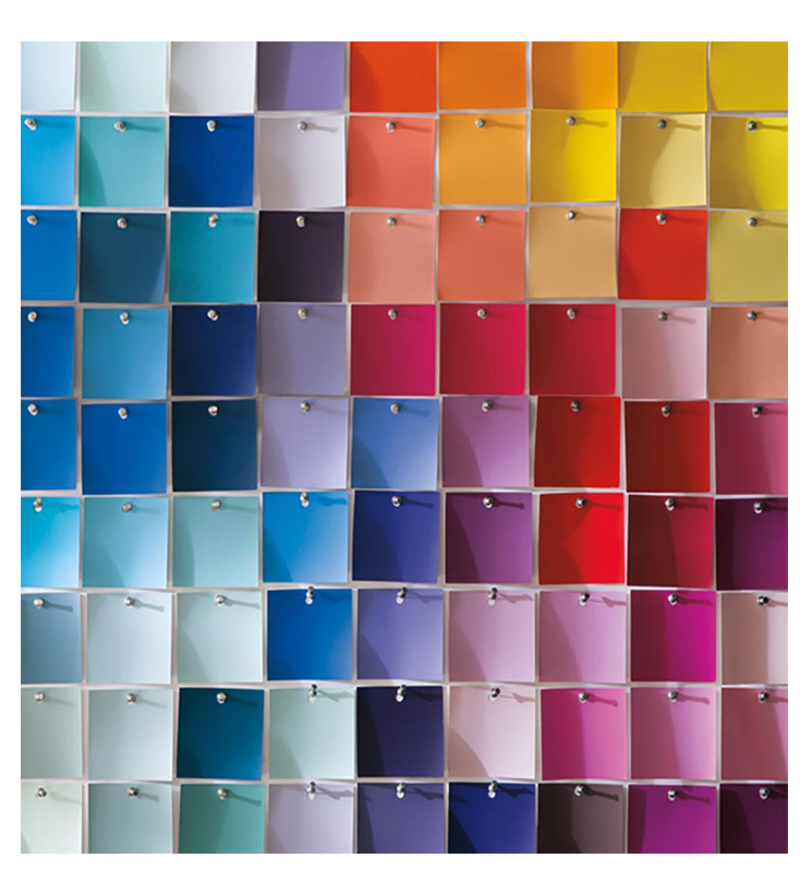
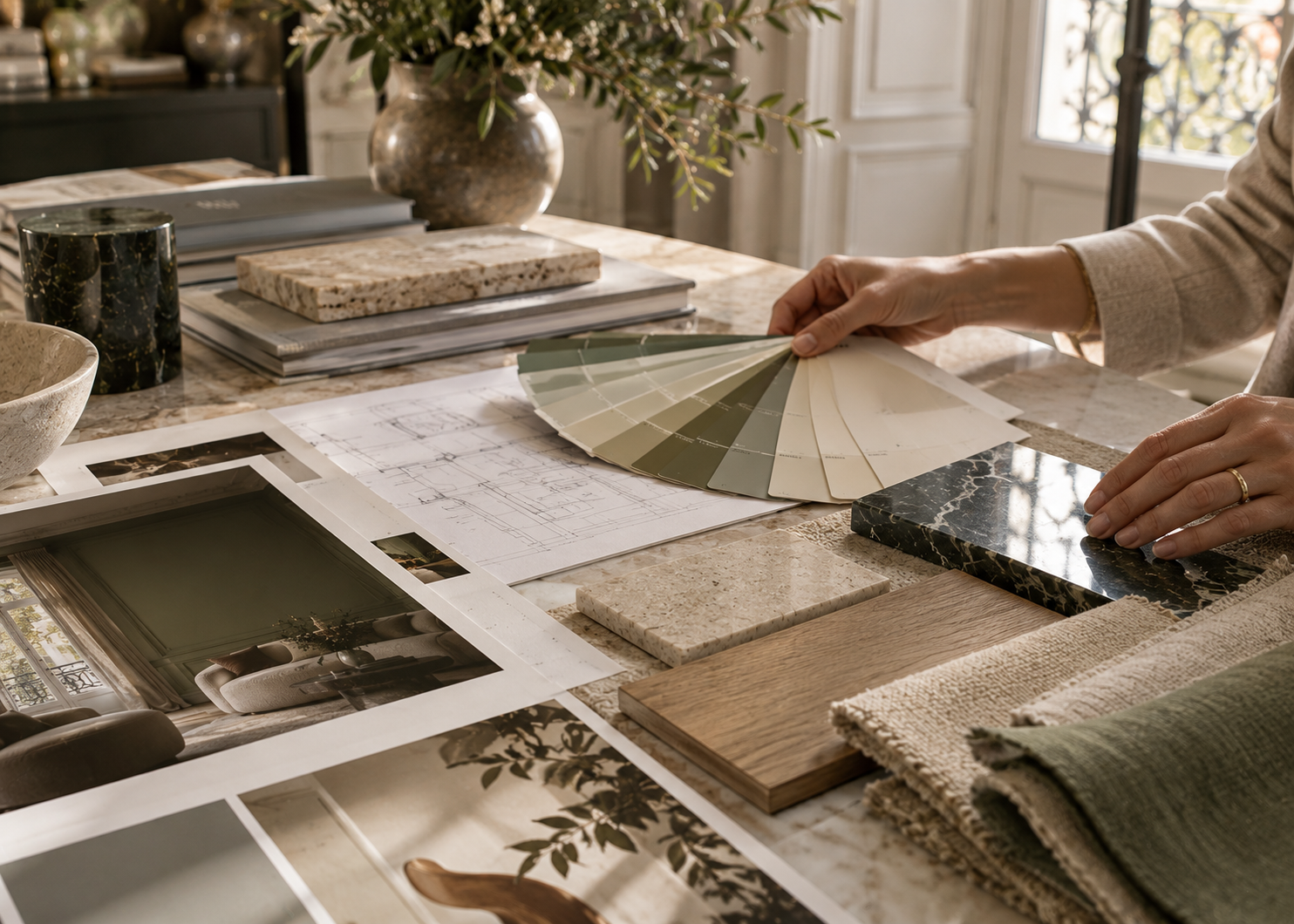
This is why sampling is essential.
Benjamin Moore recommends evaluating colors in the actual space and under different lighting conditions before making a final decision.
The more saturated a color is, the more a subtle shift in undertone can affect the final result.
Always evaluate a sample alongside the permanent elements of the room: hardwood floors, tile, stone, countertops, furniture, and window treatments.
Observe it at several times of day as well.
And don’t rely solely on how a paint color appears on a screen. Digital displays cannot reproduce paint colors with complete accuracy, and the lighting in your home will alter them further.
A deep color needs to be seen in the environment where it will actually live.
Choosing a deep shade doesn’t mean creating a theatrical interior.
Chocolate brown can feel as natural as beige. Forest green can become almost neutral when paired with wood and stone. Midnight blue can give a room structure without overwhelming it. Burgundy can introduce warmth without becoming the dominant feature.
It all depends on how the color interacts with the architecture, materials, and light.
Perhaps that is the most useful way to think about deep colors: not as a risk or a decorative statement, but as another material within the interior.
Because when a deep color is chosen well, it doesn’t diminish a space.
It gives the space an identity.